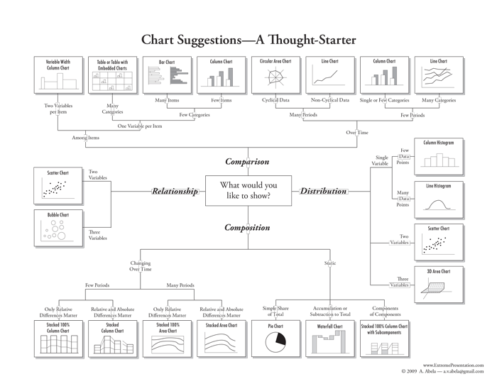
Choosing the "right chart type" is not only a question of right or wrong. Some datasets can be explored in many ways through visualizations. The first questions you should ask yourself are: what message do I want to convey? Do I need a data-driven visualization or a concept-driven one?
Data-driven visualizations
If you need data-driven visualizations, think about what aspect of your data would you like to highlight in your chart:
- Comparison: compare values of different categories (also through time). In this case, use bar/column charts, circular charts, multiple lines/areas charts, the bubble chart, the radar chart.
- Composition: highlight the part-to-whole relationship of different categories. The ideal chart types to display parts or proportions are the circular ones (yes, the infamous pie chart too–go for it without prejudice; a pie chart can be very helpful when used correctly), the stacked bar/column chart, the inbound Sankey arrow, the treemap, and the waterfall chart.
- Distribution: visualize the frequency of occurrence of your data to identify a trend as well as outliers. Use the dot plot chart or the bubble chart, the line chart and the bar chart for this purpose.
- Relationship: investigate the relationship between two or more variables and deliver insights about dependencies and correlations. The bubble chart, the dot plot chart, and the multiple lines/areas charts are ideal for this case.
- Rankings: list items of a group according to a system of priorities, ratings, points or grades. Choose the list of milestones, the ribbon list, and the ribbon bar chart to create your ranking list easily. Vizzlo's trophy chart is also a great illustrative way to display champions.
One of the most popular illustrations for this scheme is the "Chart Chooser Diagram," designed by Andrew Abela. It is available to download as PDF on his blog "The Extreme Presentation Method," which is full of handy tips for preparing presentations.
Concept-driven visualizations
Concept-driven visualizations are perfect to summarize, organize and illustrate complex concepts, simplifying their communication and making them more comprehensible for your audiences. These visualizations also have a strategic meaning: they serve as a means of documenting processes and structures and facilitate decision making.
- Business roadmaps: visualize a strategic time-based/sequential plan that defines goals and milestones for projects and products. For time-based plans, choose the Gantt chart or the detailed Gantt chart, the Gantt-like timeline and the timeline. For simple sequential plans, you might choose the milestones as arrow chart, the milestone plan with triangles, the rhombus milestone plan, the long process diagram or the list of milestones. The roadmap chart is a more literal illustration for simple projects that will surely enrich your presentation.
- Process: visualize the completion status of tasks or recurring/cyclic processes. To display your work in progress, choose the progress bar chart, the ribbon bar chart, the battery chart, the radial percentage chart or the multiple radial bar charts. The gearwheels chart and the long process diagram are appropriate to represent the steps or actions leading to an end. To plot continuous processes, choose the cycle chart or the feedback loop chart.
- Business and marketing frameworks: visualize your business model, strategy, organizational structure, sales funnel, competitors and portfolio. We offer several charts that are based on well-established analytical frameworks. Click to see all business and marketing related charts.
- Pictorial charts and maps: visualize bold single numbers, short phrases and call to actions, dates, cartographic data, directions etc. in a creative and compelling manner. From a hamburger chart to a brain chart, from a calendar chart to a speech bubble, you find on the portfolio charts that will lighten up your presentation and help you not to lose your audience.
Tip: Normally, you can fit your answer into more than one category, and many times the charts serve more than one purpose. Focus on your primary objective and remember: make it simple and keep it readable! The vizzards are already designed to impress.
The Vizzlo blog will deal with the different chart types, helping you to get familiarized with their characteristics. You will soon realize that "charting" is not complicated but fun. So, keep calm and chart on!


Comments
0 comments
Article is closed for comments.