Vizzlo's Competitive Radar helps you to report the strengths and weaknesses of your competitors compared to those of your own business.
Using Vizzlo's Competitive Radar allows you to
— Add as many segments as you like
— Set colors independently for segment headers, segment backgrounds, and competitor labels.
— Drag and drop competitor labels.
What is a Competitive Radar?
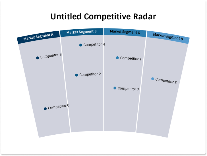
A Competitive Radar is a visualization that helps you to report the strengths and weaknesses of your competitors compared to those of your own business. In the above example, each competitor is represented by its own segment. While a dot represents one aspect of the market structure. This classification can also be reversed however. Each market spectrum is represented by a segment and your competitors are displayed as dots within a market segment. A dot that is closer to the bottom of the chart indicates that is closer to your business. Consequently, items that are plotted towards the top of the chart are further away from you.
Competitive Radar step by step
When you create a new document, you'll see that by default the chart comes with default data. It will look like this. Depending on your default theme and document layout this might differ from what you see.
Add new segments and competitors
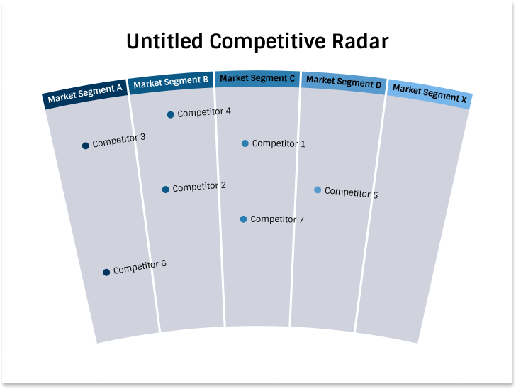
You can add new segments by
— one click on the Segments button in the menu bar, or
— use the `+` buttons displayed on the left and right-hand side of a selected segment.
There are now competitors attached to the newly added segment Market Segment X yet, so the result will be this:
Similarly, a new competitor can be added by clicking on + Add
Competitor button in the menu bar.
Edit the theme
The colors of the segment header and segment background are taken from the color palettes of your theme. You can change the theme in the sidebar. To edit the currently selected theme, click on Customize theme.
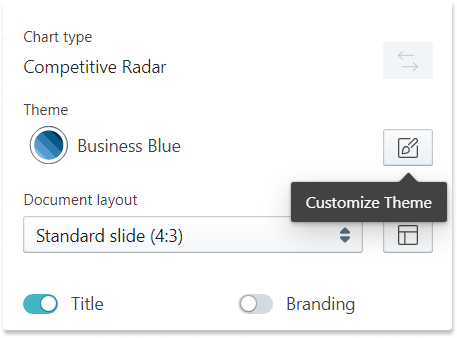
As you see, we are using the Business Blue theme by default and a document aspect ratio of 4:3.
In the next steps we will
— We will edit the theme colors
— Edit the chart title
— Change default fonts
— Change the color of the dots
— Change the aspect ratio of the chart
Edit the theme colors
When you clicked on Customize theme in the sidebar you will see the theme colors, which you can edit when you click on it.
Tip: Read our article on How to customize a theme.
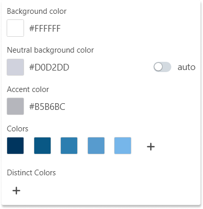
In a Competitive Radar chart the Background color changes the background color of your entire document. The Neutral background color is used for a segment's background, and Colors are used for the segment headers.
For this example we will change the default:
— Background to #E7ECEE
— Neutral background color to #F4CD6E
— Colors to #00BF8F, #FFFFFF, #F80101, #EE699F, #FAEF01
Note: Accent color is not used by the chart, so we leave it untouched.
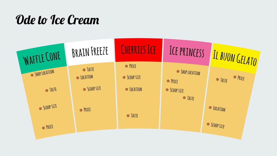
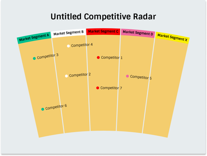
After you changed the colors, the chart should look like this:
Edit the chart title
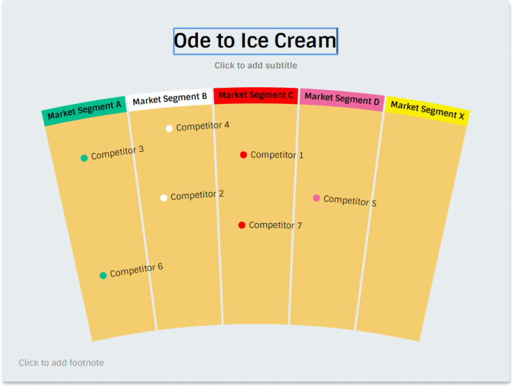
That looks better already! Let's give the chart a decent name. The chart is interactive, i.e. click on the chart title to edit it. In reference to the wonderful movie My girl, we call the chart Ode to Ice Cream.
Change default fonts
Before we change the font, let's give the segments better names. Just like you changed the title of the chart, you can simply click on a segment header and start editing. In this example we use the following names:
- Waffle Cone
- Brain Freeze
- Cherries Ice
- Ice princess
- Il buon Gelato
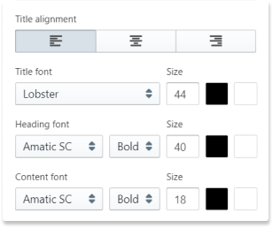
Fonts are part of a theme. To change the default font, you need to click on Customize theme again. We will use Lobster for the title and Armatic SC Bold for Header and Content.
Change the color of the dots
We are almost done. As you noticed the dots associated with each segment use the same color as the segment header by default. You can change the color for each dot separately. Click on any dot and use the color input in the sidebar. We are using #B36C3E as the color for all dots.
Change the aspect ratio of the chart
Finally, we will change the aspect ratio to 16:9. In The sidebar use the input element Document layout.
---

Comments
0 comments
Article is closed for comments.