
Vizzlo's Project Phase Chart is a smart table. It will help you to visualize your project's phases, tasks and flow.
What is a Project Phase Chart?
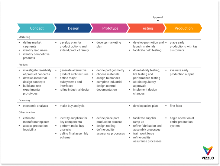
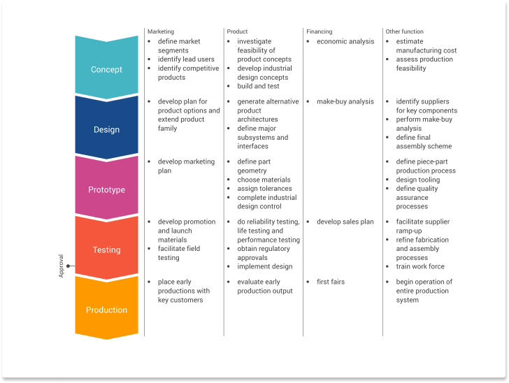
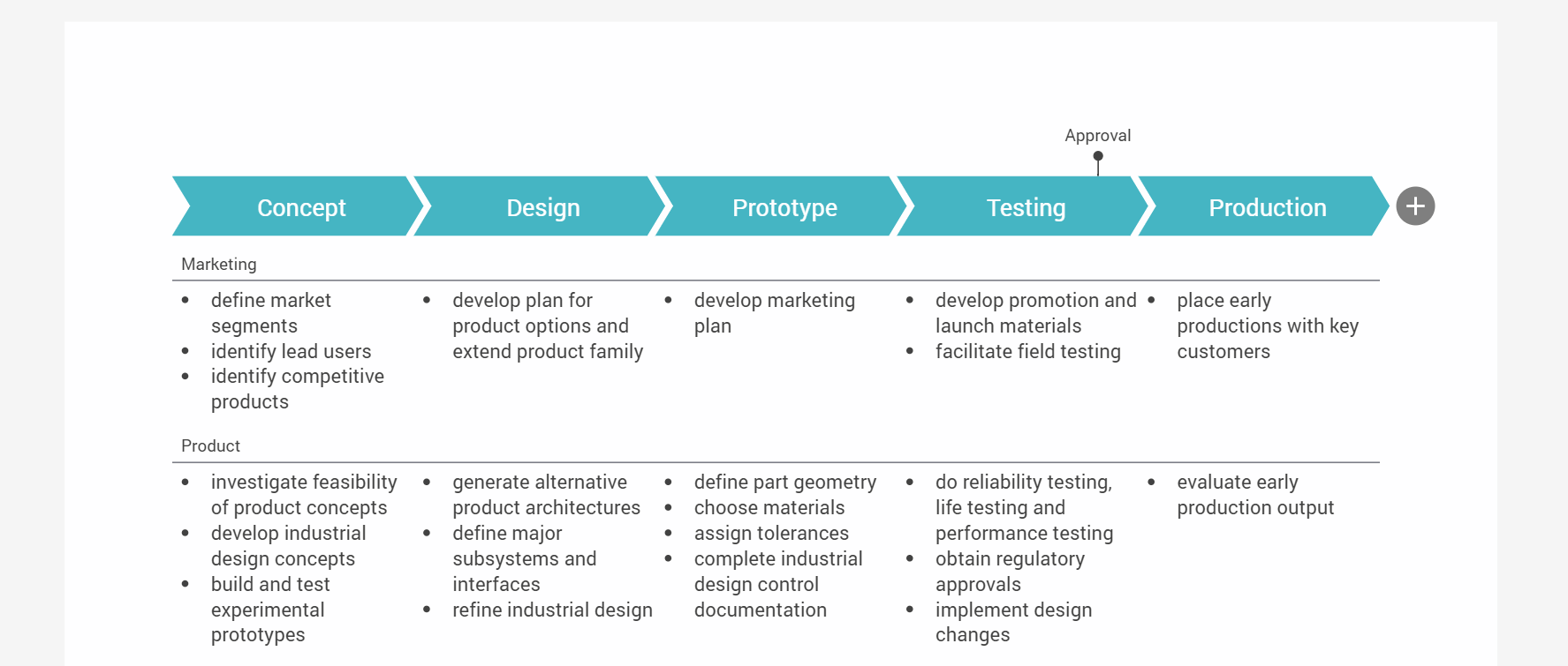
The chart is a detailed chevron list to visualize sequential project phases or process flows. The visual division of projects into phases and activities will help you to keep track of the entire project lifecycle.
Customize your chart
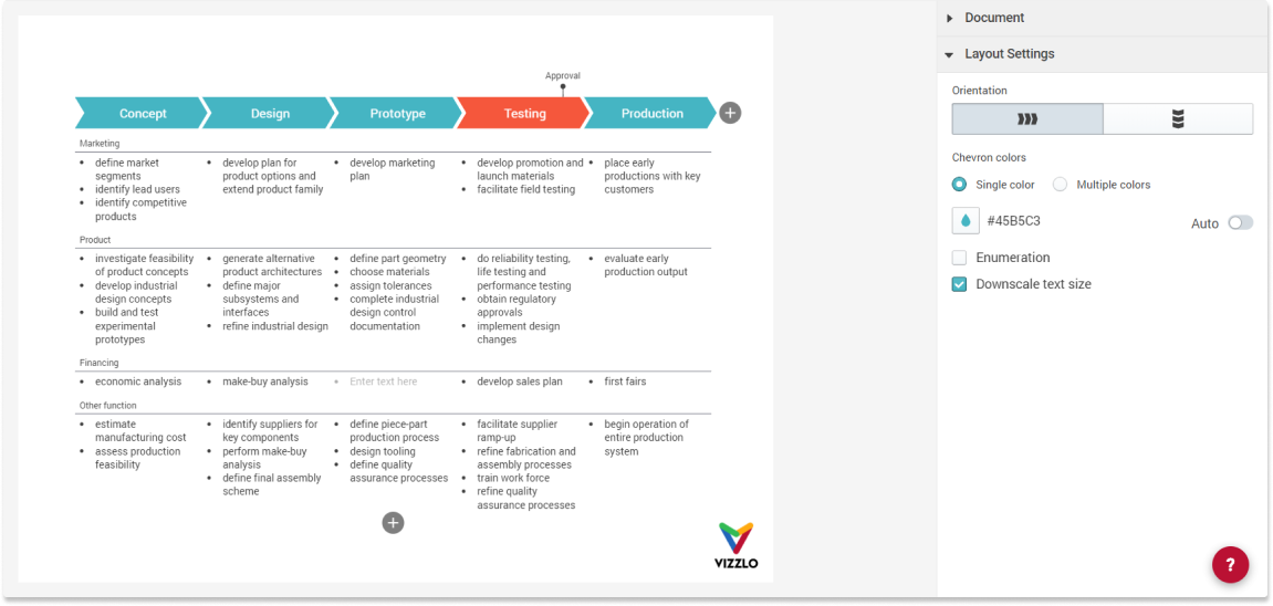
In the sidebar of the chart you find options to
- Change the orientation of the chart. You can organize the chevrons either vertically or horizontally.
- Color the chevron headers individually or uniformly
- Add enumeration above the chevrons
- Scale the font size down (Note: this options is a leftover from the early beginning of the chart. It is likely to be removed in the future.)
Want to flip the chart? Click on the button in the sidebar to get this result.
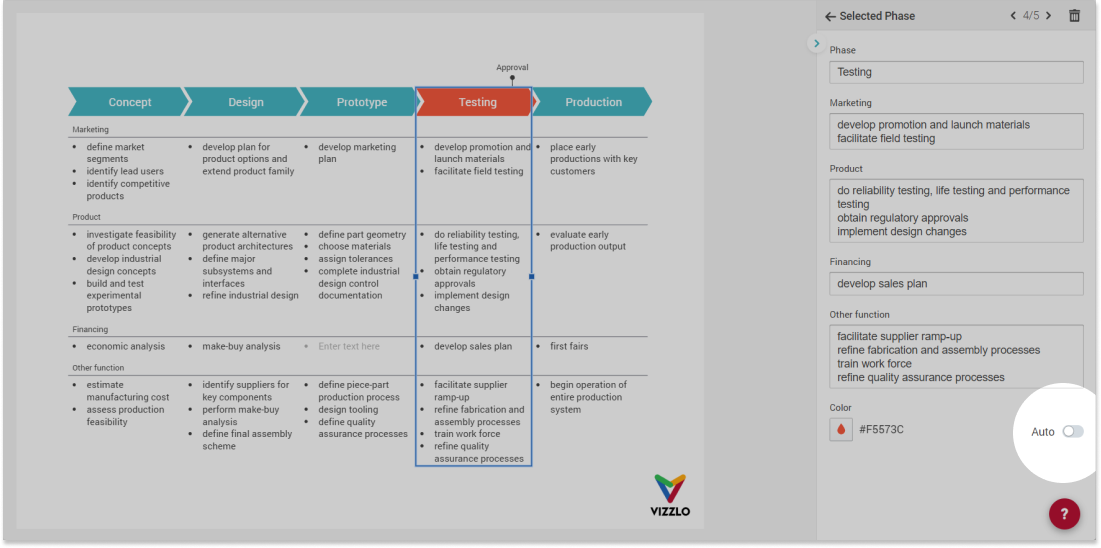
To quickly change the color of all chevrons to be the same, use the radio buttons in the sidebar. If you choose to color the chevron headers individually, by default, the colors will be taken from your theme. (You might want to read our help center article Customize a theme.) While Multiple colors is selected, the color input will be disabled.
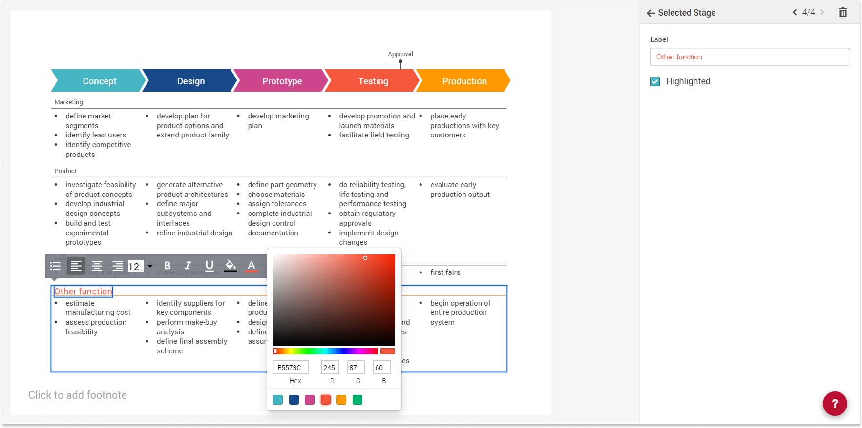
The chart is completely interactive. Click on any column (or phase) to edit its properties. Despite the chosen color setting in the sidebar, you can change colors for each phase individually.
To remove change back that individual color to its default, click on the phase and switch the toggle to Auto.
Customize column width
You have the option to adjust the width of your columns. Therefore, click on any column and use the drag handlers to change the width. All other columns will adjust their width accordingly. If you want to make sure that a column stays the same, right-click on that column. A menu will open, click the option Fixed column width. A lock icon at the top of a column indicates that the width is fixed. Click on that icon to remove the binding.
As you drag the columns, you will see the column width displayed above each column.
Note: the option to adjust the column widths does exist only in the horizontal orientation yet.
Add new phases and stages
Adding a new column (phase) or row (stage) is easy. Click on the `+` icon in the top right corner to add a phase. Or use the button `+` Add phase in the top bar.
When you select a stage, you will see two `+` icons on the top and bottom of that stage. Click on either of them to add a stage above or below the current selection.
Phases and stages can be dragged to other positions easily.
Add a milestone
The chart offers the option to add milestones on top of the chevron headers. Either click on `+` Add milestone in the top bar or use right-click. The milestones can be dragged from left to right.
Text highlighting
For each stage, there is an option to highlight its header. The color used for this is the Accent color taken from your theme.
You can go even further and use the rich text editing, to fully customize any text. Select any text and change the font size or font color, etc.
Comments
0 comments
Please sign in to leave a comment.