Vizzlo's Gantt chart is easy to use and looks beautiful. The chart is completely interactive, that is you can click on any element to select and then edit it. Besides, you can right-click on the elements and the canvas to see a context menu with more options.
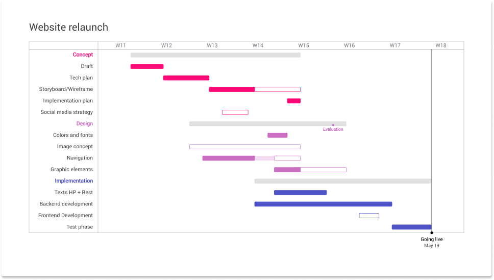
What is a Gantt chart?
A Gantt chart is commonly used in project management. It requires knowledge, and skills on project activities to meet all requirements. When it comes to managing projects, you need tools to make them manageable. A Gantt chart is a timeline of your project. Professionals use Gantt charts to visualize how highly complex tasks can be broken down into smaller processes. It is one of the most popular and most effective ways to show a project's timeline. A Gantt chart shows you what has to be done and when by whom. Tasks or events are displayed from top to bottom against time. Bars represent tasks as part of an activity. From the position and length of the bar, you can see the start date, duration, and end date of the task. The Gantt chart keeps the project team and informed from start to finish. To help you and your team collaborate efficiently.
Gantt Chart step by step
Vizzlo’s Gantt chart was designed to assist project managers and all other professionals in planning and communicating their work. In this tutorial you will learn how to:
— edit default data and title
— change font properties
— add new activities to your Gantt chart
— add a segment and a milestone
— edit a theme and layout
— change the date style
— export your work
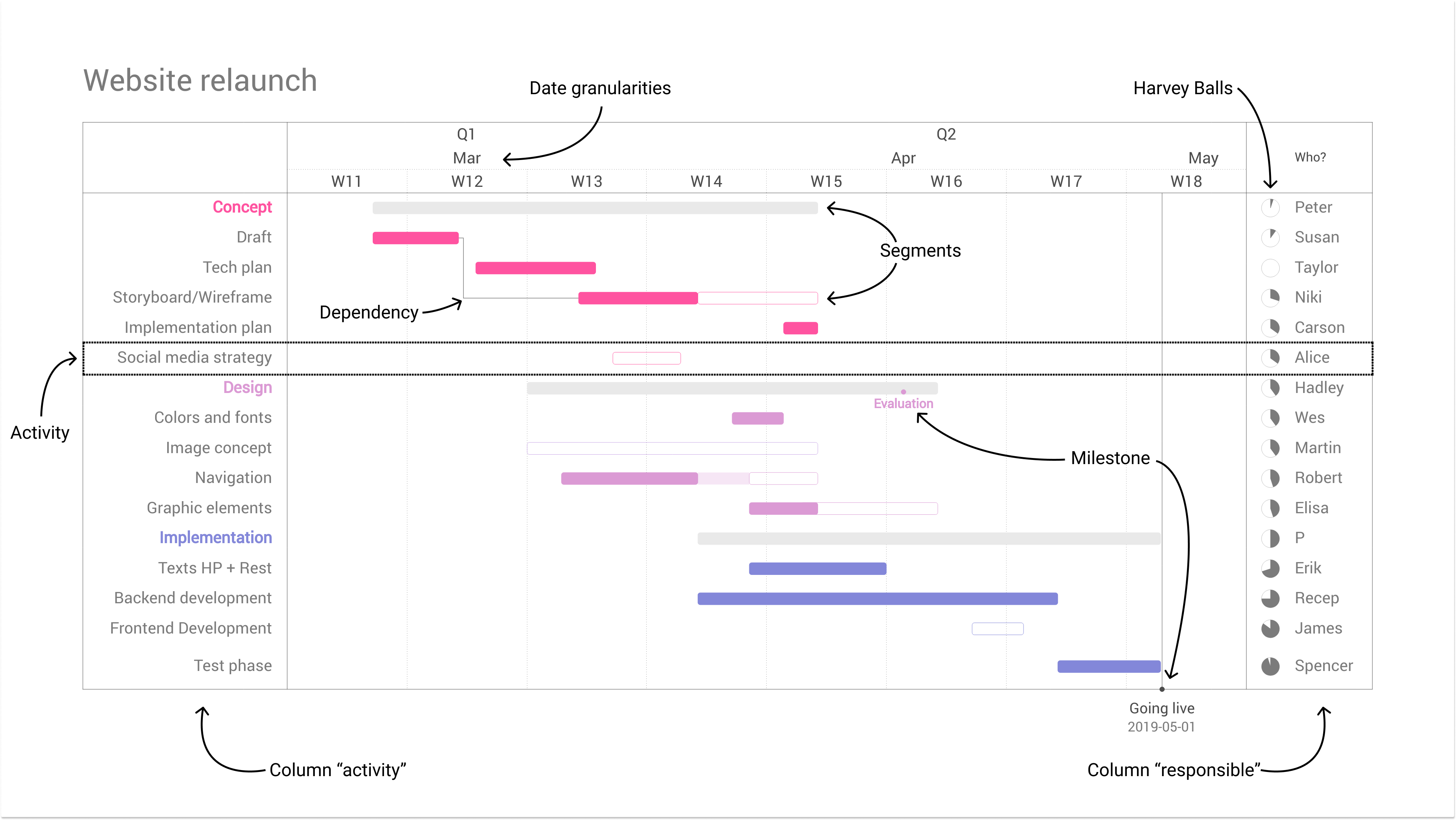
If you don't know what an activity, a segment or a milestone is, the next image will explain the different elements.
The chart comes with sample data. When you create a new document this looks as below. There might be differences regarding fonts, colors and aspect ratio of the document, depending on your default theme and default layout:
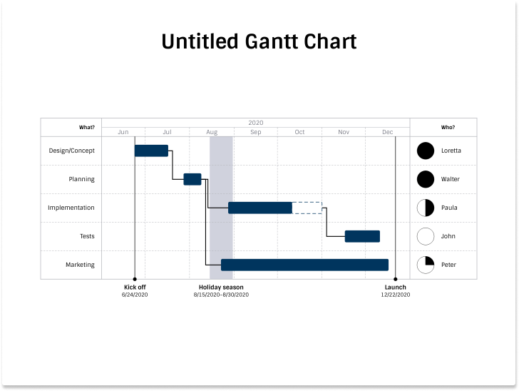
We are using Business Blue as default theme with a 4:3 aspect ratio above.
Let's give your chart a new title. To change the title of the chart, click on it and start typing. You will notice a second text input once you clicked on the chart title of the chart. There you have the possibility to add a subtitle too.
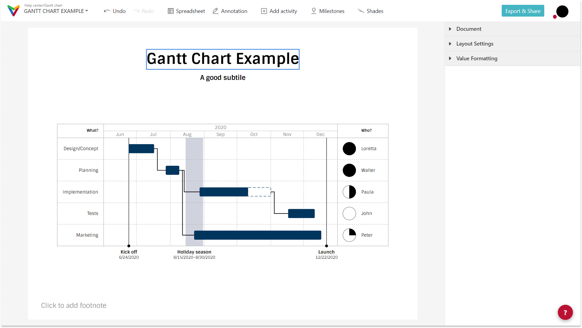
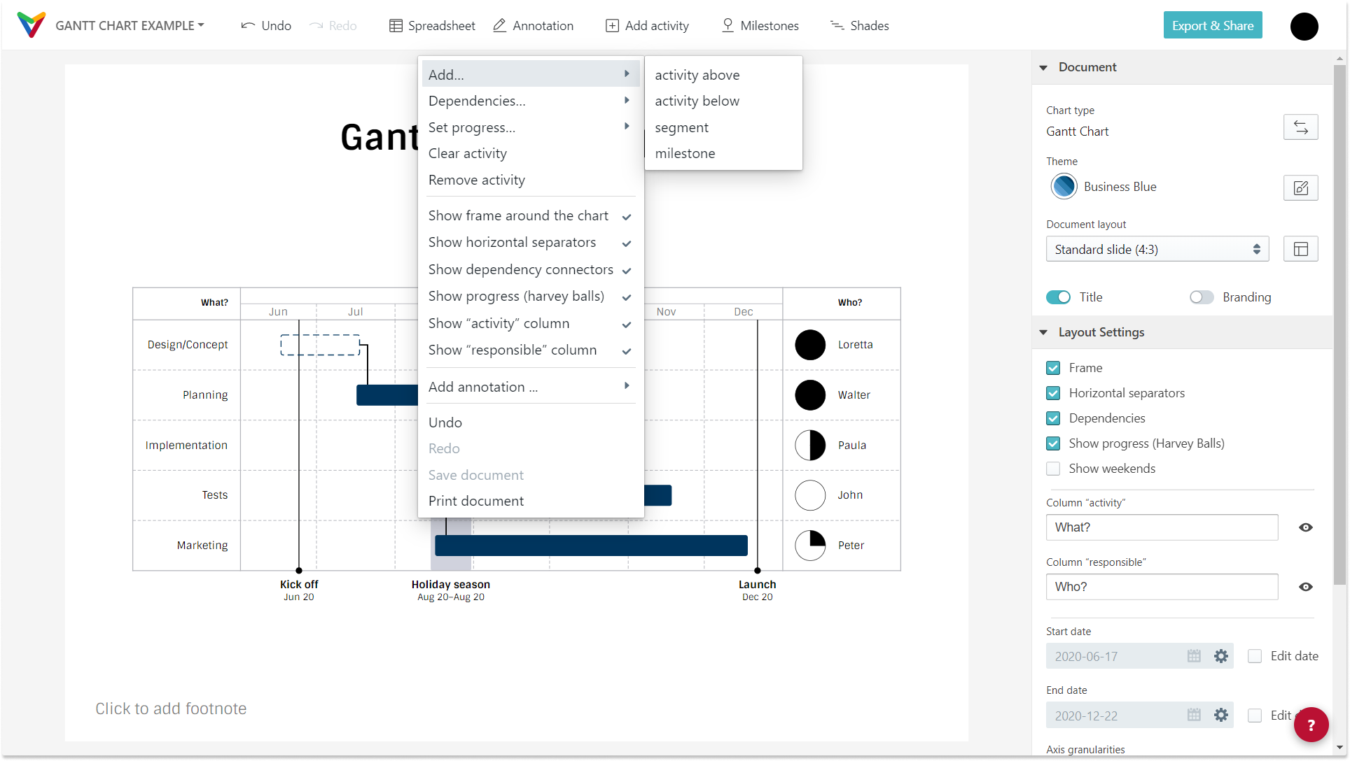
A second option to change the document title is the document menu. This document menu will also show you many more features and options.
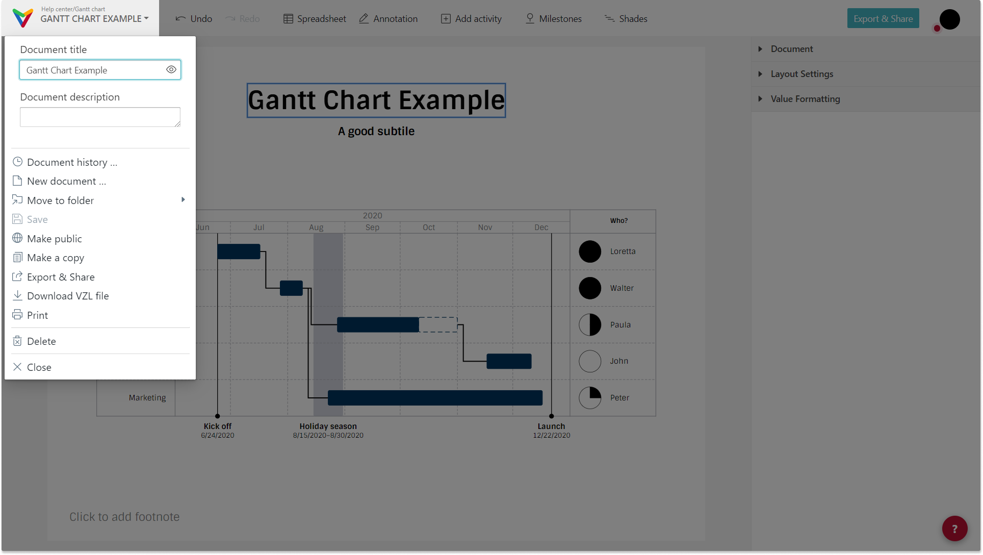
1) Edit default data
To edit any of the existing activities, segments or milestones, simply click on it and start editing. You can edit any element either right in place or in the sidebar. You can also use the toolbar on the top of the editor.
Adding an activity can be done in 4 different ways:
— Select any existing activity and click on either of the two `+` buttons on top or below it
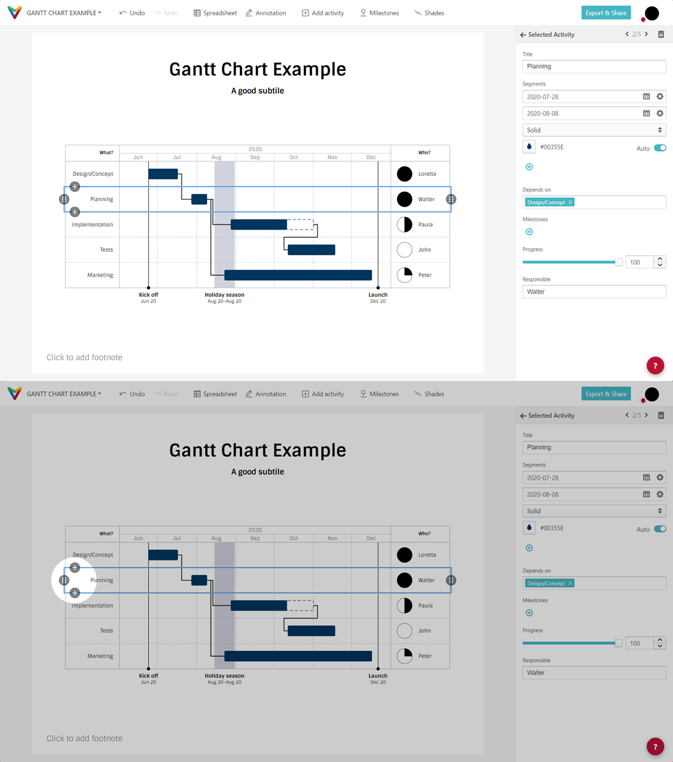
— Click the + Add activity button in the menu bar
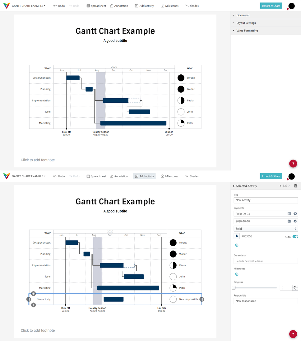
— Open the spreadsheet and add a new row there.
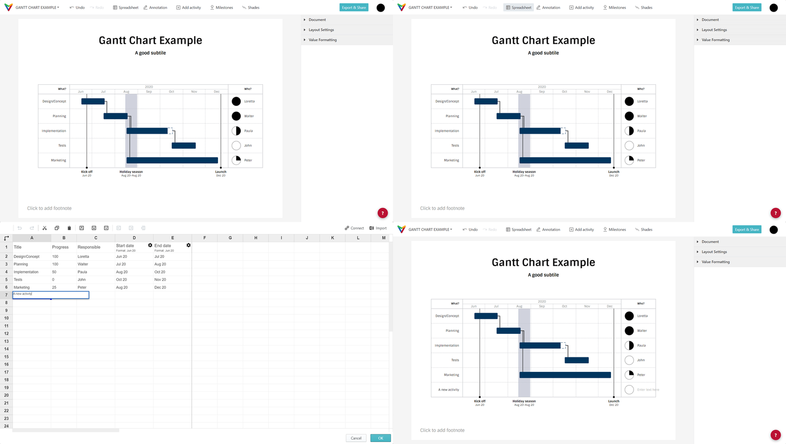
— After right-clicking on any activity
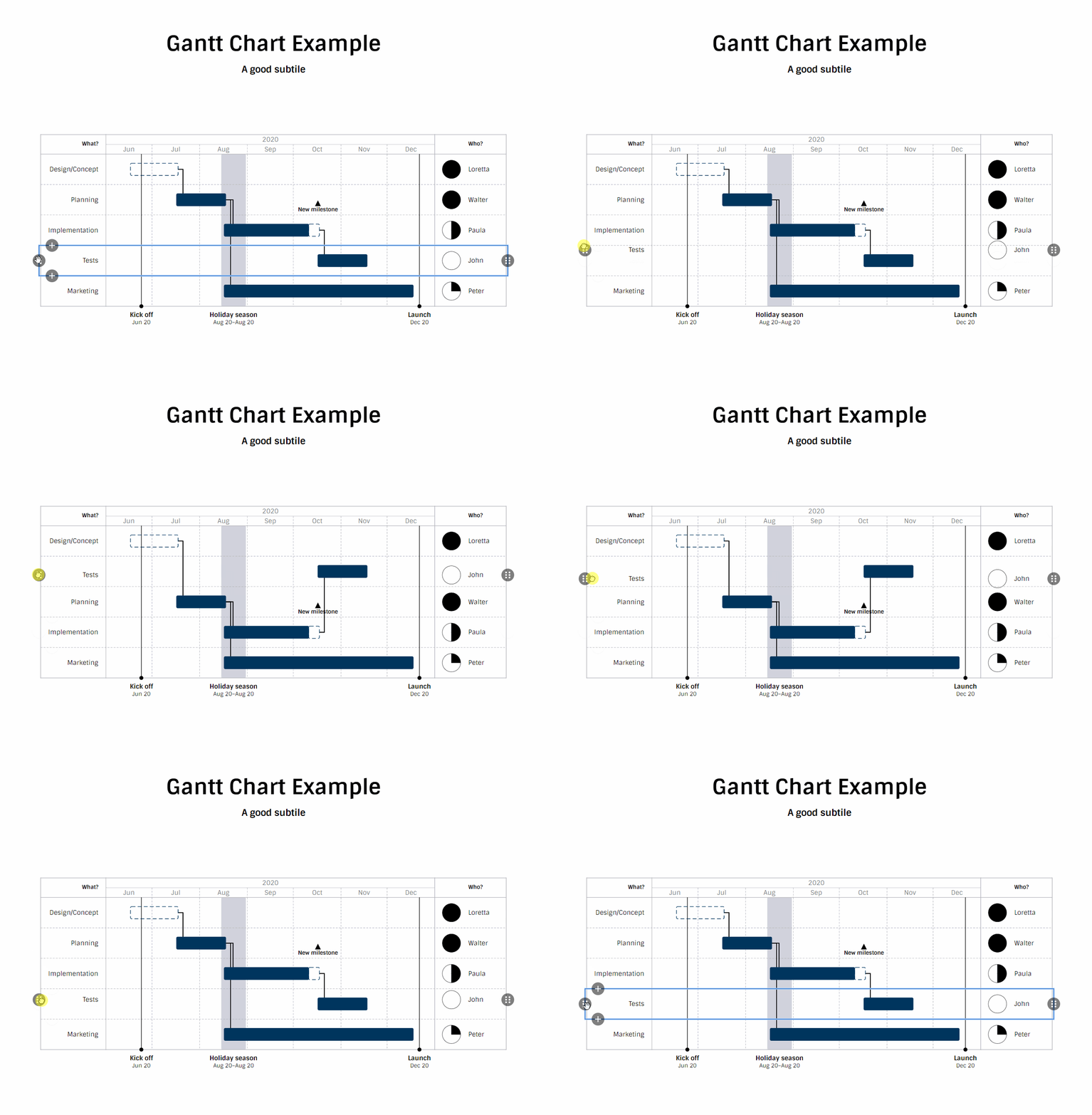
If you need to rearrange activities you can do that by drag and drop easily. Select the activity you want to move and use the drag handler on the left-hand or the right-hand site to move the activity up or down.
To add a segment you have multiple options too.
2) Explore the sidebar
The sidebar contains three tabs: Document, Layout and Date format
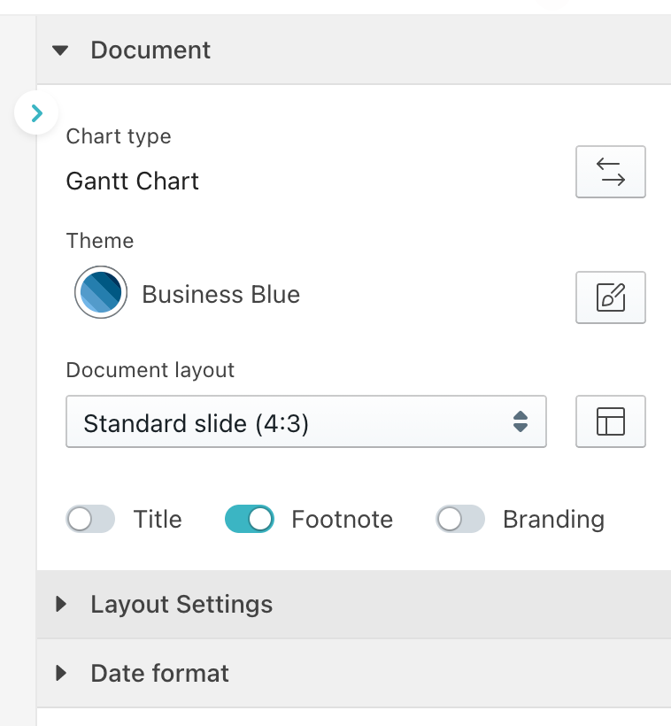
2.1) Document
Choose the document size between different slide layout presets or enter your preferred dimensions and choose a theme. You can also remove the title, footnote and branding (overlay).
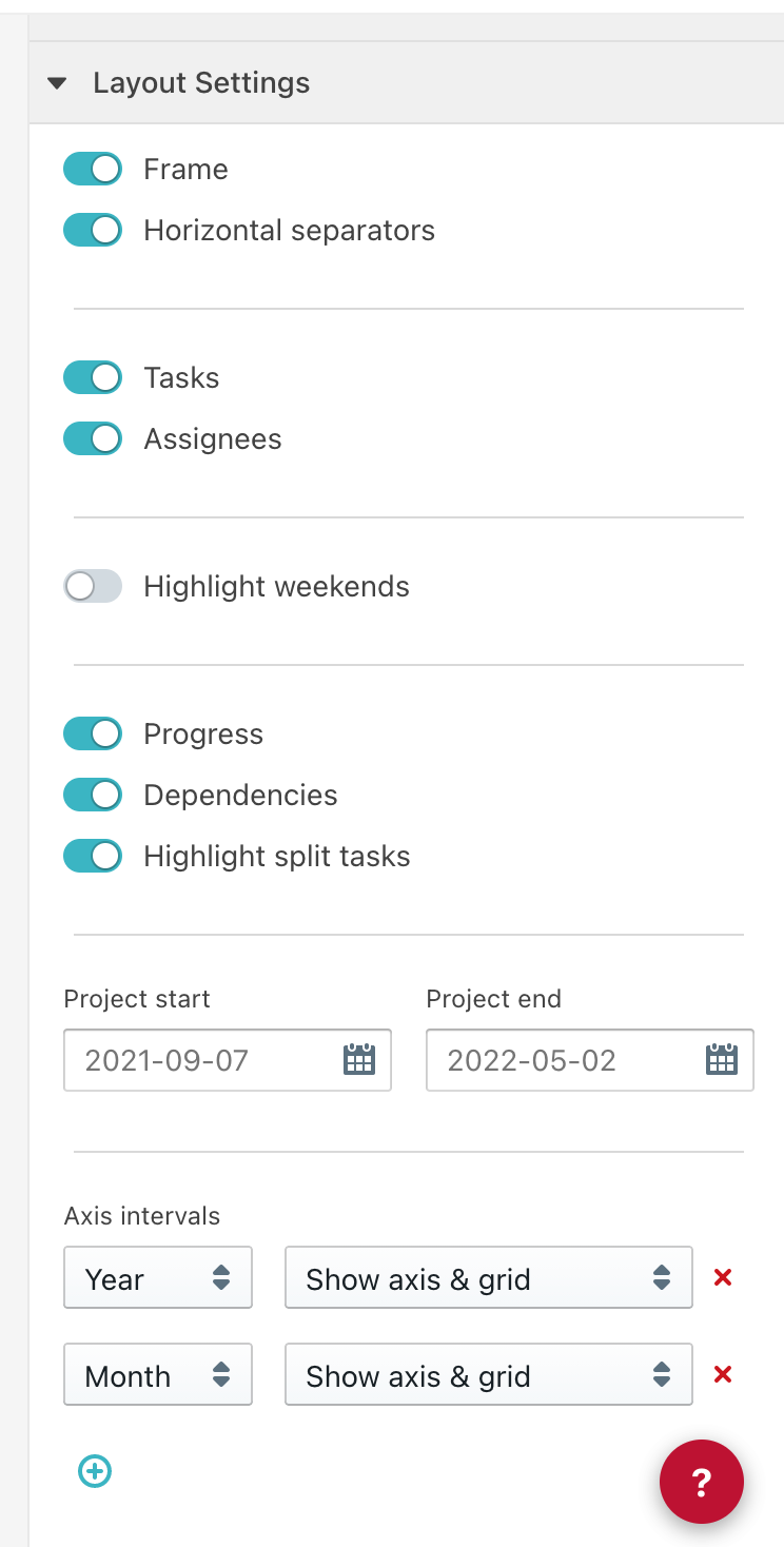
2.3) Layout Settings: show/hide frames, dependencies, columns, etc.
Click on the checkboxes in the 'Layout settings' section to see how the chart changes. Of course, you can always change the layout of your Gantt chart. However, experimenting with the sample data might help you get familiarized with the vizzard.
2.3) Date format
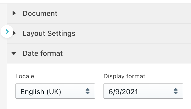
Click on the drop-down menu 'Date format' in the sidebar to choose the date format shown beyond the milestones. You can pick your preferred date format based on different languages/locale standards.
3) Start and end dates
In the Layout Settings tab, you can edit the dates directly (using the YYYY-MM-DD format) or pick it by clicking on the calendar icon. If you prefer the duration to be set automatically, you can simply delete the date you've previously input.
Changing the date format to be exhibited in the chart can be done through the Date format tab.
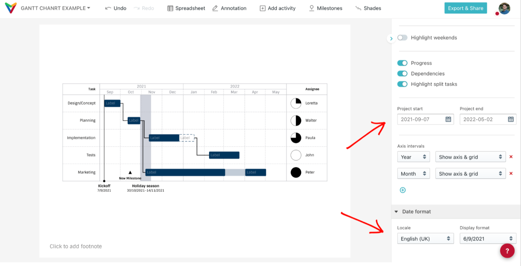 Note: This step is not mandatory. The duration of your project will be automatically calculated departing from the date of your first entry. However, it'll freeze your chart view while you're setting your project schedule. Use this option also to show just a time frame (this is helpful when presenting project phases or your work in progress, and will be described closer below).
4) Using the spreadsheet to enter/edit your data
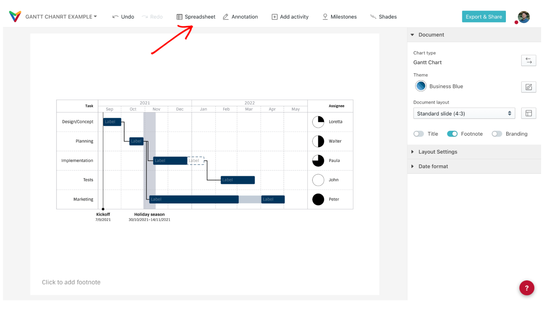
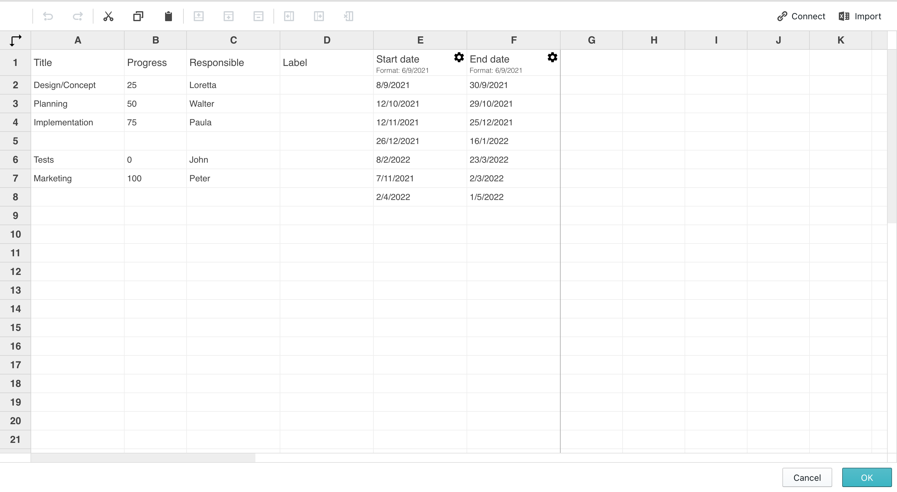
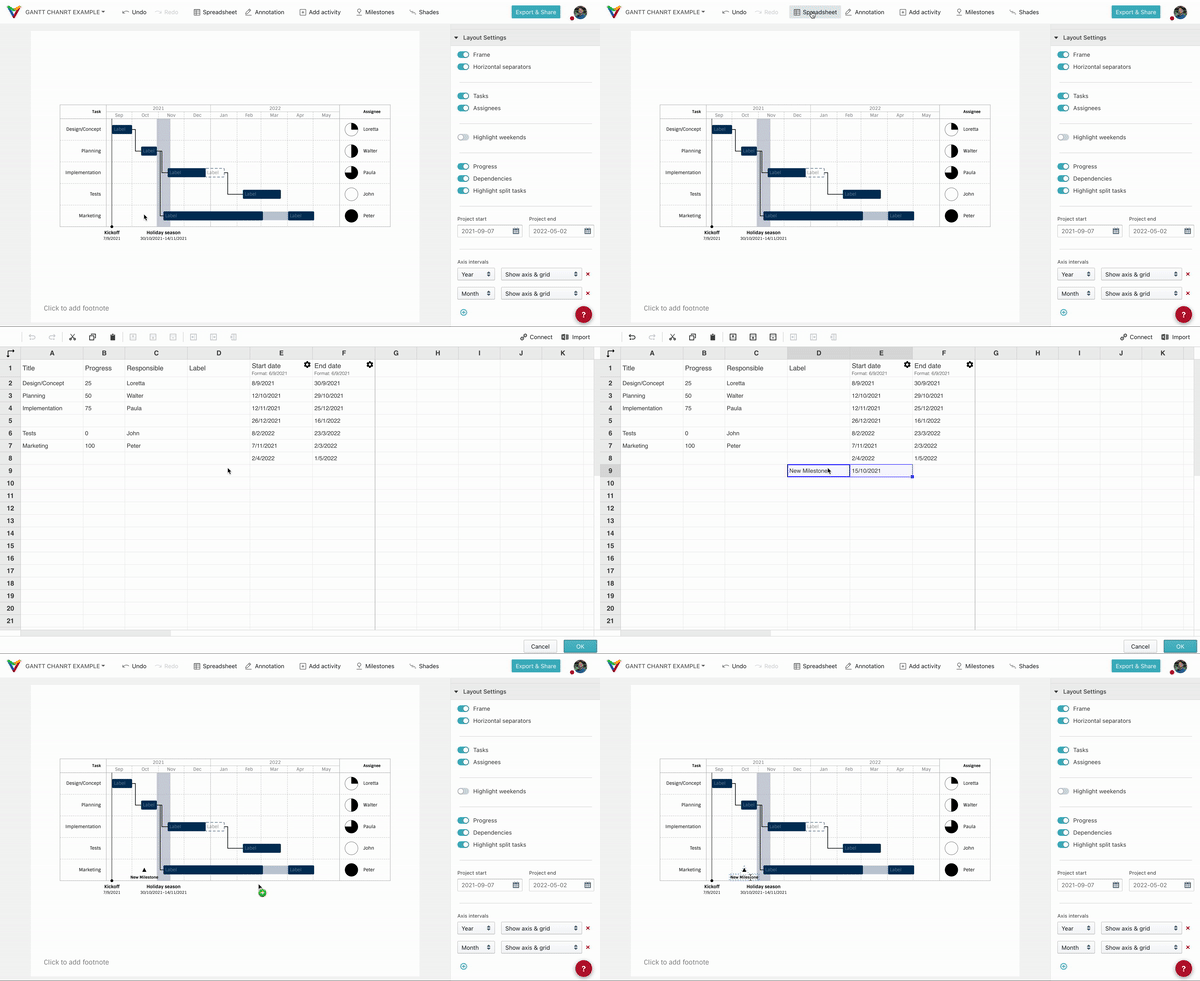
Click on click on the button 'Spreadsheet' in the toolbar (on top of the screen). You can paste your information from Excel or any other spreadsheet software. Make sure that the date format of your source (the order of year, month and day) matches the selected date format in the chart.
5) Editing an activity
Select any activity to edit it. Click on its text fields (column 'Task' in our example) to rewrite them. Alternatively, you can also use the sidebar.
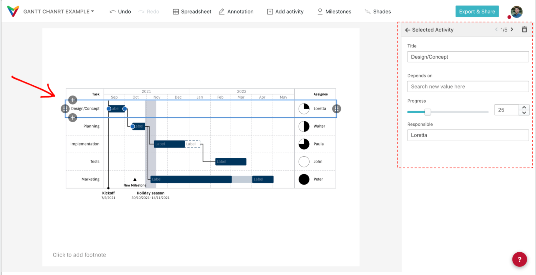
6) Editing a segment (the activity bar that shows its duration)
Because of the sample data, you can choose to edit the given segment or delete it (x) to create a new one.
Drag and drop the segment along the row to reposition it, and pull its extremes to adjust its duration/length. You can also enter the start and end dates in the card of the sidebar or edit the dates in the spreadsheet.
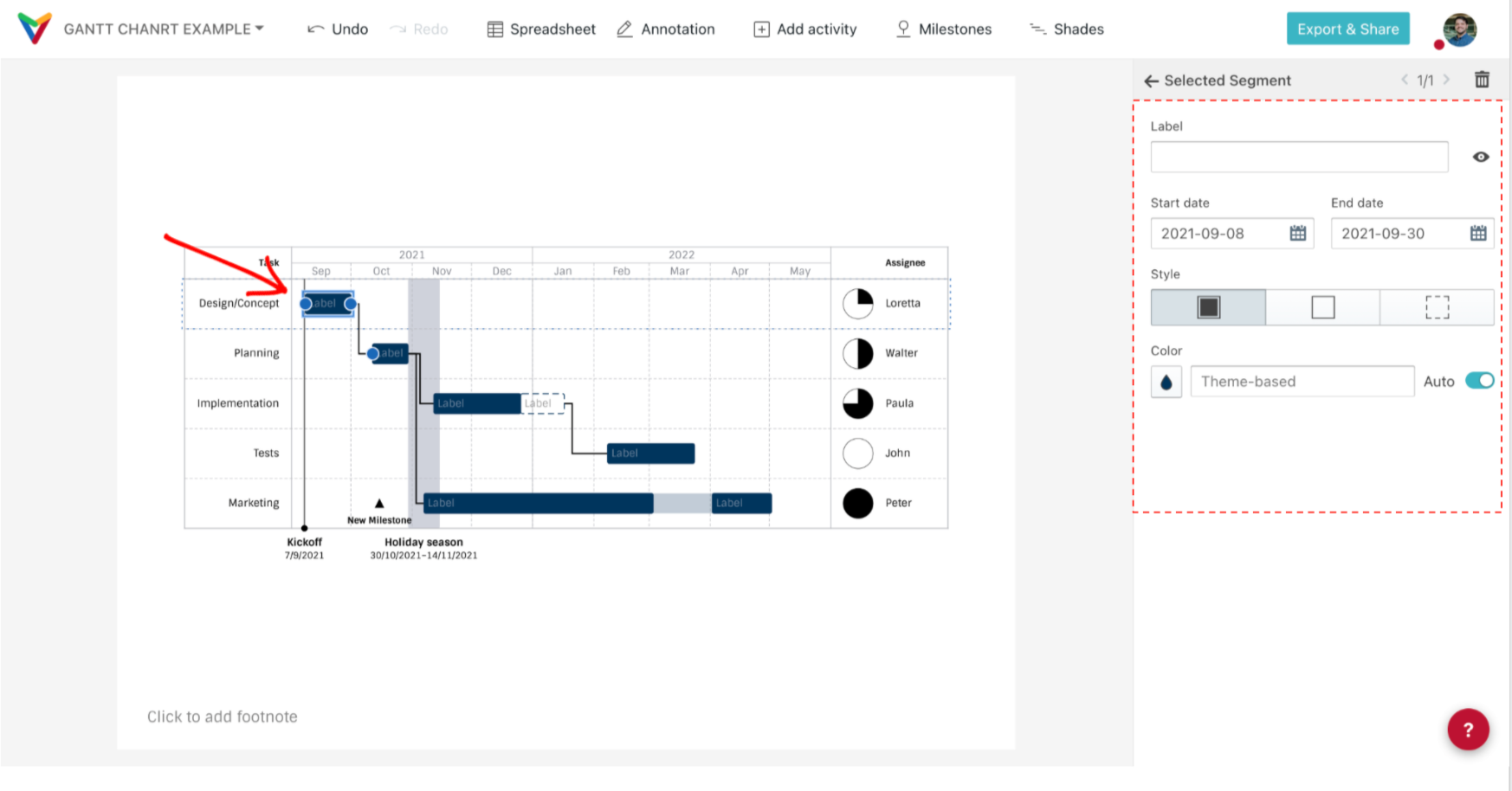
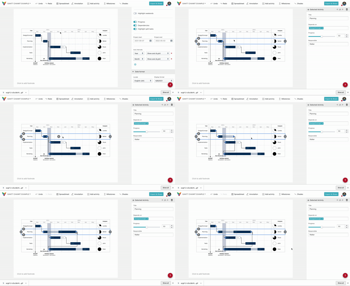
If you deleted it, create a new segment following one of these options:
a) Hover the mouse over the selected activity. You'll see your cursor as an arrow with a plus sign (+). Hold and drag the mouse, giving the new segment the length/duration you wish. Drag and drop the newly created bar to adjust its position, or pull its extremes to extend it.
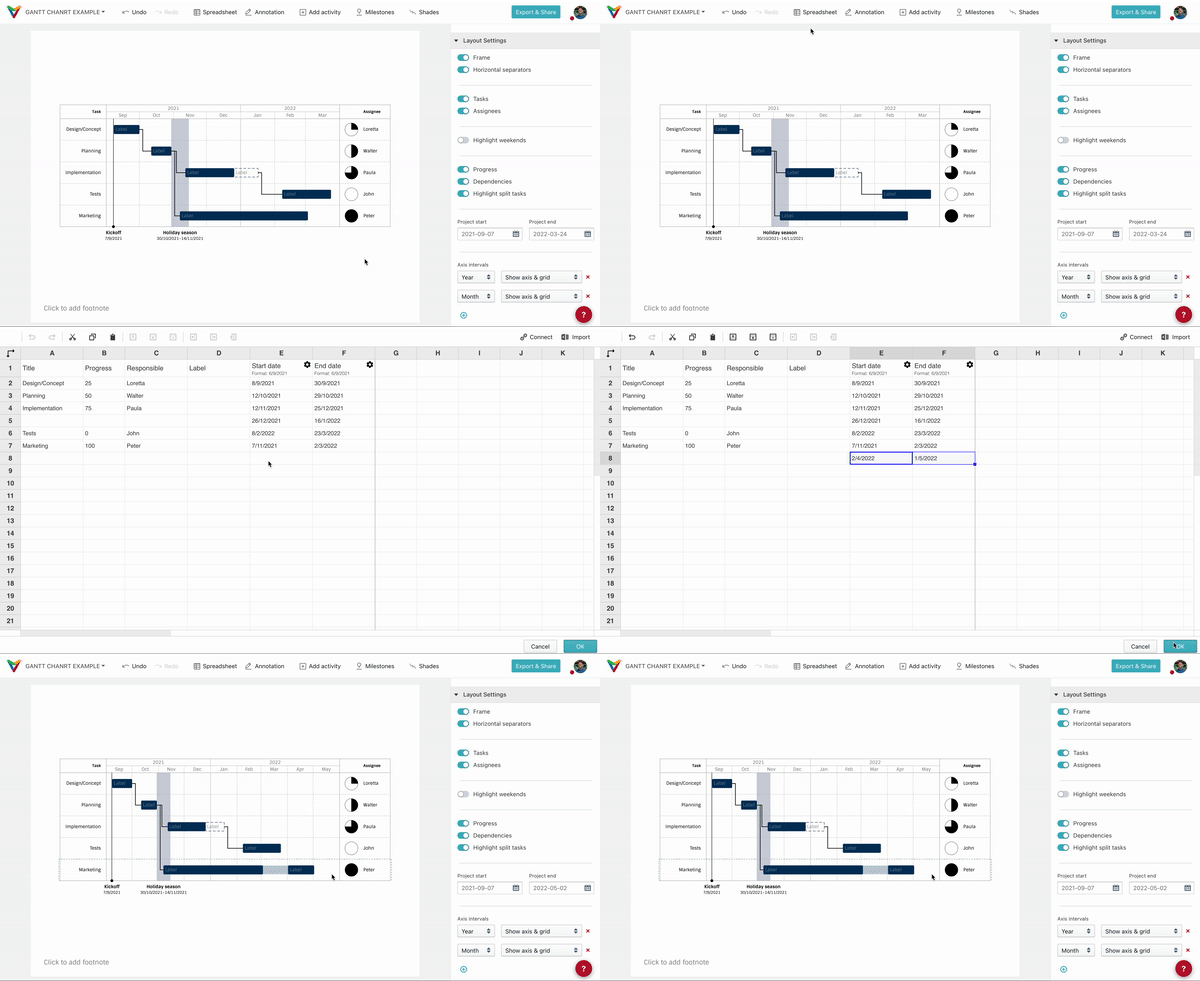
b) You can also create a new segment from the Spreadsheet by editing the starting and ending dates in an activity's row. If you want to create a second segment in an activity, create a new line under that activity and just include new starting and ending dates - do not include a new title (a label is optional).
Tip: If an activity has more than one segment and you want to delete all of them, right-click and choose the option "Clear activity" in the context menu.
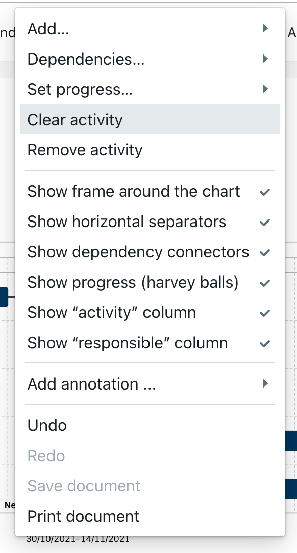
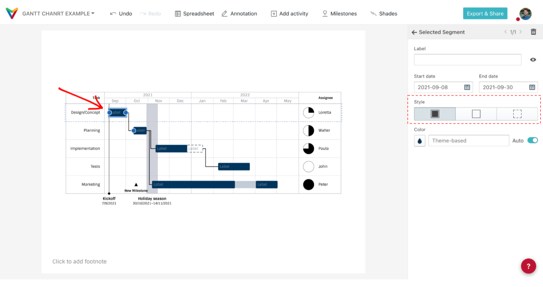
7) Setting the style of a segment
Right-click on the segment to use the context menu or use its card in the sidebar.
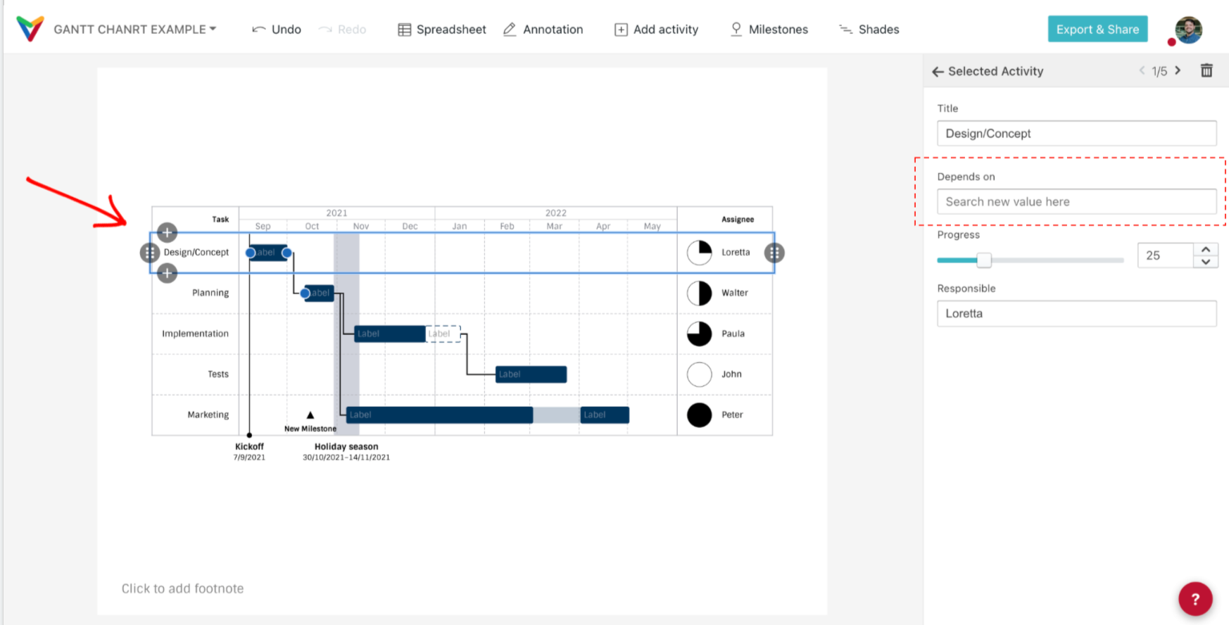
 8) Setting dependencies:
Right-click on the segment to use the context menu. Or use the card of the activity in the sidebar to set its dependencies.
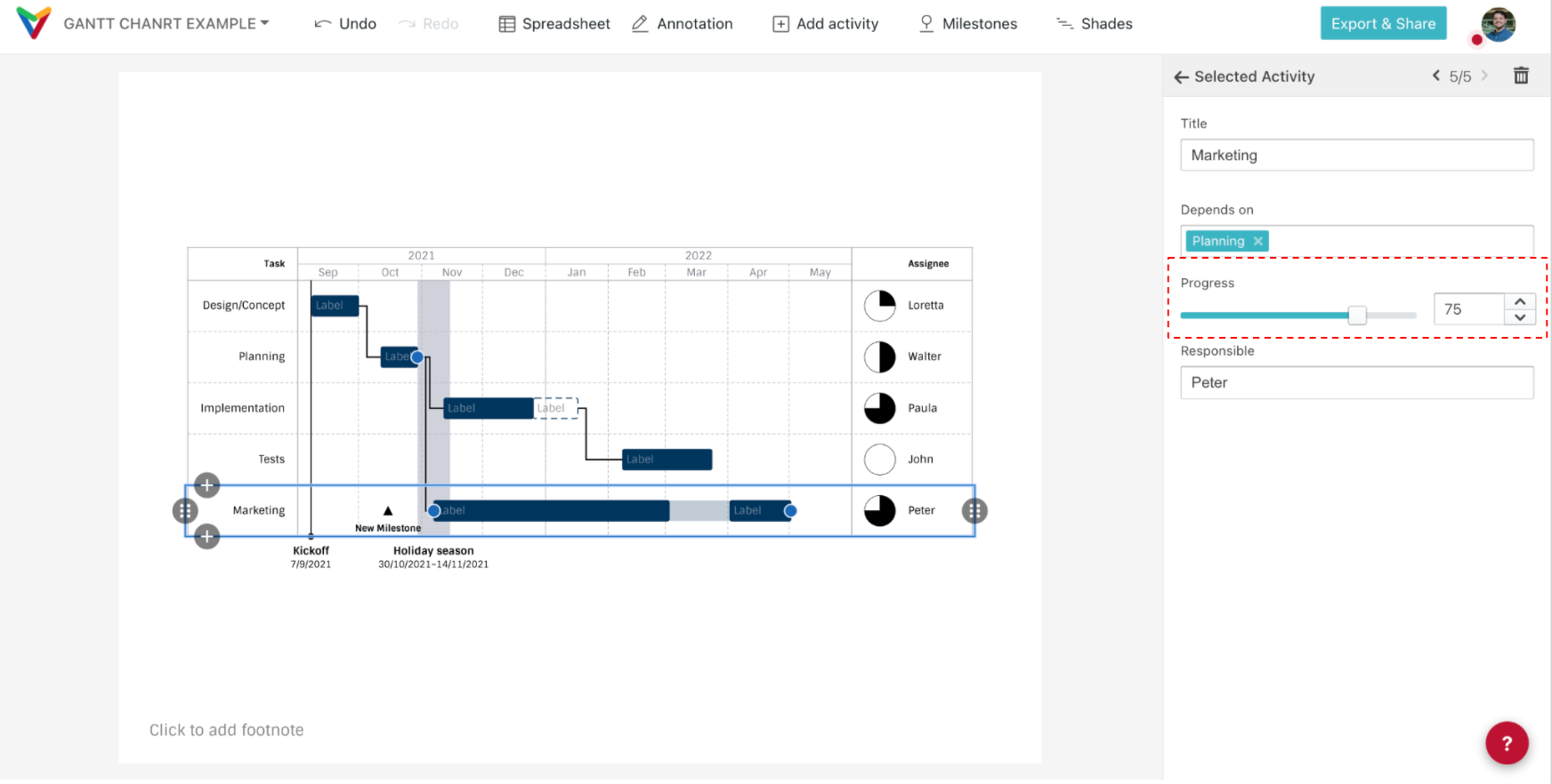
9) Setting progress
The Harvey Balls are just like little pie charts — the full circumference represents 100% of the progress, indicating the degree of accomplishment of the activity in its pre-established time.
Use the slider in the activity card to set the progress or directly enter the value in the respective field. Alternatively, you can right-click on the activity and use its context menu.
10) Pinpoint milestones for single activities
Vizzlo's Gantt chart allows you to pinpoint important milestones for single activities that don't mark general anchors for the whole project.
Click on an activity to select it. Hover the mouse over its row. You'll see your cursor as an arrow with a plus sign (+). Click once. Click on the newly created milestone to edit its text. Drag and drop to position it as you wish.
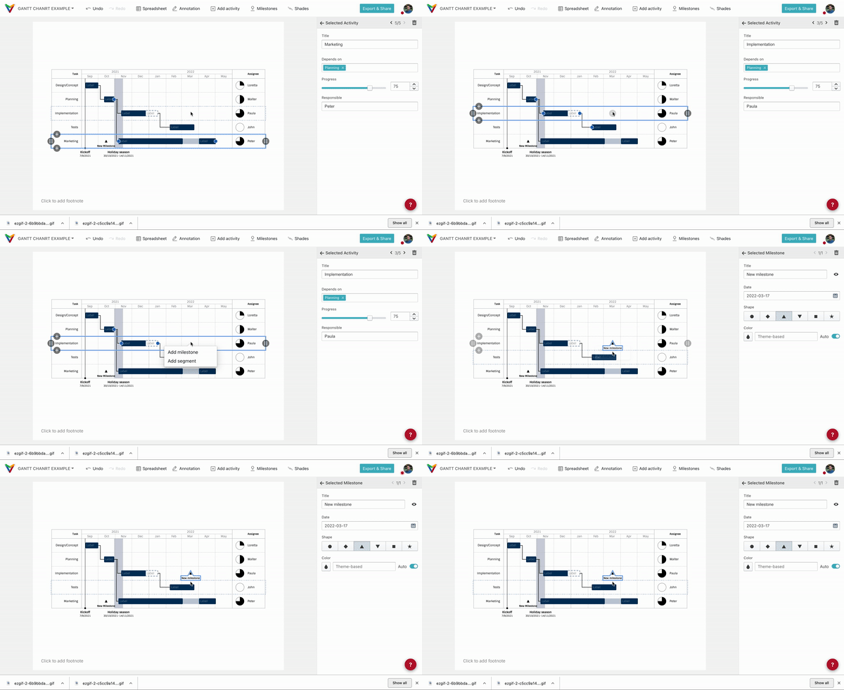
Or use the Spreadsheet to create and edit your milestones. Just add a new line under the desired activity and just add a starting date - a label is optional.
11) Rearranging activities
Hover the mouse over the activity you want to move. Drag and drop it to the position you wish.
12) Adding or excluding activities
Use the plus buttons to add an extra activity above or below the selected one. And press the '🗑' button on the sidebar to delete it.
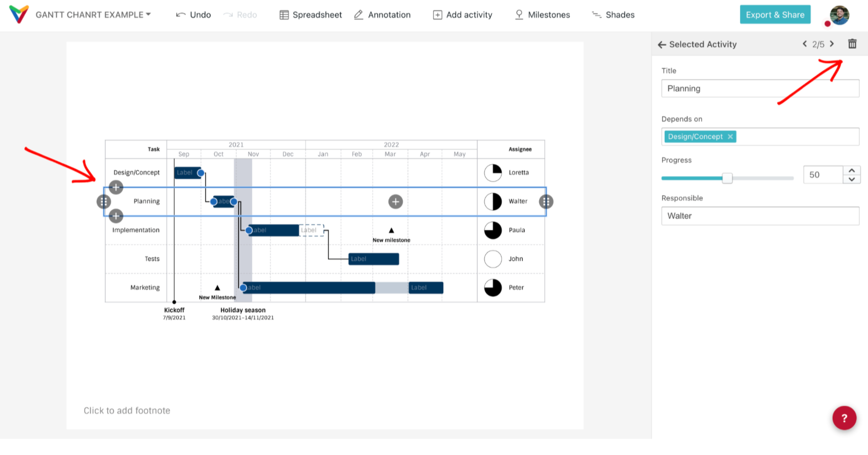
Alternatively, right-click to use the context menu. You can also use the Spreadsheet to create a new row (just create a new row and add a title).
13) Adding project milestones
To add project milestones, click on the button 'Milestones' in the toolbar (on top of the screen). A dialog box will open.
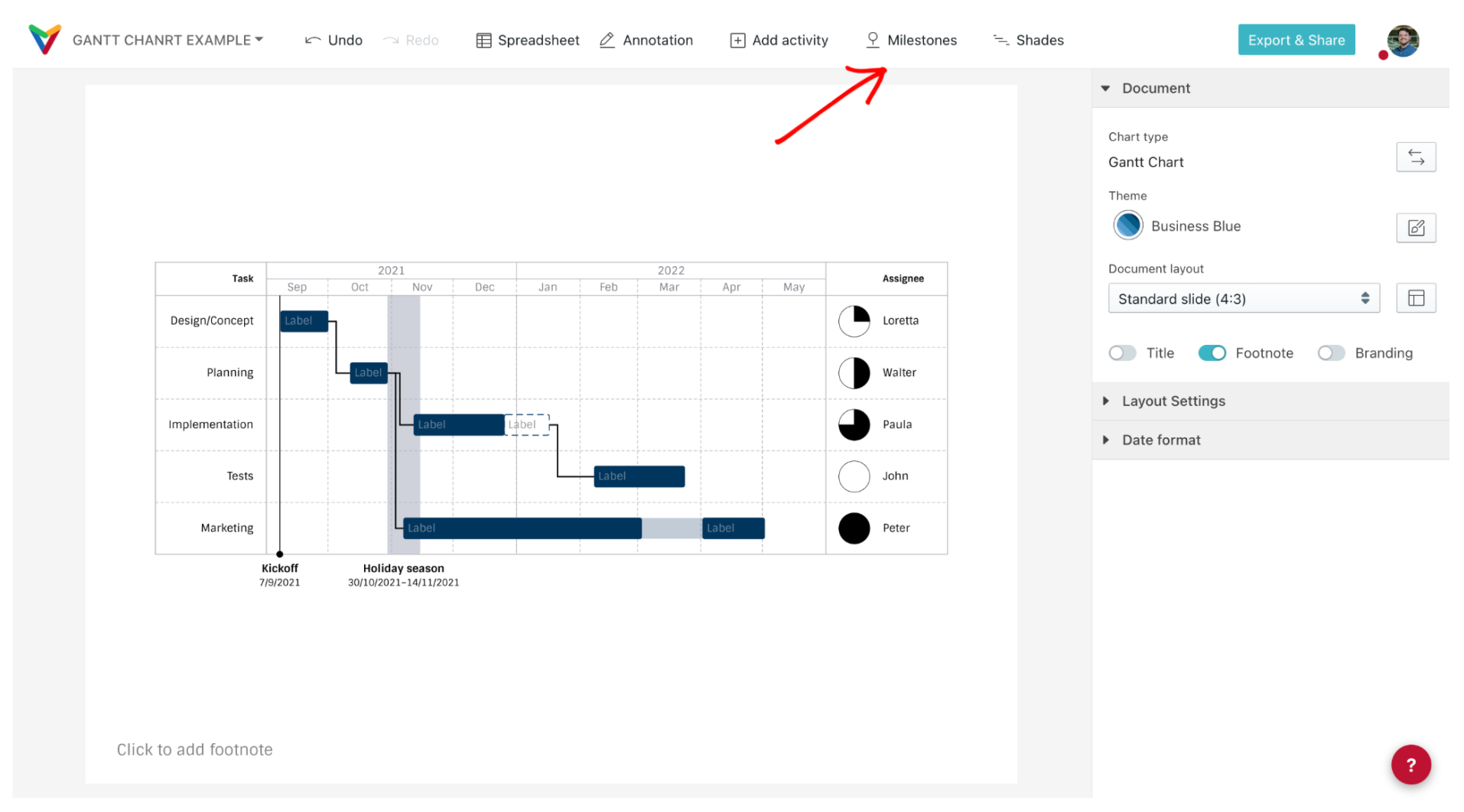
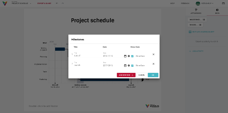
Tip: You can also drag and drop your milestones and click on them to edit.
Alternatively, you can also click on the bottom line of the chart to add a project milestone.

14) Adding shades
Shades are used to highlight certain periods, as well as indicate environmental or background process and events, like an internal audit period, training, longer holidays or court vacations.
To add a shade, click on the button 'Shades' in the toolbar (on top of the screen). A dialog box will open.
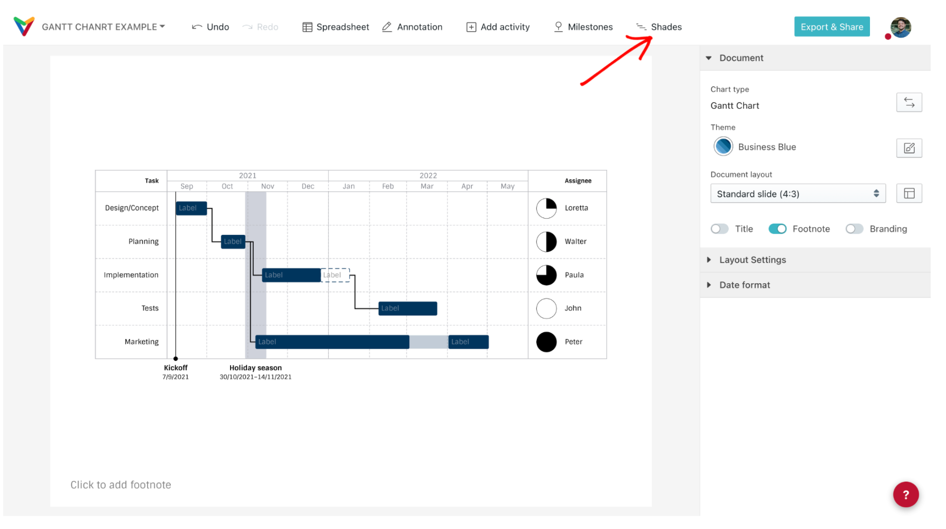
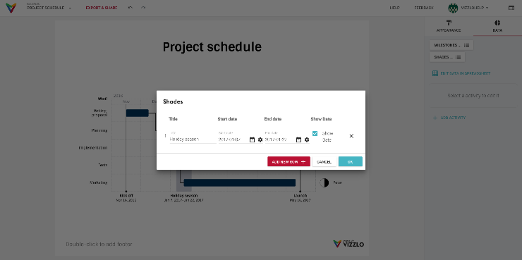
Tip: Drag and drop the shade and click on it to edit.
15) Showing the whole project or just a time frame
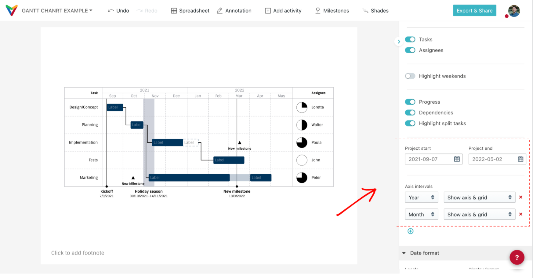
As mentioned above, you can choose to view the entire project or just a particular period. For this, use the sidebar: check the boxes of the start and end dates to edit the period you want to visualize. Your Gantt chart will be readjusted without losing the information of your project. This option is especially useful for presentations; to give your audience a narrower overview over a particular project phase.
Tip: Play with the axis granularity, adding weeks or dates to convey your project plan more clearly.
16) Exporting and sharing your Gantt chart
Click here to learn how to share your chart or export it into your presentation.

Comments
0 comments
Article is closed for comments.