Vizzlo's Organizational chart allows you to show the structure of organizations or the relationships between hierarchical levels. Organizational charts are incredibly useful when you need to show a larger group of people where they stand in the organization and what tasks they need to perform. This visual representation quickly gets to the heart of this challenge.
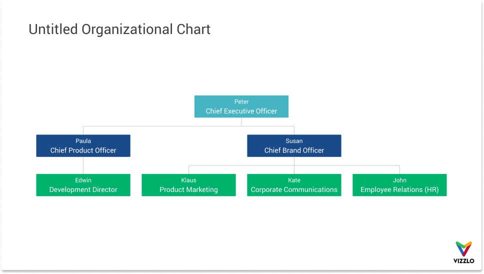
Change the layout of the chart
You can switch between two chart layouts: horizontal or vertical.
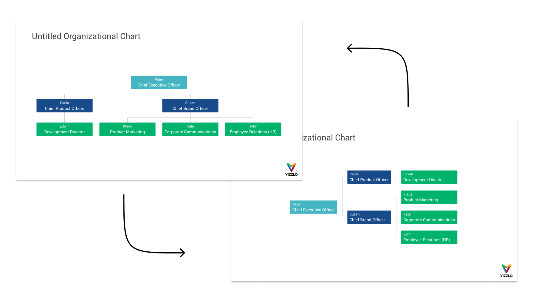
Add a new role
There are multiple ways to add new roles to your chart. You can:
— Click on any existing role and then use the `+` buttons on either side
— Right-click on the chart → Add new role
— Use the `+` in the top right corner of the chart
— Use the button `+` Add role in the menu bar
— A fifth option is the spreadsheet. You can open the spreadsheet from the menu bar.
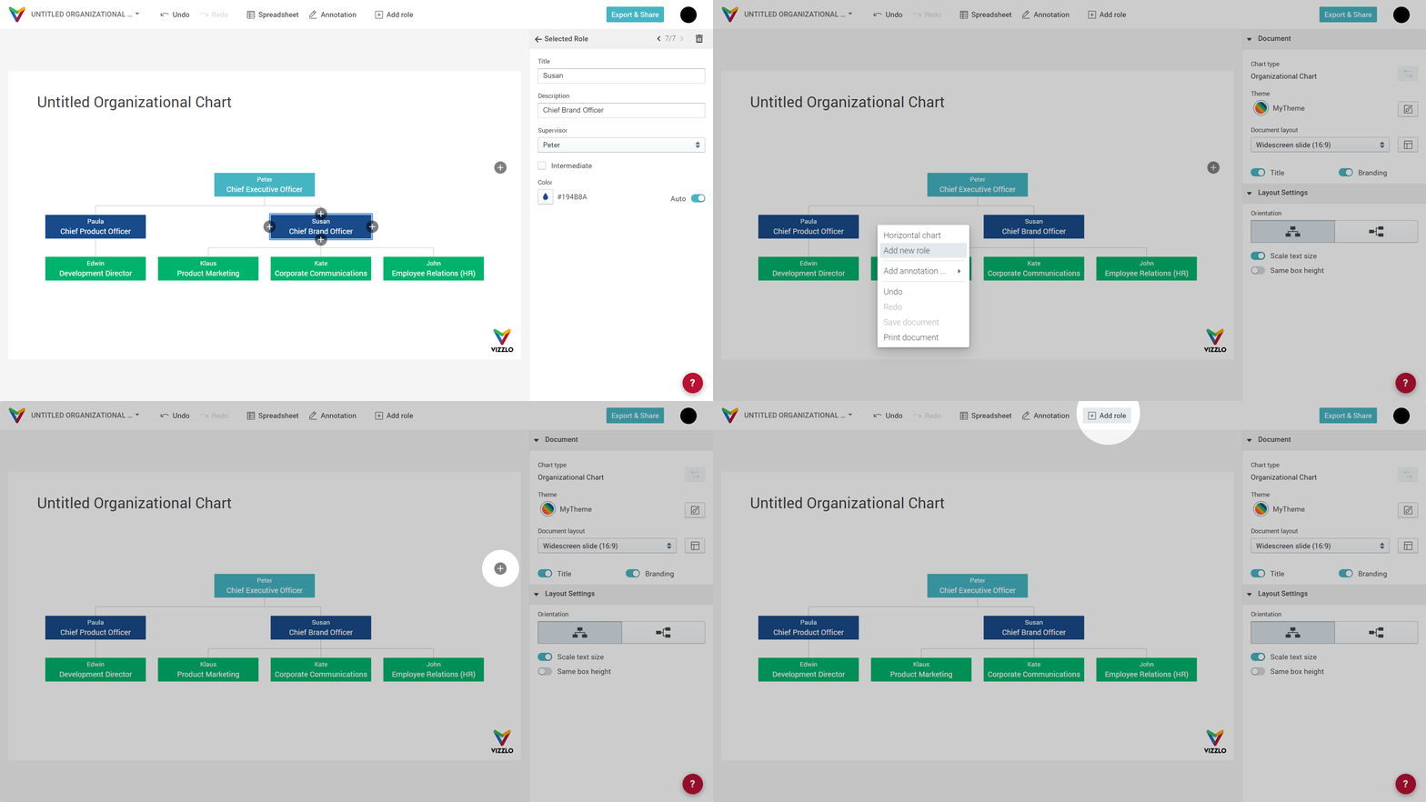
Remove a role
To remove a role from the chart, select it and press delete.
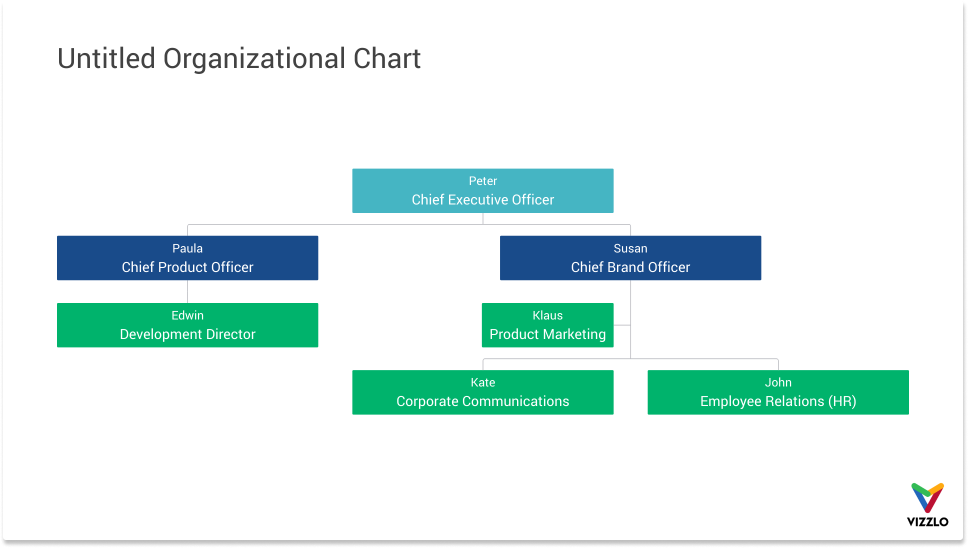
Add an intermediate role
You have the option to set one role as an intermediate role. After you clicked on any role, you'll see a checkbox in the sidebar Intermediate. Note: this feature is disabled for some roles. It is disabled when a role cannot be positioned between two roles. In the example above, only Klaus, Kate, and John can be set to be intermediate roles.
Reposition existing roles
As your organization grows or changes in a short period of time, you often need to check your chart for accuracy. Vizzlo's Organizational chart is fully interactive. You can simply drag and drop existing roles to any other position. As soon as you drag one role over another, arrows indicate the side where the role will be added.
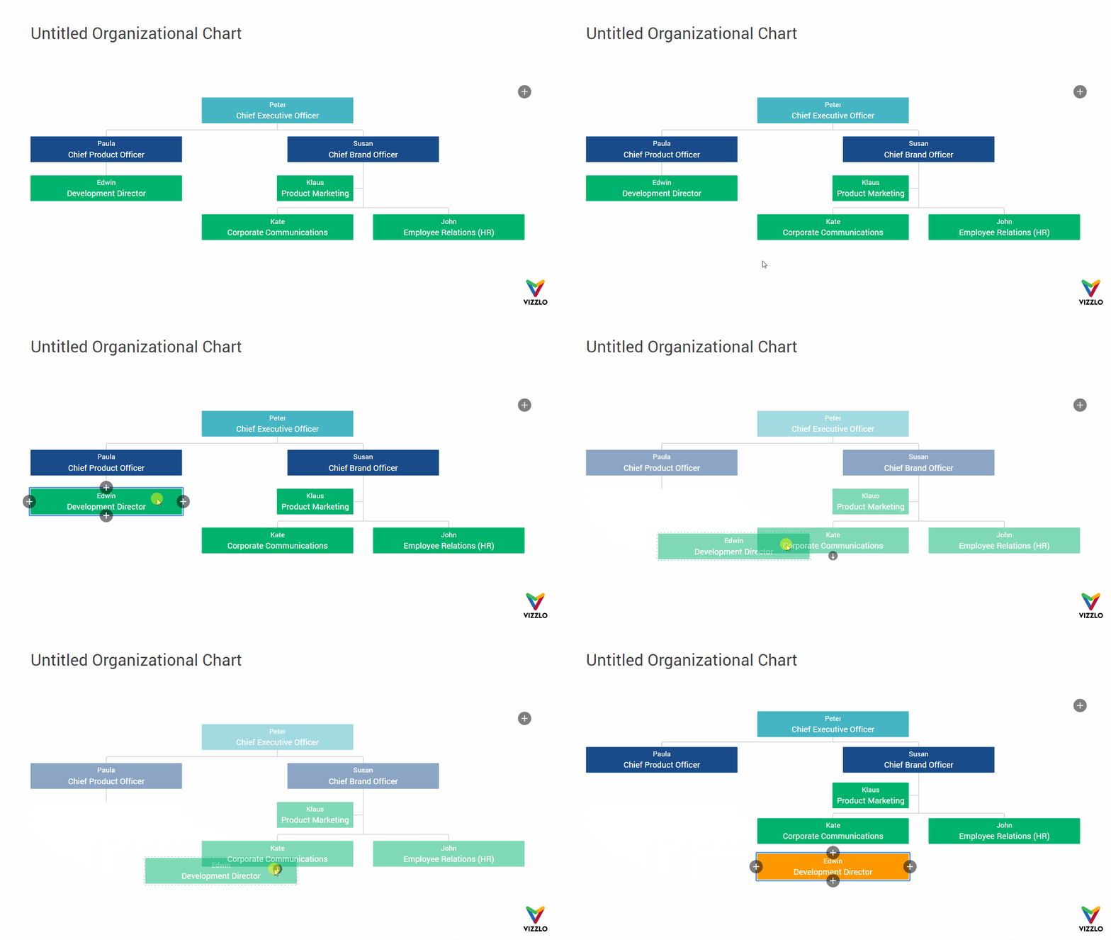
Flexible box height / box width
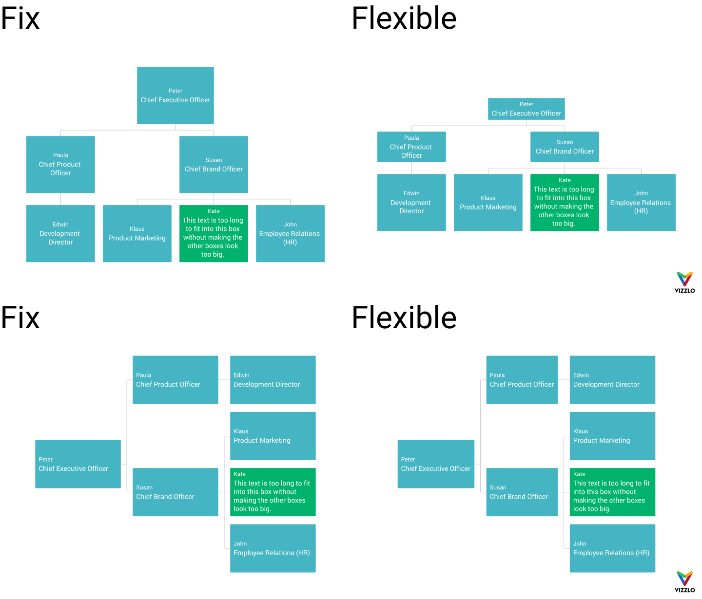
In the sidebar you will notice a toggle Flexible box height (or Flexible box width depending on the chart's orientation). Fix box height/width means the same height/width for all boxes across rows. If you choose flexible boxes, the height/width of the boxes varies across rows.
The intention of that input is best illustrated by an example.
Change colors
In the animation above all boxes except for one have the same color. By default, each row will have the same color. These colors are taken from your theme. Tip: Read our article Customize a theme. To change the color of any box, simply click on it and use the color input in the sidebar.
Scale text size
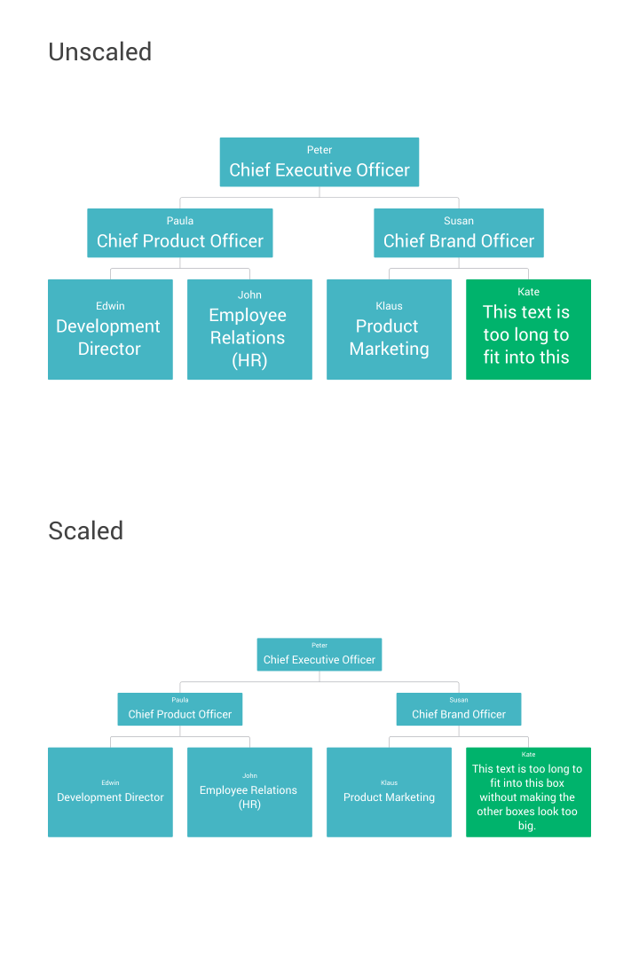
The second toggle in the sidebar, Scale text, allows you to easily scale down the display font size in case the text won't fit.
Add a new tree
When you click on the `+` in the top right corner of the chart, a second tree will be added. In the sidebar, you will then see a third toggle Connect trees.
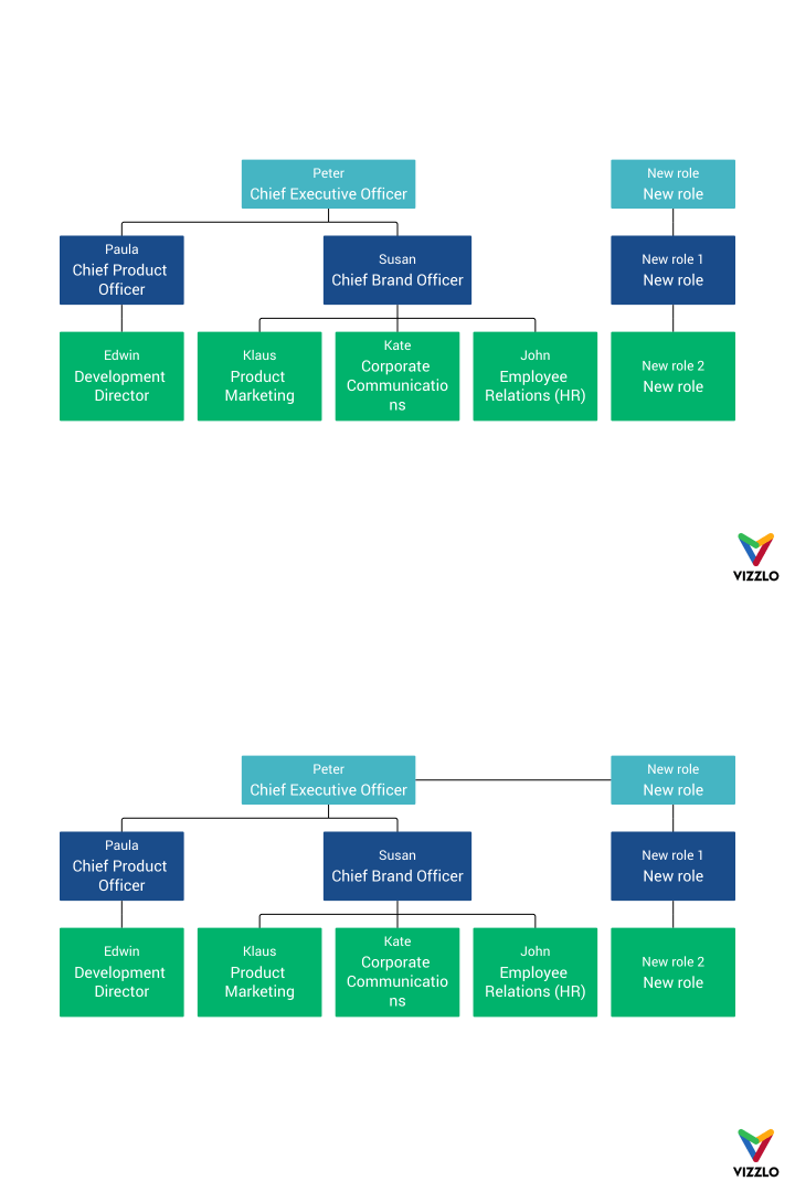
Note: We have adjusted the line width and color of the connector lines. To do so, open the theme editor and adjust the Axis line setting.

Comments
0 comments
Article is closed for comments.