Vizzlo's timeline chart is completely interactive — just click on the elements to edit them. Besides, you always have the sidebar to use as a support. Right-click on the elements and the canvas to see a context menu with more options.
In this text we will show you how to:
— edit default data and title
— change font properties
— add a new milestone to your chart
— add a scale break
— edit a theme and layout
— change the date style
— export your work
Timeline step by step
Just like any other Vizzlo chart, our timeline comes with default data. When you create a new document you will start with this setup:
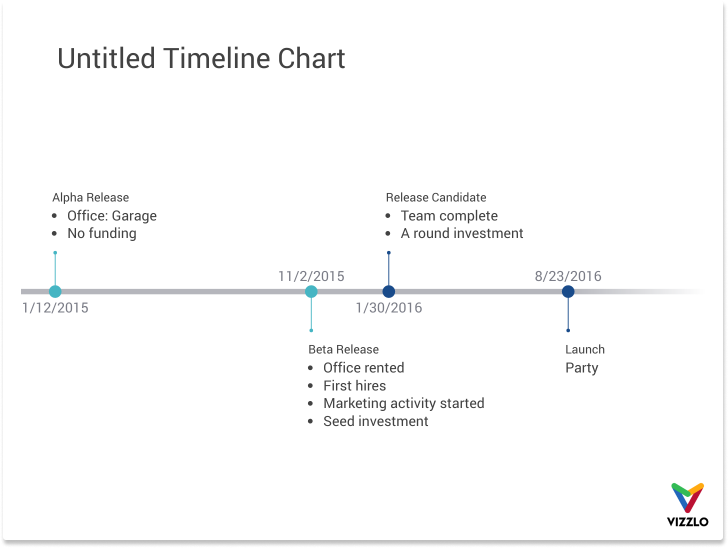
Note: depending on your default theme and layout, the colors, fonts or document dimensions might differ.
Vizzlo's Editor
- A theme changes the overlook of your documents. Vizzlo of a selection of predefined themes and you can also design your own themes.
Furthermore, you can change the chart dimension by clicking on Document layout in the sidebar
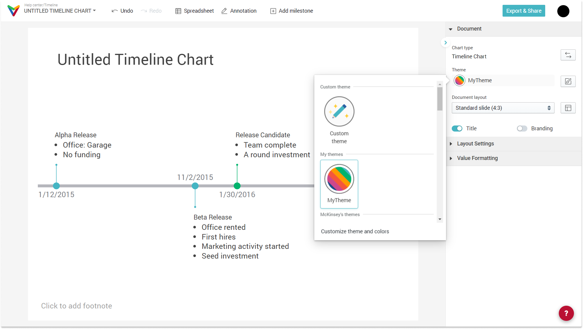
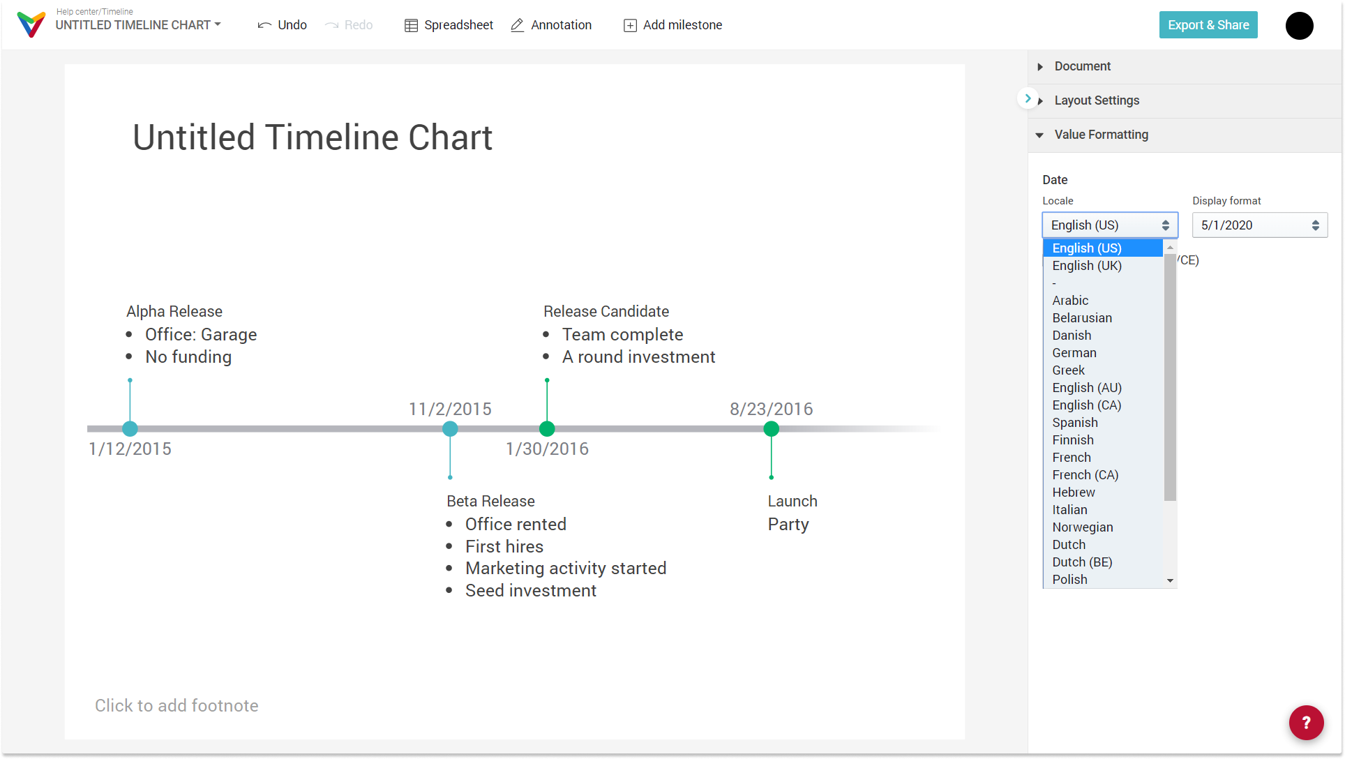
- Set date format preferences
Under Value formatting you can choose the format of the displayed dates. You can pick your preferred date format from a large variety of display options in different languages/locale standards, selecting the order of the date components, the separators, or if it should be written in full.
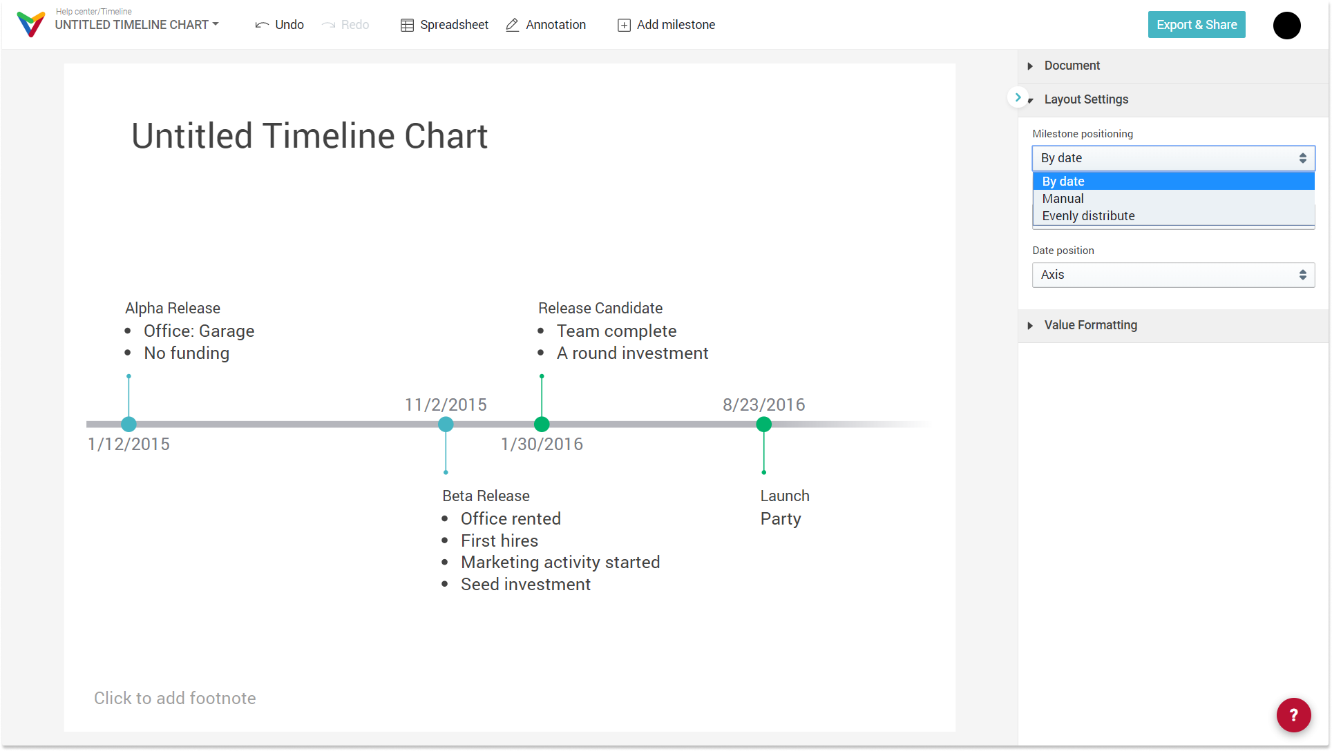
- Set the milestone position or arrangement
By default, when you create a new document, your milestones will be automatically arranged on the time axis according to their dates. We recommend this option to start. However, there are two more possibilities:
- choose "Manual" positioning to have full control and fine-tune the position of your milestones
- choose "Evenly distribute" if you would like to have the same distance between your events.
Hint: If you grab the milestones and slide them over the axis, your chart will automatically change to Milestone position 'Manual'.
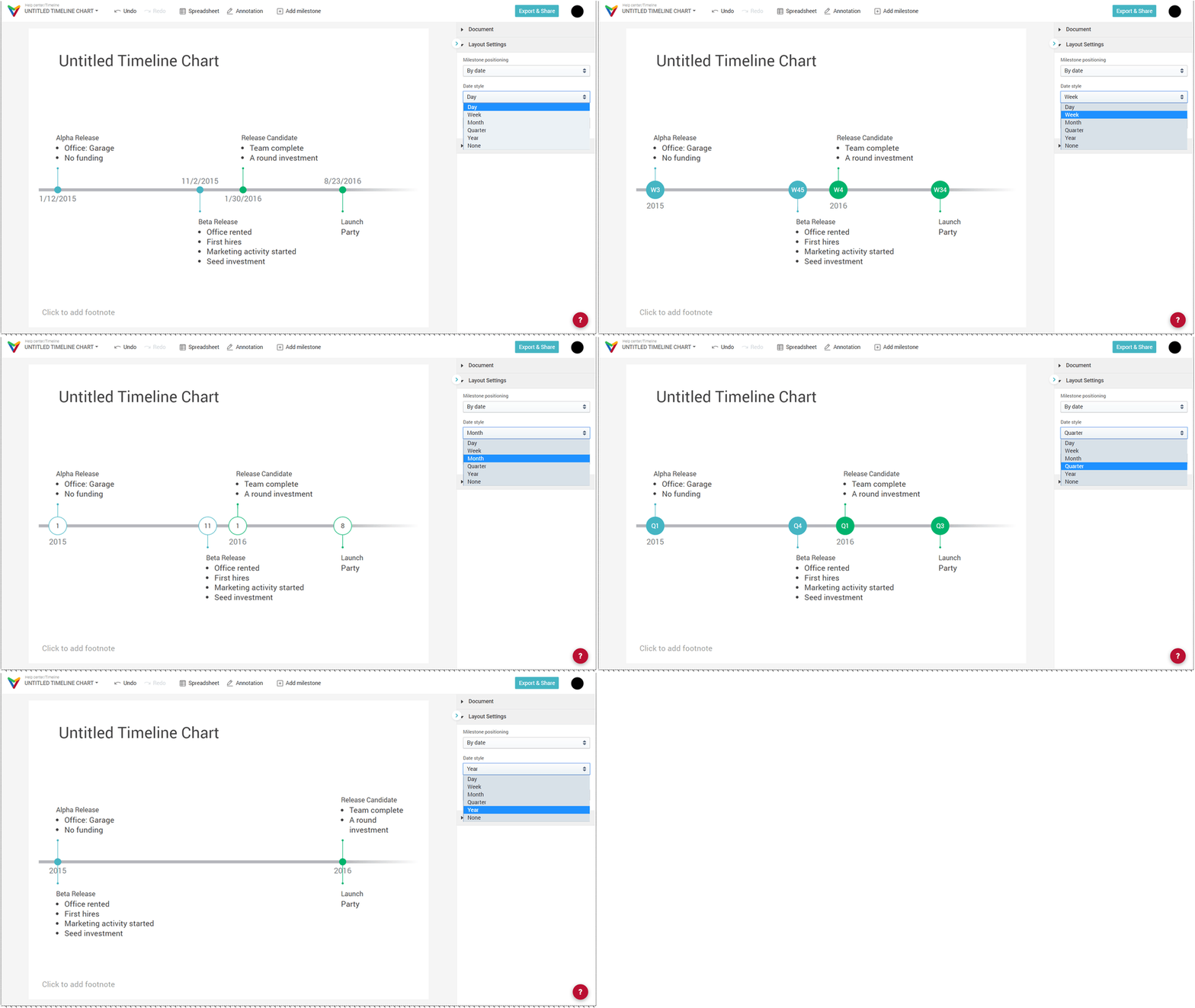
- Change the date style and granularity
This is a layout option. It will change
- how dates are displayed
- the design and
- the granularity of the milestone position
Note: Choose "None" if you want to create a simple sequence of events without particular dates. While using this option, you can still enter details like time (hours, minutes) as part of the title or description of each milestone manually.
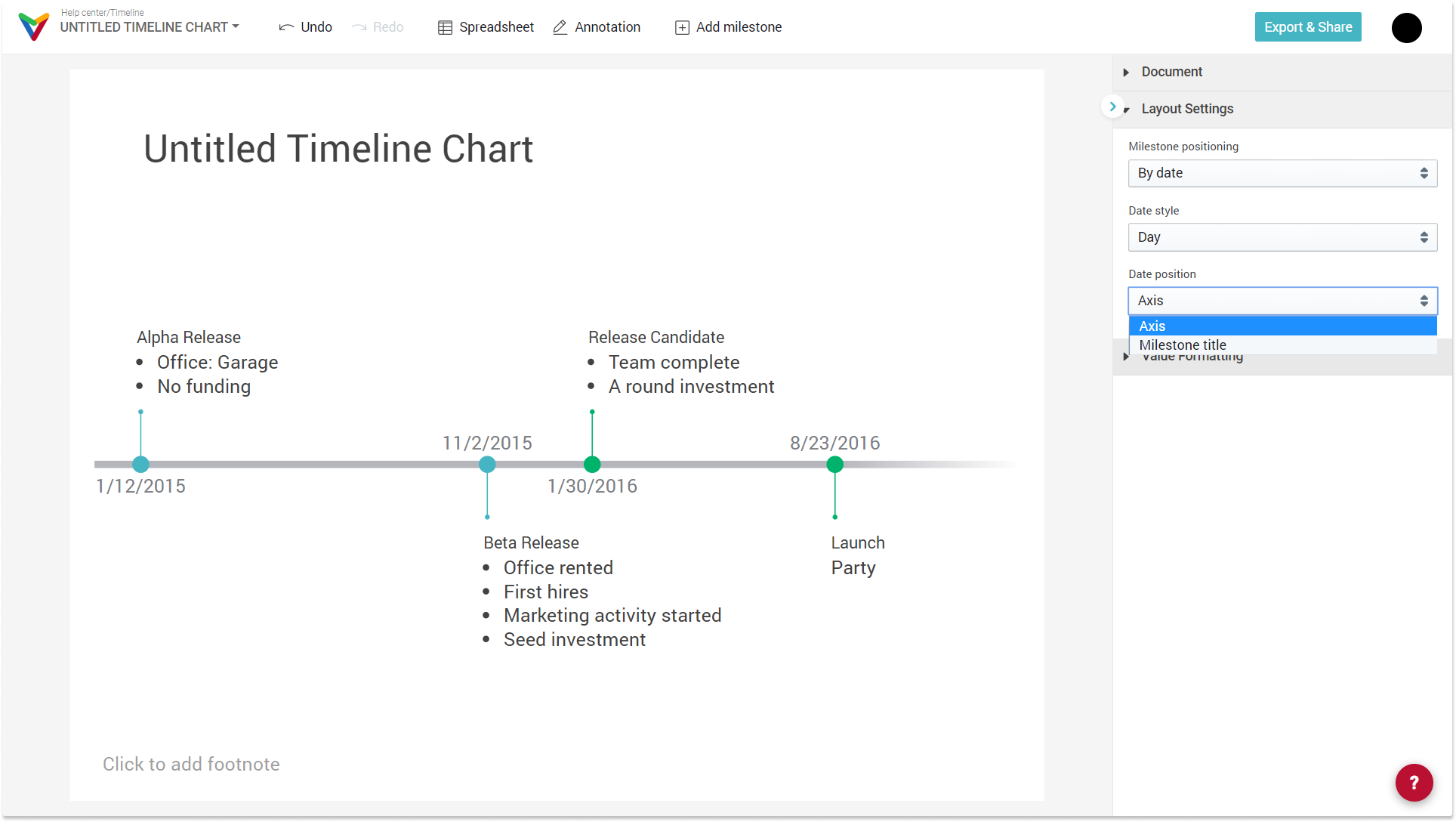
- Change position of dates along the axis or above the milestones title
Choose your favorite date position. In order to avoid overlapping dates over the axis, it's useful to change the position of the date.
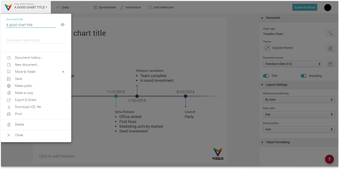
Change the title of your chart
To change the title of the chart, click on it and start typing. You will notice a second text input once you clicked on the chart title of the chart. There you have the possibility to add a subtitle too.
A second option to change the document title is the document menu. This document menu will also show you many more features and options.
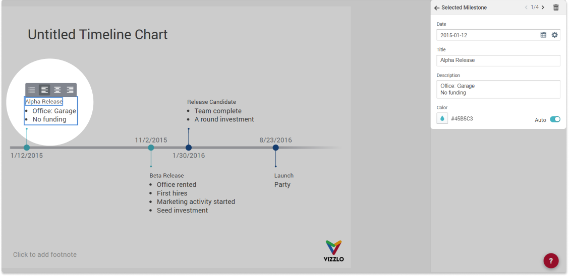
Edit default data
To edit any of the existing milestones, simply click on it and start editing. You can edit the elements either directly or in the sidebar. Further, you can also use the spreadsheet to add your data.
Change font properties
Besides the text itself, you can also change the font properties. For the timeline, all the text elements except the dates support rich-text formatting. That means you can adjust the font size, the font color, font background color and font style character by character, add bullet points and adjust the text alignment etc. Highlight the text you want to format and start editing.
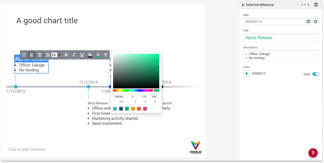
Rich text editing is not yet possible for the document title. But it is a feature that is on our list!
Add a new milestone to your chart
You have two options in the editor:
- Hover over the date axis and click on the `+` icon, choose Add milestone
- Click on the button
+ Add milestonein the top bar
Note: If you use the second option, the new milestones will be added at the end of your timeline.
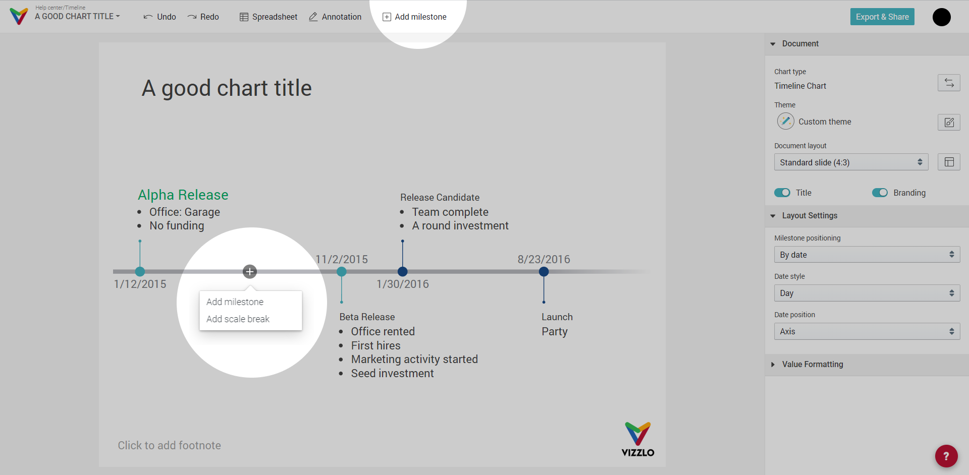
A third option to a milestone is by means of the spreadsheet. Click on the Spreadsheet button to edit your data. You can paste your data from any spreadsheet software into Vizzlo's spreadsheet.
Tip: Make sure to read Editing and adding data, How to upload your data to Vizzlo, and Date formats that Vizzlo can interpret.
Add a scale break to your chart
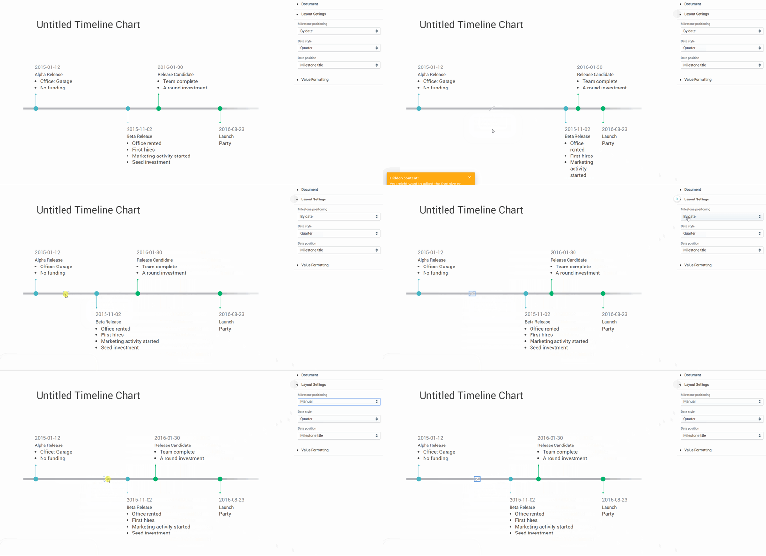
Scale breaks can make your timeline more compact. That is a useful feature if you have long gaps between your milestones. To add a scale break, hover your mouse over the time axis. Click on the `+` icon and choose Add scale break.
Note: A scale break can have two effects:
- If you choose to position your milestones "By Date" you can grab and drag the scale break to optimize the distribution of the milestones as you wish. Note that milestones will not be positioned on a linear timescale anymore.
- If the positioning of your milestones is set to "Manual," by dragging the scale break, the distribution of your milestones will be unaffected. You will only reposition the scale break within your timeline such that the scale break has only a cosmetic effect.
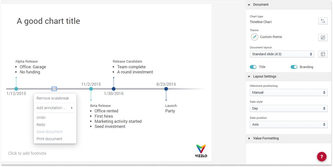
To remove a scale break, right-click on it. A menu will open, click on Remove scale break.
6) Exporting and sharing your timeline
Click on the Export & Share button in the top right corner to open the context menu. Read on here to learn how to share your chart or export it into your presentation.

Comments
0 comments
Article is closed for comments.