
Vizzlo's Waterfall chart is fully interactive. Move elements from side to side, add new bars and adjust color with a few clicks. In this tutorial we will show you how to use different functionalities and create a representative waterfall chart.
What is a Waterfall chart?
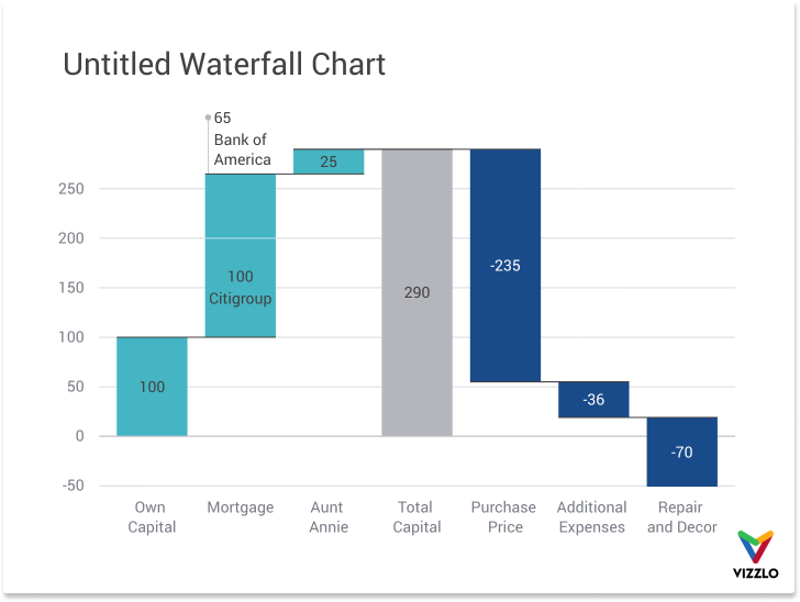
A waterfall chart is a type of visualization that shows a cumulative sum. It is basically a kind of stacked bar chart with a visible and an invisible part. The visible part shows the data added to or subtracted from the previous value. The invisible row acts as a placeholder; it still clarifies the previous amount to help the viewer better understand changes in the distribution. A waterfall chart is mostly used in a business context. In this tutorial however we will use an example from the energy sector.
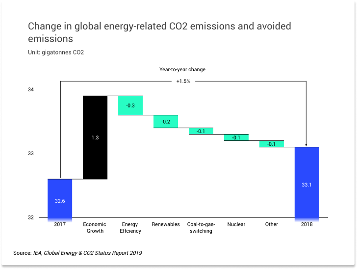
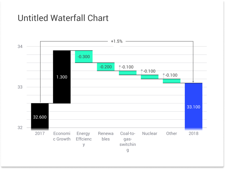
This chart mainly focuses on two values: global CO2 emissions in 2017 and 2018. But in addition, it shows the main drivers of the difference between these two years. Therefore, this kind of visualization puts its main emphasis on change.
The data used for this chart comes from the IEA and can be downloaded here.
Waterfall chart step by step
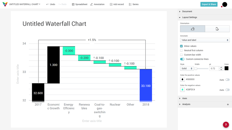
Go to our portfolio and search for Waterfall chart. Click on 'Create' to open it. Depending on your favorite theme and layout aspect ratio, the default chart should look somewhat like this:
Positive values result in bar segments going upwards, negative values create bar segments going downwards. Segments that go all the way down to the zero baseline of the chart are called subtotals.
Edit data
The default values can be edited in two ways:
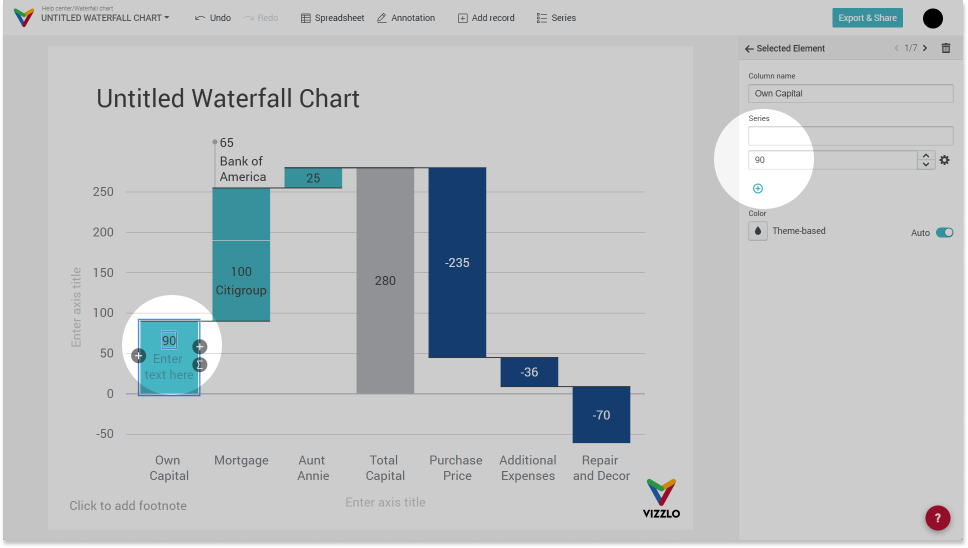
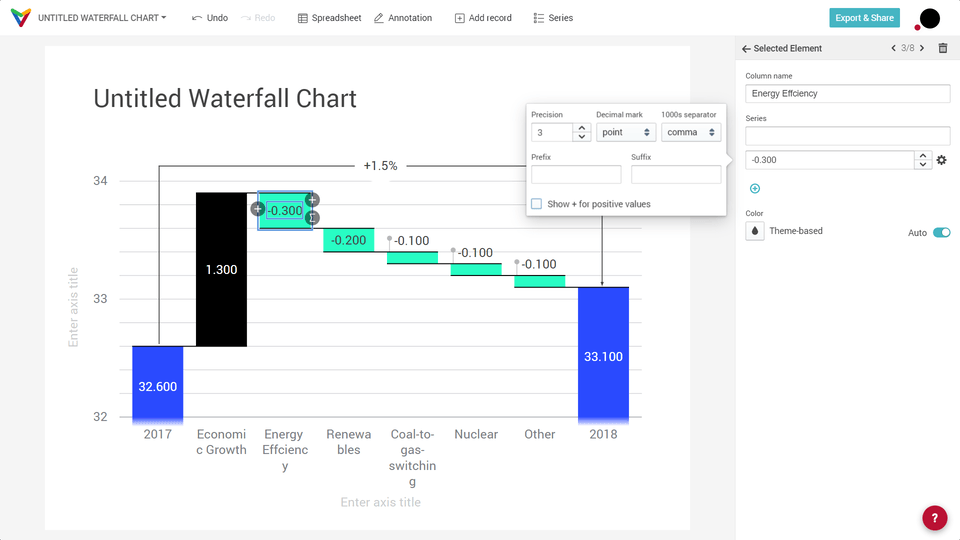
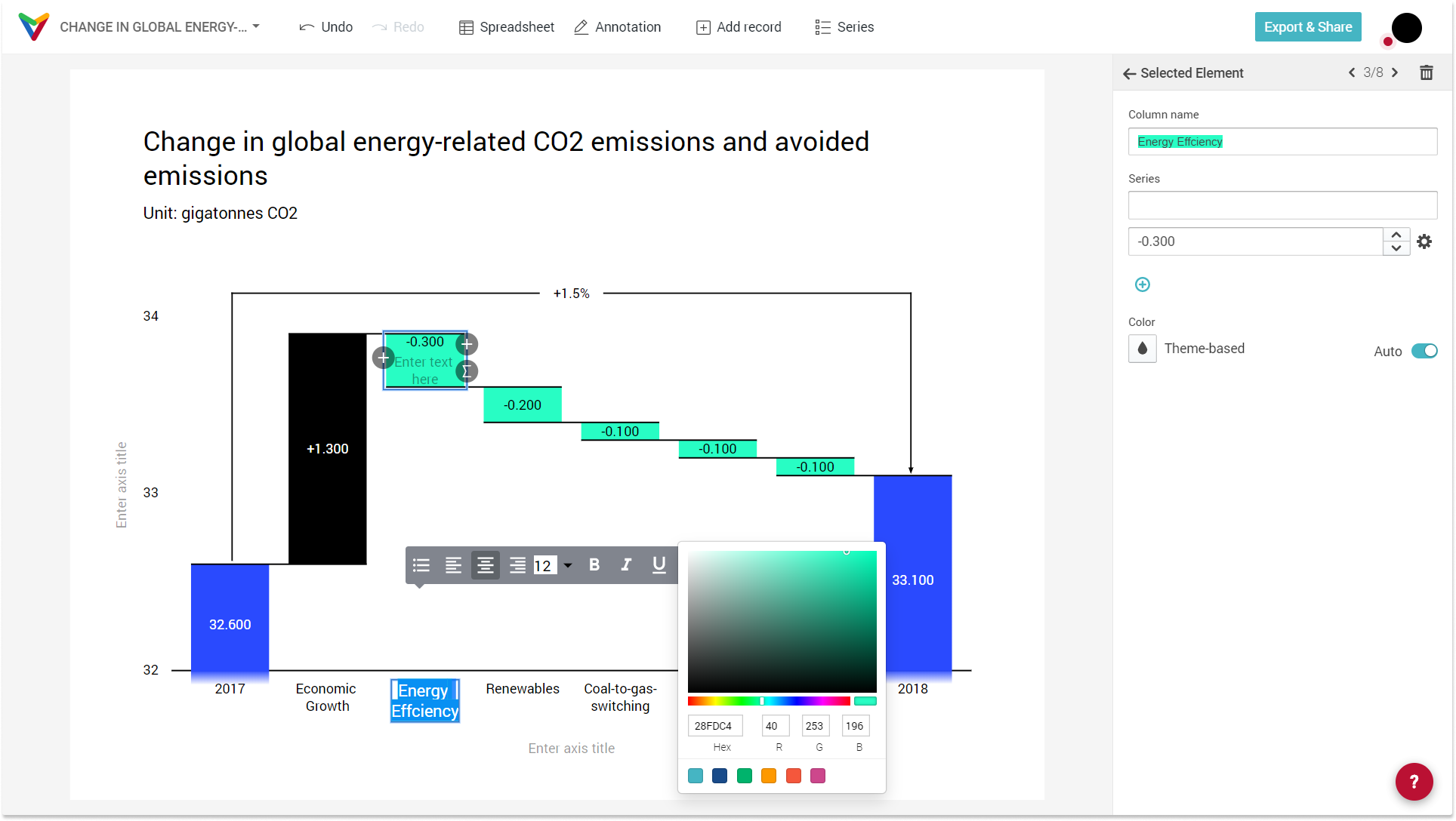
1) Click on any bar and change their values in the sidebar or on the bar directly
2) Open the spreadsheet and insert your data
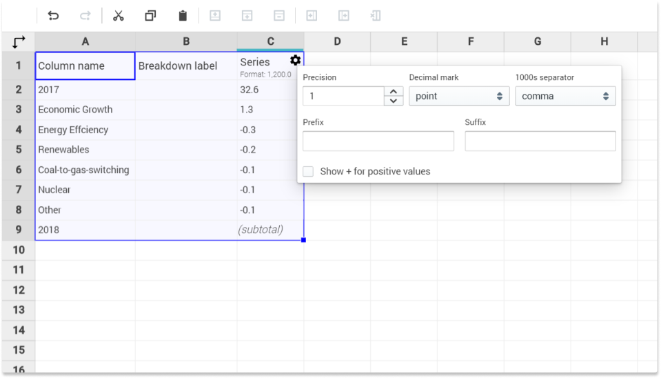
As you can see in the picture above, you can click on the gearwheel icon to open a dialog. In the dialog you have options to change the precision settings, add prefix and suffix etc. By default, decreases will be prefixed with a minus sign, if you want to prefix increases with a plus sign, click on 'Show + for positive values'.
Tip: Read our articles about How to upload your data to Vizzlo and about Editing and adding data.
After importing the data, you will see the following result:

😕
Not yet very pleasing to the eye. The changes are small compared to the first and last bars. But we will get to a better result soon.
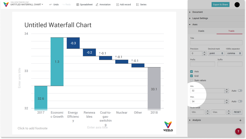
Change axis range
The graph is intended to show the main drivers of annual change. We can add a scale break to the y-axis to emphasize the transition rather than the absolute value of CO2 emissions.
Open the dropdown menu 'Axes', choose the tab 'Y-axis' and adjust the axis range using the two number inputs Minimum and Maximum.
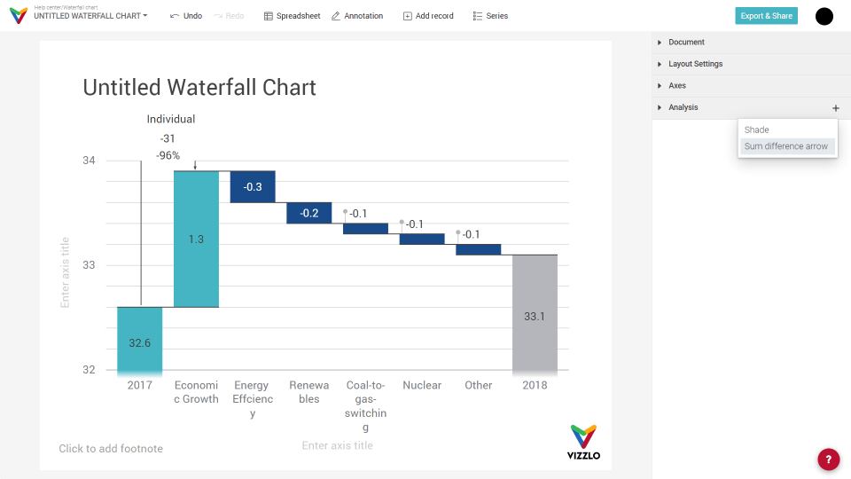
Add a Sum/Difference arrow
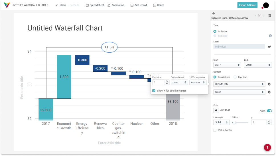
A Sum/Difference arrow can be used to emphasize the transition between two bars. We want to show the growth rate of the total CO2 emission between 2017 and 2018. In the sidebar click on the '+' icon in the Analysis dropdown menu. When a Sum/Difference Arrow is selected, a card in the sidebar will show customization options specifically for that element:
By default, the Sum/Difference arrow will show two values:
— Growth rate: (End value - Start value) / Start Value
— Difference: End value - Start value (et vice versa)
— Sum: Start value + end value
— Ratio: Start value / End value (et vice versa)
— None
You can hide one or both values. Each value can have its own number format. Click on the gearwheel to see the options.
We want to show the growth rate between 2017 and 2018, so we need to:
— set Start to 2017
— set End to 2018
— set of the calculations to Growth rate and one to None
— optional: adjust the precision setting and hide the label
There is also the option to show 'Free text'. The length of the content is limited and depends on the width of the Sum/Difference arrow. If the text doesn't fit, use the 'Label', which you can freely position by drag and drop.
Change bar colors
As you can see there are three different colors used for the bars to distinguish:
— Color for positive values
— Color for negative values
— Color for subtotals which is the taken from the theme
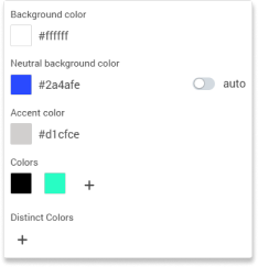
In this example, we will use the following colors:
— Neutral background color: #2A4AFE
— Color for negative values: #000000
— Color for positive values: #28FDC4
If you customize the theme, colors will look as follows:
When you use these colors, you will see the following chart:
To highlight the first column not as an increase or 'positive value', but as sub-total, click the checkbox 'Neutral first column':
Marking the first column as 'neutral' has two effects:
— the color becomes the same as it would be a sub-total column
— the option to show a '+ for positive values' does not apply.
When you want to change the color for each bar separately, click on that specific bar. The chart is interactive. In the sidebar you will see all options to change a bar's properties:
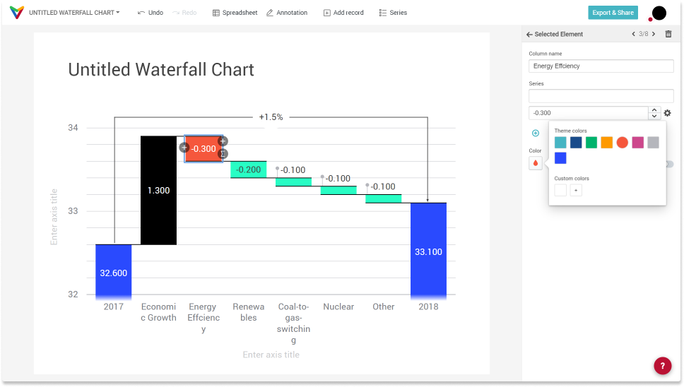
If you have changed the color of a bar, there is an 'Auto' toggle to reset a bar's color to default.
Adjust font properties
To adjust the font properties, click on 'Customize theme'.
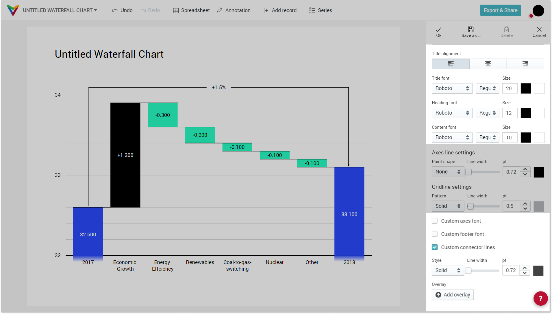
To adjust the axes or the foot font, you need to click the checkbox 'Custom axes font' and 'Custom footer font', respectively.
Axes labels support rich-text formatting. Highlight the text you want to format and start editing. You can change the font size, the font color, font background color and font style character by character, add bullet points, adjust the text alignment etc.
Remove grid lines
In the sidebar under 'Axes --> Y-axis' you find a checkbox called 'Grid'. This will show/hide the grid lines from your plot.
Adjusting the document title
Click on the title to give your chart a meaningful name. Optionally you can change the chart title in the document menu, which opens when you click on the chart title in the top left corner. There, you can also choose to show/hide the chart title by clicking on the eye icon.
Comments
0 comments
Article is closed for comments.