Vizzlo's bubble chart allows you to display up to four dimensions of your data. In this tutorial we'll explain what a bubble chart is, when to use it, and how to create it.
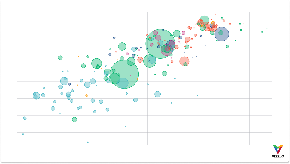
What is a bubble chart?
In its simplest form, a bubble chart displays the relationship between two quantities, positioned according to their values in a Cartesian coordinate system. So each observation is represented by a point (•), positioned according to the value of two variables. As well as a horizontal and vertical position, each point also has a size and a color. In this case, one would speak of a scatter plot rather than a bubble chart.
The plot below shows a standard bivariate scatter plot. We are using data from the Gapminder Foundation (which is the same data used for the plot above). You can download the data here.
Data
The data must be organized as follows:
| Label | x-Value | y-Value | Size | Color |
|---|---|---|---|---|
| A | 1 | 2 | 5 | category1 |
| B | 2 | 4 | 17 | category1 |
| C | 3 | 5 | 10 | category2 |
| ... | ... | ... | ... | ... |
Tip: Read our articles about How to upload your data to Vizzlo, and How to connect charts with external data sources for automated updates
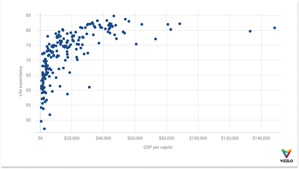
Scatter plots are also called correlation plots because they reveal how the two variables are related. From the chart above, we see a positive, non-linear relationship between GDP per capita shown along the horizontal axis and life expectancy shown along the vertical axis. The higher the income, the longer people live. Scatter plots are a valuable and versatile tool at the stage of data exploration.
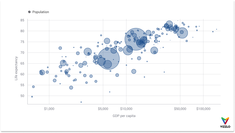
A remarkable feature of this chart type is that it can effectively map multiple variables at once without the chart looking cluttered and confusing. Take the chart below, it maps the population of each country to the size of the points. The resulting diagram type is then commonly called a bubble chart.
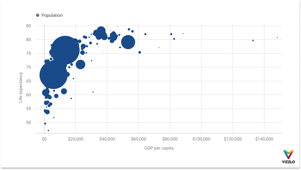
Although the three dimensions are effectively represented in the above chart, the chart does not yet work well. This is because
- many points lie on top of each other, and
- there are many more data points between $0 and $40,000, than between $40,000 and $140,000.
The first problem is called "overplotting", i.e., too many bubbles are on top of each other. One way to overcome this problem is to use opacity (or transparency). Overlapping bubbles appear darker.
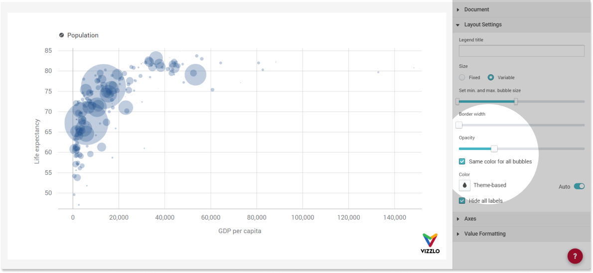
Secondly, the GDP data shows a strongly right-skewed distribution. This can be overcome if we plot the data on a logarithmic scale.
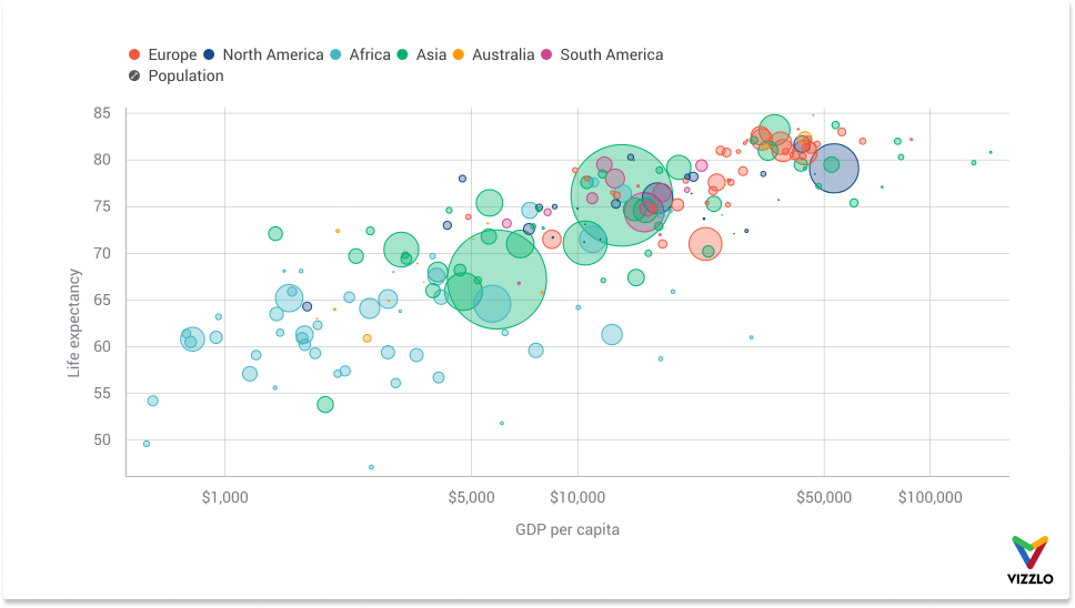
Besides, we can give each point a unique color corresponding to its continent. This exhibits another aspect of the data, and now four variables are plotted clearly.

Comments
0 comments
Please sign in to leave a comment.