Vizzlo's Time Series Graph allows you to effectively display observations that are naturally ordered by time as lines, bars or area. In this tutorial we will show you how to create an Area Chart.
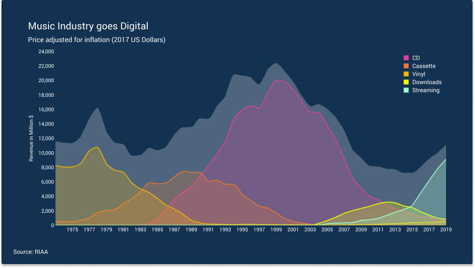
We use data from the Recording Industry Association of America (RIAA) - music sales over time in the United States, broken down by format. The dataset used can be downloaded as CSV file here. Note that we removed some categories (e.g. Ringtones, DVDs, Kiosk (?)) from the original data.
If you are interested in the complete data, you can download it from data.world.
What is an Area Chart?
An area chart is a special case form of a line graph. In addition to a connection of your observations with continuous line segments, the area below each line is filled with a solid color. While a line chart focussed on relative changes, an area chart is different as it shifts the focus to the magnitude of some set of numbers. As a result, the chart needs to start at zero, so that the height is proportional to the amount shown. Vizzlo's Time Series Graph will adjust the y-axis range for you once you change the Series style from Line (which is default) to Area.
Area charts are a good choice, when you want to:
— show the magnitude of multiple data series over time
— visualize the breakdown of a total into sub-categories
— emphasize a part-to-whole relationship
Customize a theme
Before we start, we will briefly show you how to customize a theme. You can safely skip this section and you will not miss anything regarding the creation of the Area Chart. We have a help center article for you about how to Customize a theme.
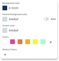
To customize a theme you need to open the Theme editor in the sidebar. In this example we will use the following colors:
— Background color : #133251
— Neutral background color : #D4DBDF
— Accent color : #D4DBDF (not needed in this example though)
— Colors : #FFFFFF , #DC4399 , #E87739 , #F1B606 , #F7FF00 , #A1FFCE
In the theme editor the color section should look like this:
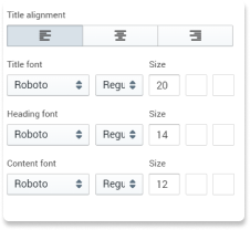
The font type we are using is Roboto regular. The font color is #FFFFFF, i.e. white. All text elements are left-aligned.
The font sizes are as follows:
— Title : 20pt
— Subtitle : 14pt
— Content : 12pt
— (custom) Axis font: 12pt
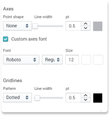
Axis lines and gridlines :
— Axis lines : solid, #B5B6BC , width : 0.5pt (but we will hide the axis lines further done)
— Grid lines : dotted, #000000 , width : 0.5pt
With this setup we are ready to go.
Area Chart step-by-step
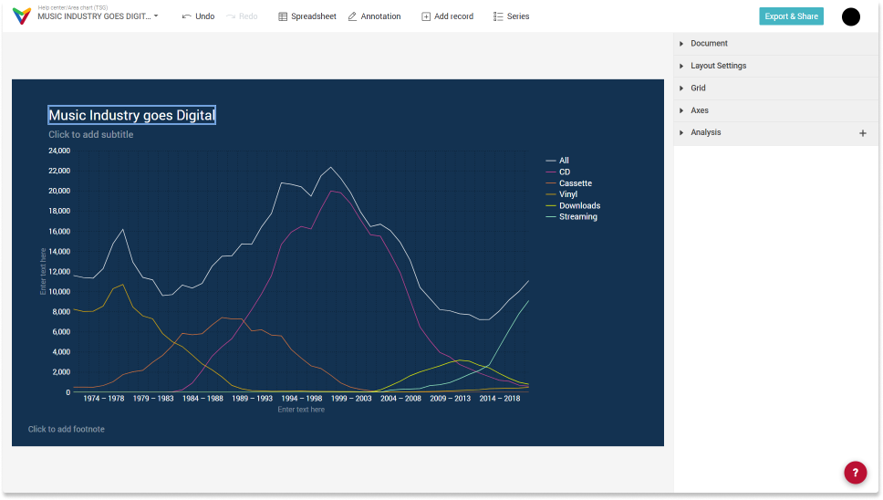
When you imported the data to a Time Series Graph, your chart will look like this, given a 16:9 layout.

As a first step, we give the chart a real title.
Change the chart title
The chart is interactive. Click on the title to edit it. You will notice that a second text input becomes visible once you selected the title. You have the option to add a subtitle, too.
Lines, Bars, Areas
By default, Vizzlo's Time Series Graph allows you to display your observations as lines, bars or area. Other options are Stacked area or 100% stacked area.
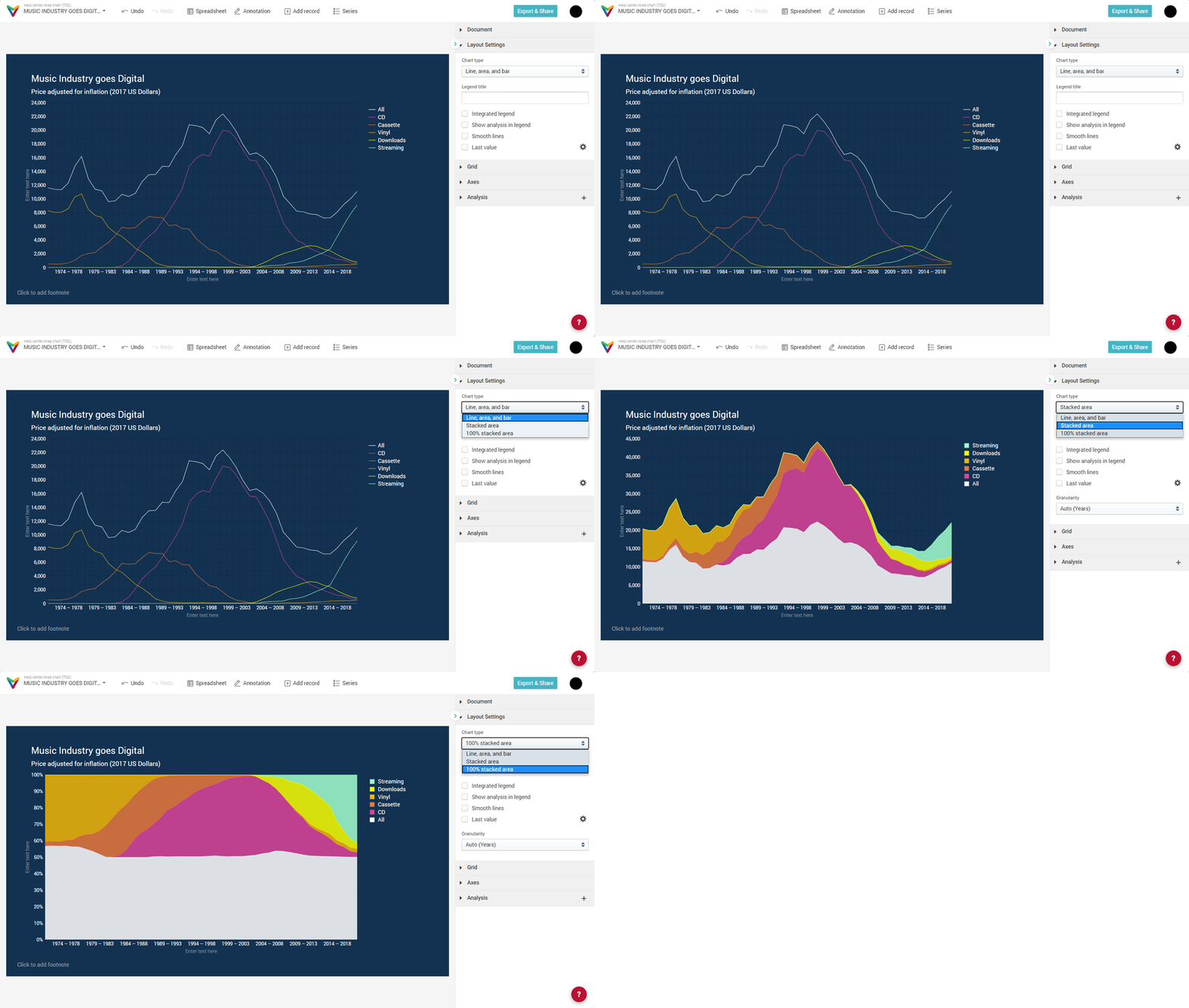
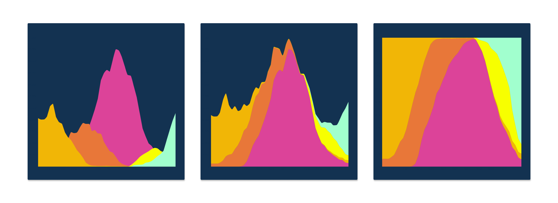
The difference between an Area Chart, a Stacked Area Chart and a 100% Stacked Area Chart is the position of the individual series as illustrated below. The choice between the three chart types depends on the message you want to convey.
Area Chart
The area diagram gives an impression of the development of the series over time. However, where the data series overlap, it can be an impossible challenge for observers to recognize that several surfaces share the same space. This limitation can be overcome.
Stacked Area
Now the overall trend of the music industry sales is clearly visible. However, the relative shares of the five formats within each year are hard to compare, because it is not clear what the baseline is for most series.
100% Stacked Area
The relative proportions of the five formats within a year are now easier to compare. But this kind of visualization tells us nothing about the development of the absolute number of revenues in the music industry.
We will show you ways to overcome the pitfalls to create an area chart that shows the evolution of multiple single series as well as the evolution of all series together.
Edit series properties
For the moment let's just work with a single time series. In the example data set there is series called "All". This series is the sum of all values for each year, i.e. it adds up the sales value of all music formats for each year, not only Cassettes, CDs, Vinyl, Downloads and Streaming but also the data we removed for this example.
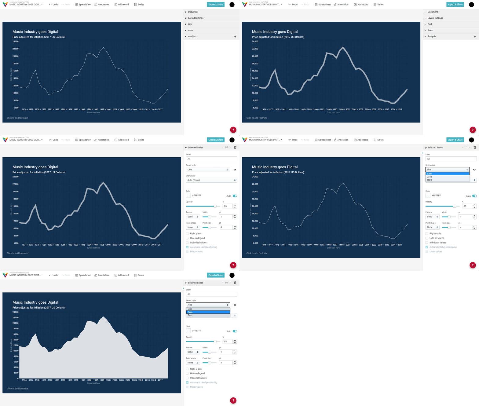
When you only show this series as a line (which is default), you'll see this chart:
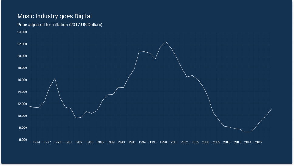
We will now change the following properties of this series:
- Change the line Series style from Line to Area. Note that the chart adjusts the scale of the y-axis.
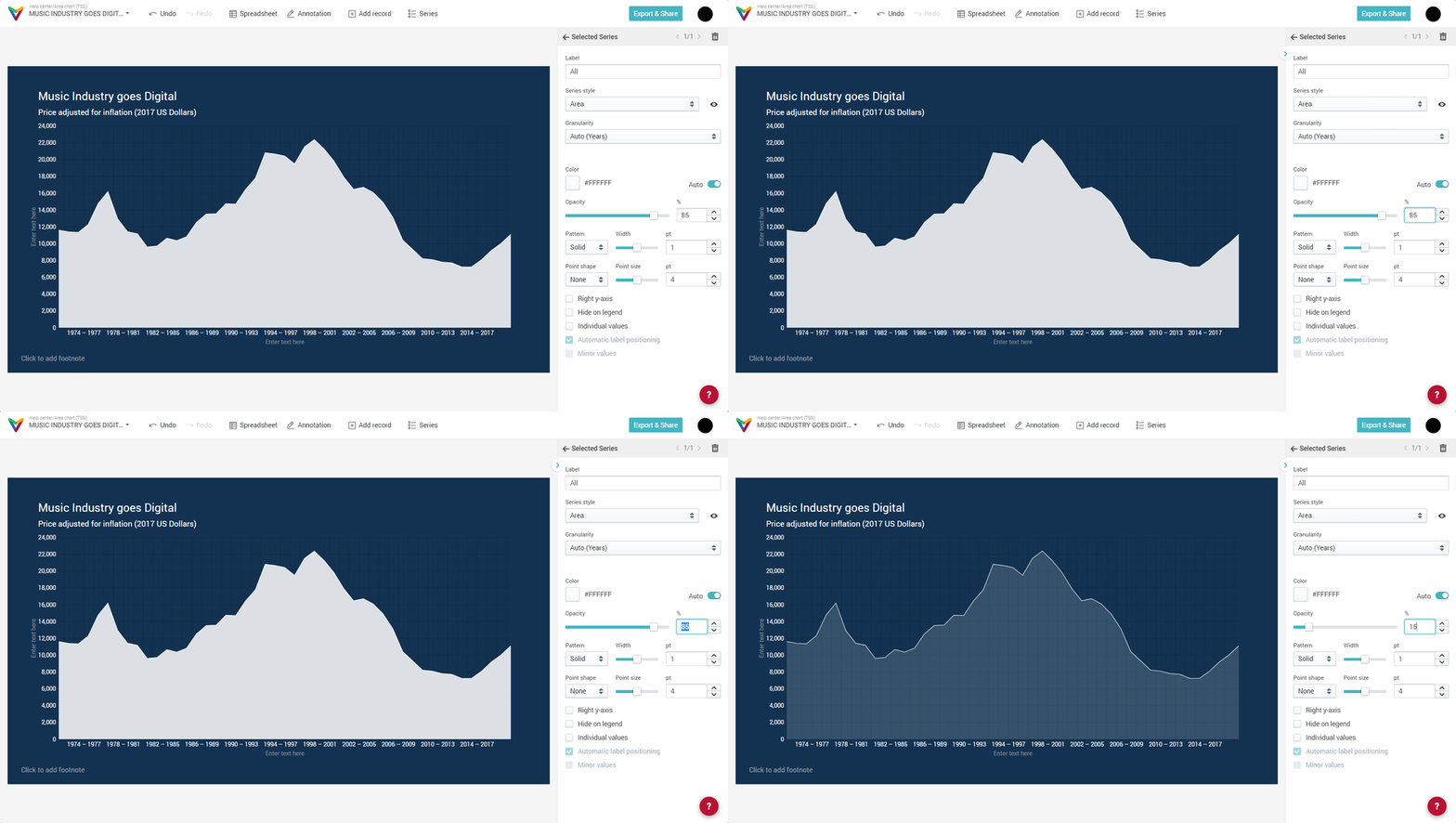
- Set the opacity to 15/100
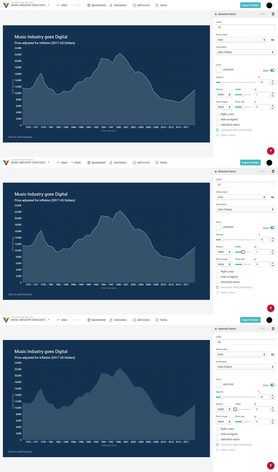
- Set the line width to 0pt
These steps need to be done for every series because the setting Chart type allows a different Series style for each single series, i.e. you can mix Lines, Bars, or Areas.
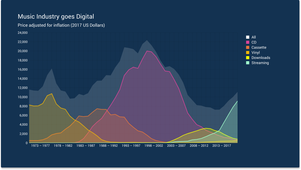
After we changed these properties for all other series to be
— Opacity : 25/100
— Line width : 2pt
we get the following chart:
The last steps we are going to take are
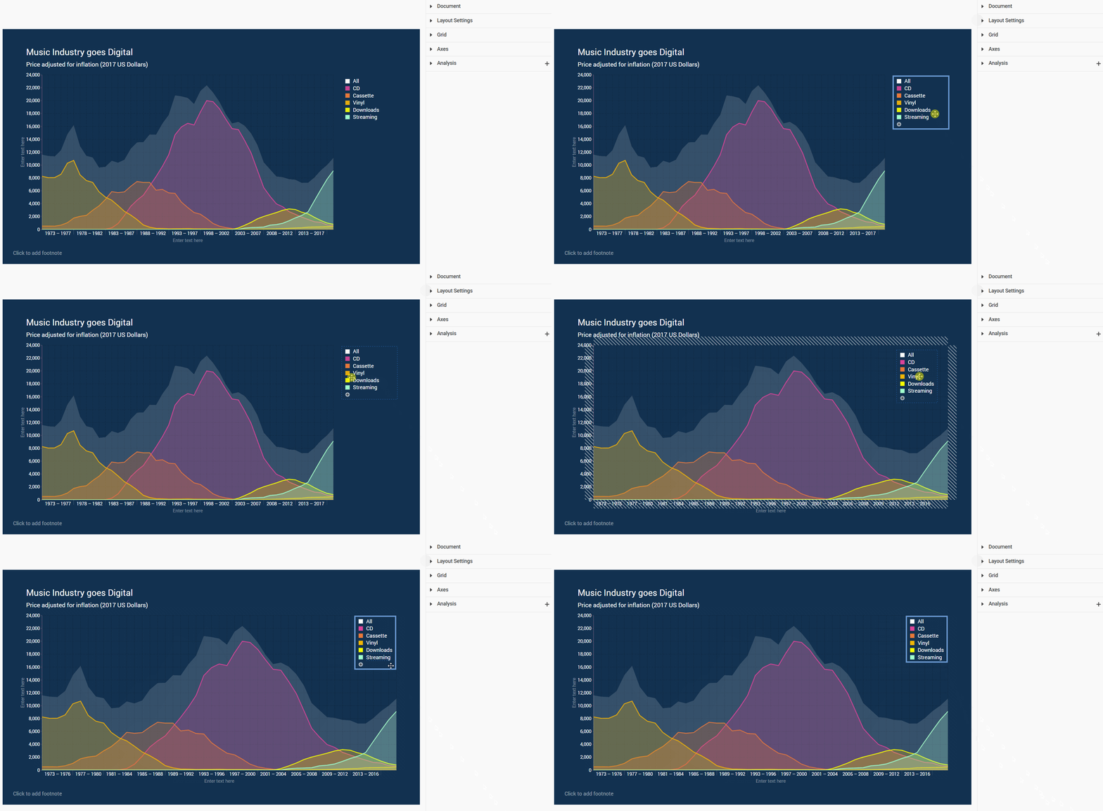
- Remove "All" from the legend

- Move the legend from outside the canvas inside the canvas
- Add a title to the y-axis

- Remove the y-axis line

- Remove the vertical gridlines
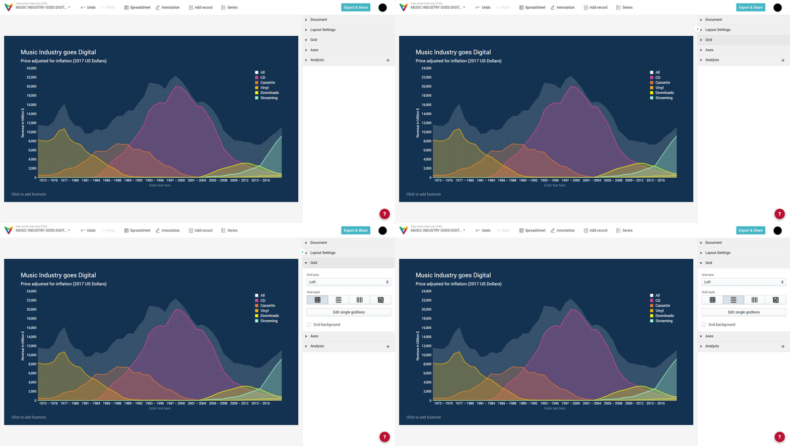
- Adjust the date format and axis label position for the x-axis

Thanks for reading!

Comments
0 comments
Article is closed for comments.