
Vizzlo's slopegraph will help you to tell a story about change. It is an elegant visualization; highly regarded by data visualization experts. In this tutorial we'll explain what a slopegraph is, when to use it, and how to create it.
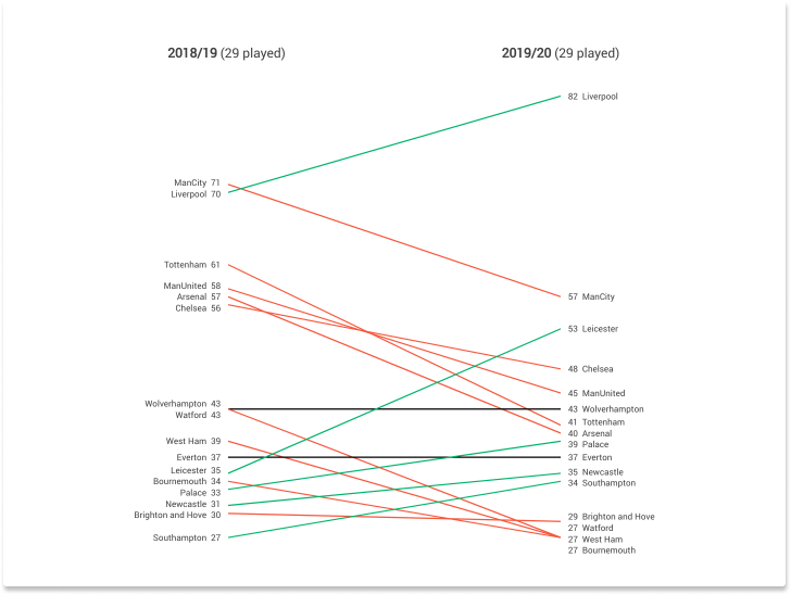
(Liverpool plays an incredible season. So does Leicester)
What is a slopegraph?
A slopegraph is visualization that most commonly tells a before and after story. Let's start Edward Tufte's classic, taken from his book The Visual Display of Quantitative Information, p. 158. Take the following data
| Country | 1970 | 1979 |
| Sweden | 46.9 | 57.4 |
| Netherlands | 44.0 | 55.8 |
| Norway | 43.5 | 52.2 |
| Britain | 40.7 | 39.0 |
| France | 39.0 | 43.4 |
| Germany | 37.5 | 42.9 |
| Belgium | 35.2 | 43.2 |
| Canada | 35.2 | 35.8 |
| Finland | 34.9 | 38.2 |
| Italy | 30.4 | 35.7 |
| United States | 30.3 | 32.5 |
| Greece | 26.8 | 30.6 |
| Switzerland | 26.5 | 33.2 |
| Spain | 22.5 | 27.1 |
| Japan | 20.7 | 26.6 |
It is hard to see any pattern just by looking at the data, of course.
A first try - grouped bars
We can abstract these numbers into a graphic using a grouped bar chart:
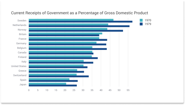
The chart gives a first indication about our variable of interest. Yet, it focuses on the absolute numbers. It is not easy to see how the numbers changes between the years 1970 and 1979. Visually, the height of the bars clearly outweighs the difference between the groups.
Second try - a range plot
A better way to emphasize the group differences is by means of a range plot. A range plot is essentially a connected dot plot.
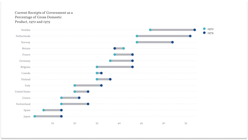
A range plot is already an improvement over the grouped bars. The chart focuses on the gap, not on the absolute numbers. Still, there are a few patterns in the data that are hard to find. (Did you find Britain outstanding?)
A case for a slopegraph
A slopegraph focuses on change. Here is Tufte's example:
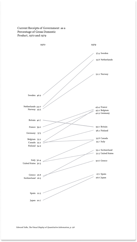
The same data visualized this way reveals a lot more information. Read the chart form left to right, or from top to bottom. You clearly see now
- the ranking of each country in 1970 and 1979, if we read the graph vertically
- the specific values associated with each country and year
- compare how the rates have changed if you look at the slopes
- that the United Kingdom is the only notable deviation in the general trend
How to create a slopegraph with Vizzlo?
We saw earlier that when you create a slopegraph with Vizzlo your data needs to be arranged as follows:
| Label | Value 1 | Value 2 |
|---|---|---|
| A | 1 | 2 |
| B | 2 | 4 |
| C | 3 | 5 |
| ... | ... | ... |
You can paste the data into the spreadsheet or upload a XLSX or CSV file.
Tip: Read our article about How to upload your data to Vizzlo.
Customize your slopegraph
The chart offers you many customization options. You can
— position the axis legend labels on top or bottom of the chart
— display labels and values on either side or hide them
— adjust the line width for all slopes simultaneously or for a single slope alone.
The chart is interactive, just click on any line to change its properties:
— color
— line width
— label.
If you want to use different colors to emphasize increases, decreases or equal values, click on the Colors toggle. Three color input will appear so you can customize the chart.
Display ranks
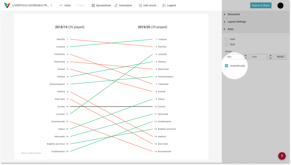
Sometimes your data contains ranks rather than continues values. In such a case you would probably want to invert the axis such that the first rank is displayed on top. Take the Premier League example from the beginning of this text. Instead of points, we look at the position of each team now. You would usually show the lead on top.
| Club | 2018/19 | 2019/20 |
| ManCity | 1 | 2 |
| Liverpool | 2 | 1 |
| Tottenham | 3 | 7 |
| ManUnited | 4 | 5 |
| Arsenal | 5 | 8 |
| Chelsea | 6 | 4 |
| Wolverhampton | 7 | 6 |
| Watford | 8 | 14 |
| West Ham | 9 | 15 |
| Everton | 10 | 10 |
| Leicester | 11 | 3 |
| Bournemouth | 12 | 16 |
| Palace | 13 | 9 |
| Newcastle | 14 | 11 |
| Brighton and Hove | 15 | 13 |
| Southampton | 16 | 12 |
In the sidebar, click on Axis --> Inverted axis to show the ranks correctly from top to bottom. Note that the colors for increasing and decreasing values won't be reversed automatically.
Miscellaneous
"I love slopegraphs. I'm happy to nail my colours to the mast and declare it. I'd probably not go as far as to wear a t-shirt with such a slogan but I feel a need to express my praise for the still-underused slopegraph and try help continue spread the word of its worth."
Andi Kirk, visualisingdata.com
Comments
0 comments
Please sign in to leave a comment.