A control chart shows the changes in the process over time. Control charts, also known as Shewhart charts or process-behavior charts, are a tool used to determine if a (business) process is in a state of control. Control charts are the graphical device for Statistical Process Monitoring.
It is a way to look at progress over time. In this tutorial we will show you how to use Vizzlo's Time Series Graph to create a Control Chart.
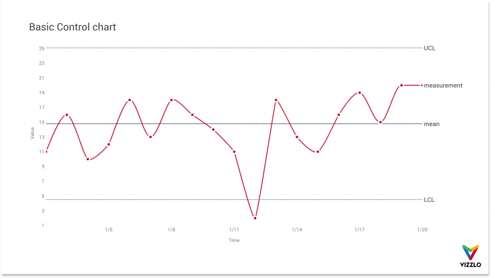
A basic Control Chart shows at least the following four lines:
— our measurement variable
— the mean of the measurement variable
— a lower bound or lower control limit (LCL) - commonly calculated as the mean of the measurement variable minus 3 times the standard deviation of the measurement variable
— an upper bound or upper control limit (UCL) - calculated as mean of the measurement variable plus 3 times the standard deviation of the measurement variable.
It is possible to add other reference lines, e.g. one time the standard deviation, twice the standard deviation etc., but in this example we keep it simple.
As long as the process remains in control, almost all the data points will fall within these limits. If a data point is out of control limits, we assume that the process is likely to be out of control and that an investigation is warranted to find and eliminate the cause(s).
The sample standard deviation — also called sigma or written as Greek letter σ — is calculated as:
$$\sigma = \sqrt{\frac{1}{N-1}\sum_{i=1}^N \left(x_i - \bar{x}\right)^2}$$
where \(\bar{x}\) is the sample mean.
Tip: Use the functions AVERAGE and STDEV.S in Microsoft Excel to calculate the sample mean and sample standard deviation respectively.
Data structure
Vizzlo's Time Series Graph assumes that the first column of your data is time-based. All other columns are assumed to be numeric.
Tip: read our article about Date formats that Vizzlo can interpret.
The first six rows of the data used in this example look like this:
| date | LCL | UCL | mean | measurement |
| 02.01.2020 | 25,06 | 4,51 | 14,79 | 11 |
| 03.01.2020 | 25,06 | 4,51 | 14,79 | 16 |
| 04.01.2020 | 25,06 | 4,51 | 14,79 | 10 |
| 05.01.2020 | 25,06 | 4,51 | 14,79 | 12 |
| 06.01.2020 | 25,06 | 4,51 | 14,79 | 18 |
You can download the data as Microsoft Excel file here.
Add your data
You can upload the Excel file easily. Open the Spreadsheet from the menu bar and either drag the file into the spreadsheet or use the Import button in the top right corner of Vizzlo's spreadsheet.
Tip: Read our article How to upload your data to Vizzlo.
When the data was imported, the rest is just styling.
Style the chart
When the data was added, the chart looks like this:

What we are going to do next is:
— change the chart title
— add direct labels instead of a legend
— smooth the lines
— remove the grid
— change line properties like color, line style, width
— change the date format of the x-axis
— do a hack to get a dot-dash type of line style 🧙♂️
Change document title
We can change the chart title easily. Just click on it and start editing.
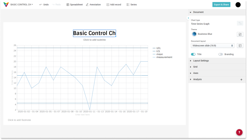
You will notice a second text input below the title when the title is selected. There you can add a subtitle if you like.
Add direct labels instead of a legend
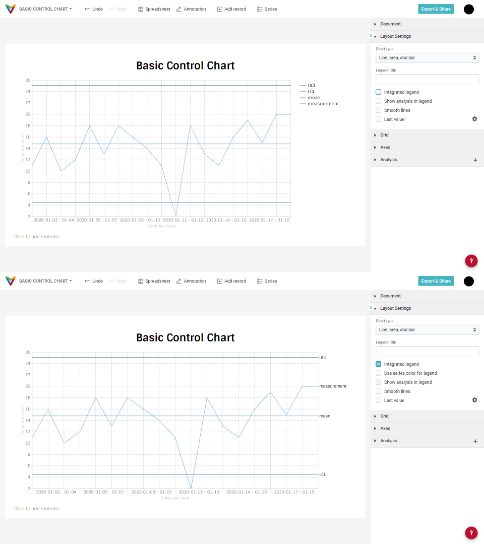
By default, the chart will show a legend, in case there is more than one single series. Instead of a legend, we can label the lines directly. In the sidebar under Layout settings click the option Integrated legend. When you click that option, another input element will show up just below. But in this example we will not make use of the option Use series color for legend. Instead, we keep the black as font color.
Smooth lines
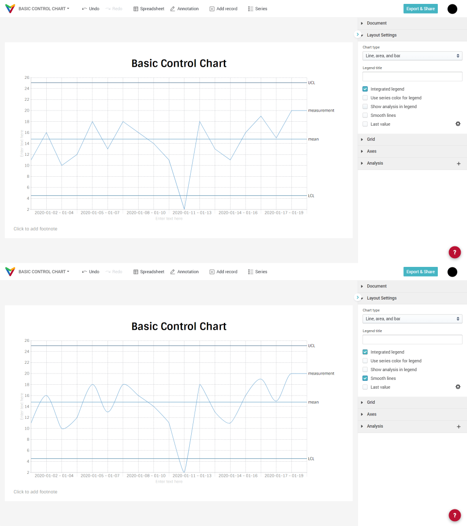
By default, a straight line is drawn between two observations. We can change the way values between the observations are interpolated. To do that, click the option Smooth lines.
Remove grid lines
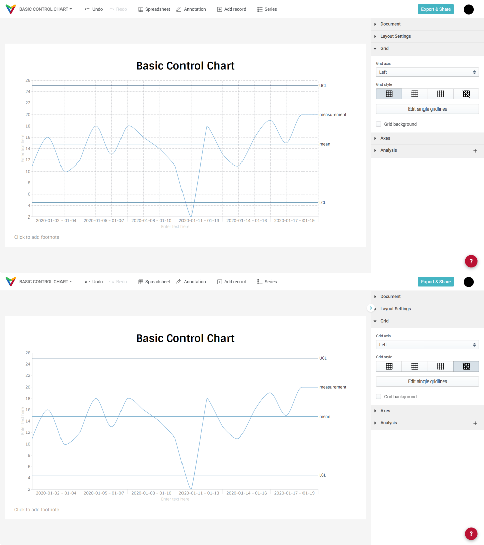
In the sidebar you see the dropdown Grid. When opened, you will see the option to show vertical and horizontal grid lines, only vertical or only horizontal grid lines or no grid lines. In this example, we will remove all the lines.
Change line properties
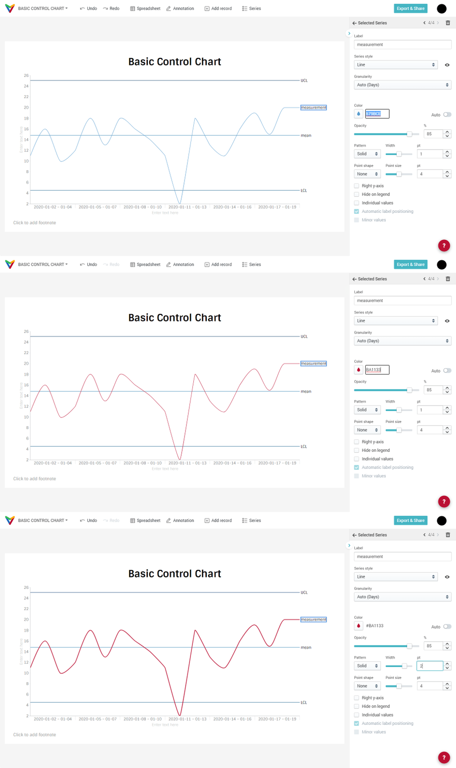
Vizzlo's Time Series Graph is interactive. Click on a line to see series specific settings in the sidebar. We can change the color, opacity, line type, line width, add points etc. We go for dotted, black lines for the upper and lower bounds, solid lines for the mean and the measurement.
The color input can be edited directly. Just click on it and insert the HEX color code.
Adjust the date format of the x-axis
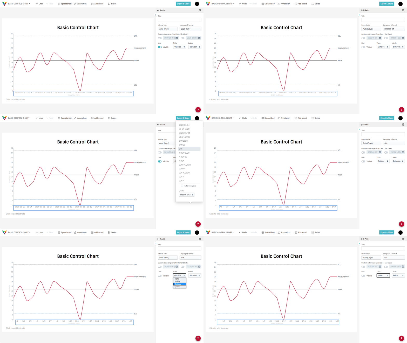
When you click on the x-axis in the sidebar, you will find axis-specific properties. We will hide the axis line, change the display format to be Month/Day and remove the axis ticks.
Get a dot-dashed line style
What we will show you now is a hack. In the initial images of this article, you saw that the line style of the measurement line looks like this:
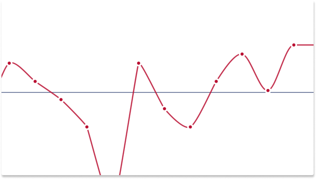
As you can see, there are in fact three series plotted in this order:
- a solid red line
- white dots
- red dots
It is important to understand the order in which the series are drawn and how they overlap. First the series in column B is drawn, then the series in column C, and so on. That is, the order in which Vizzlo's chart plots multiple series is from 'left to right' in the spreadsheet, i.e. the leftmost column is plotted below all other series.
To get to a dot-dashed line, you need to duplicate the measurement series in the spreadsheet twice. The steps we need to take in a nutshell:
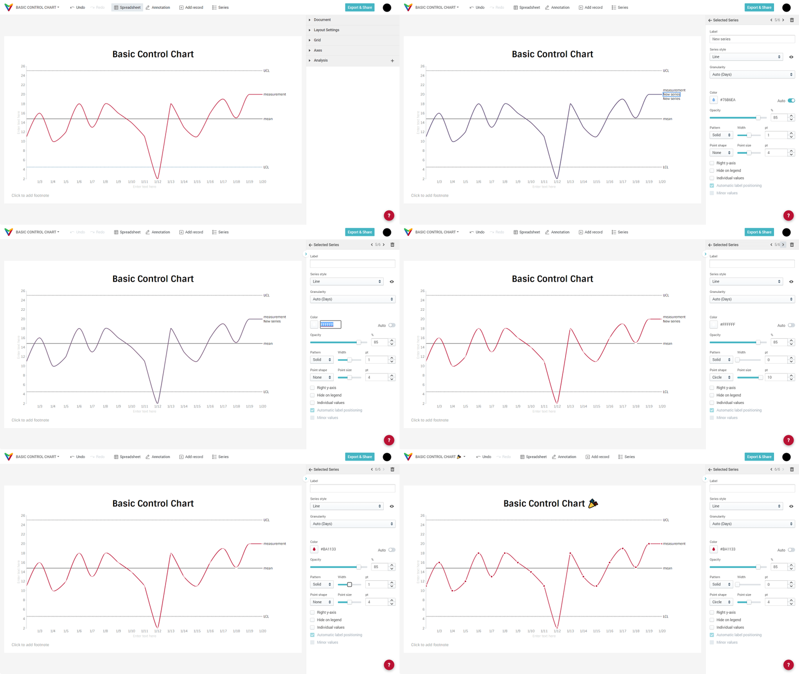
- open the spreadsheet
- select column measurement
- drag the blue square at the bottom right of the selection to the right
- close the spreadsheet
- select New series, click on the label below measurement
(tip: use the stepper in the top right corner of the sidebar to step through your series) - delete the series label
- change the color to white, i.e. #FFFFFF
- set the line width to 0
- select the option Circle from the dropdown menu Point shape
- set the point size to 8
- repeat from 5. and do the same for 'the other' New series
We told you it is a hack. 😉

Comments
0 comments
Article is closed for comments.