Vizzlo's bar chart makes it easy for you to create a graphic to show a categorical variable along with a continuous variable.
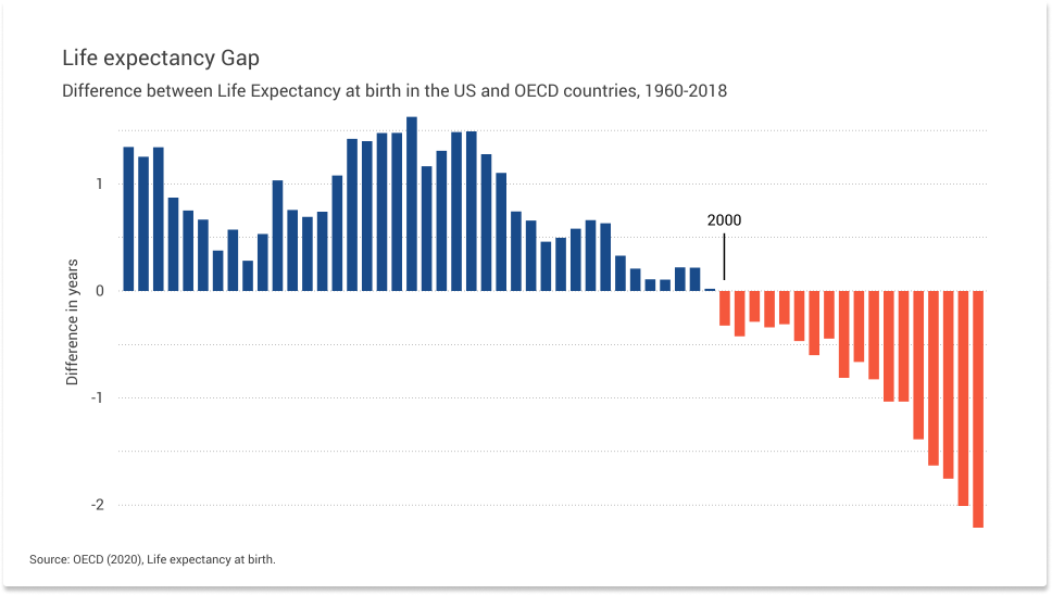
What is a bar chart?
A bar chart is a common graphical display when you want to show quantitative values for a set of categories. The bars present the categorical data by rectangular bars. The length of the bars is proportional to the numerical values associated with each category.
Data structure
Every chart comes with default data. Vizzlo allows you to insert two columns of data which must be arranged as follows:
| Category | Value |
| A | 1 |
| B | 2 |
| C | 3 |
| ... | ... |
To enter your data, click on Spreadsheet in the menu bar. You can copy&paste your data, or upload a XLSX or CSV file. The chart is fully interactive, so a third option is to click on a bar and simply adjust the values of each bar directly in the sidebar. The data we used for the life expectancy example can be downloaded here.
Tip: Read our articles about How to upload your data to Vizzlo. and about Editing and adding data.
Customize your chart
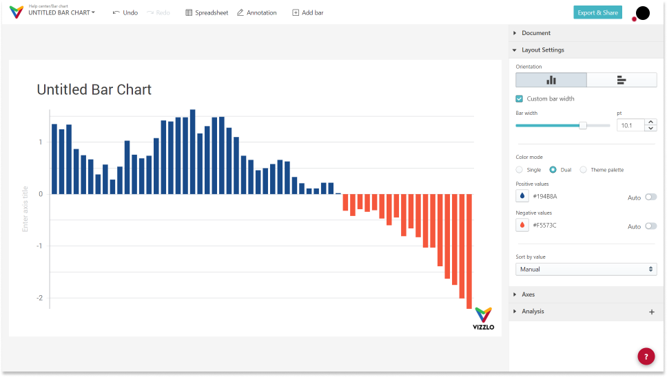
When you open a new bar chart you will see a chart similar to this one:
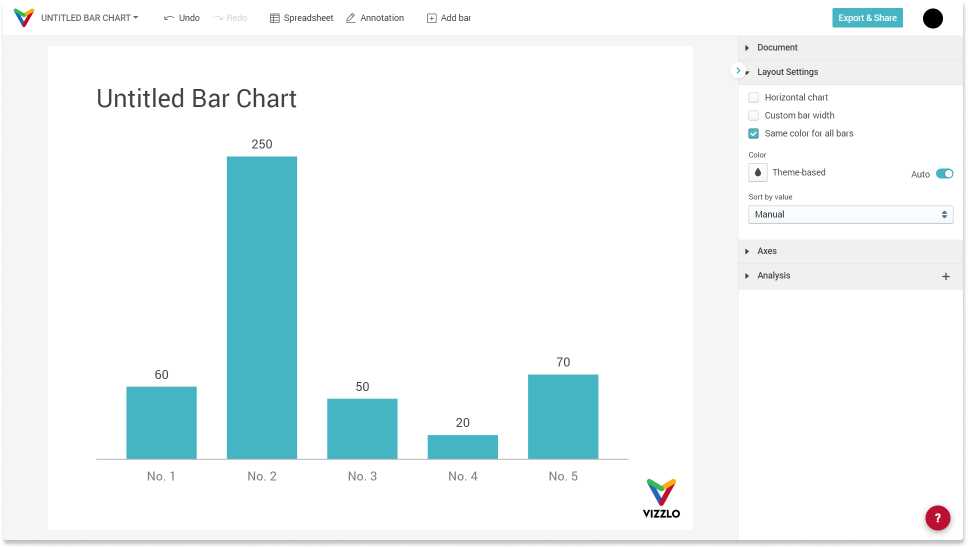
In the sidebar under Layout Settings you have several options to change the chart's appearance:
— Horizontal chart means you can swap x and y-axis
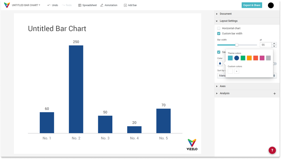
— Custom bar width means you can change the width for all bars
— Same color for all bars is true by default, if you click the checkbox the colors will be taken from your theme; click on the color input below to change the color for all bars when Same color for all bars is true
— Sort by value either ascending or descending
Using the data on life expectancy from the initial example, your chart will look like this:
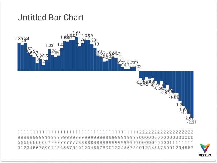
There is way too much going on in this chart. The value label overlap, bars are too wide for the given 4:3 layout, the axis labels look off. We need to clean this up a bit.
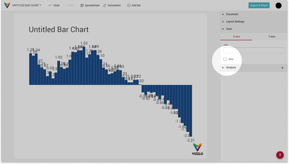
Remove x-axis
The data covers the time from 1960 to 2018 so the bars will follow a natural order. Hence, we don't need to show that information on the horizontal axis. To remove the x-axis first click on the dropdown Axes in the sidebar, under X-axis you will see a checkbox Axis.
Remove values and show y-axis
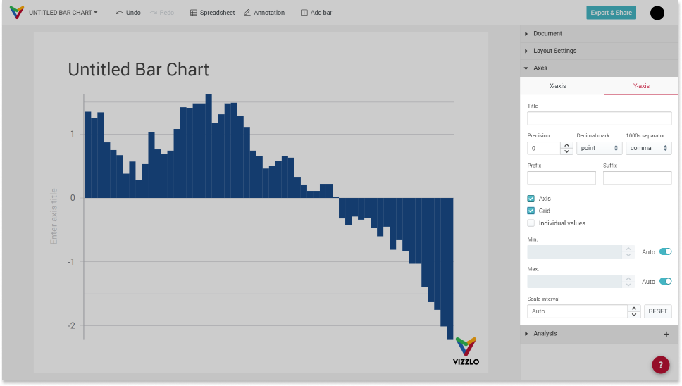
In the sidebar under Axes there is a second tab called Y-axis. There you find the options to
— change the axis title
— change the number format of the axis tick labels and the values shown in the graph
— show/hide the y-axis
— show/hide the grid lines
— show/hide values above the bars
— set a minimum and maximum to the axis range
— set a scale interval
Adjust the document layout
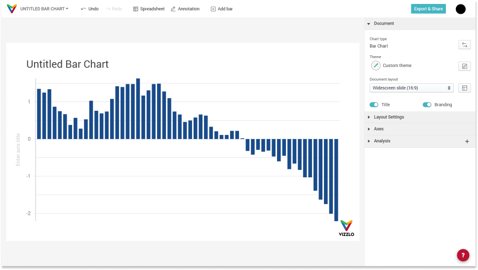
The chart shows 60 data points in total and looks a bit cluttered with the 4:3 layout. We can adjust the bar width or change the layout. Let's do the latter.
In the sidebar under Document you find the option . Click on the dropdown menu and choose any of the default layout or create your own. We go with 16:9.
Adjust color for individual bars
If you want to highlight a single you need to select it and in thesidebar you will see the properties that you can adjust.
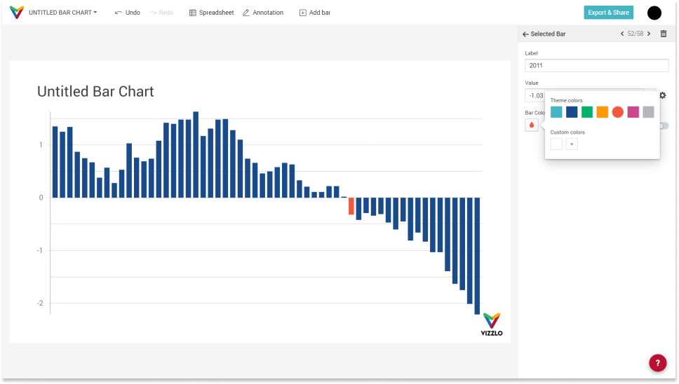
Note: If you change the color of a bar, this setting will override all other settings that let you adjust the color. This means, for example, that if we choose to color positive and negative values differently, the setting that was set for a single bar will not be overwritten. To change this, you need to toggle the Auto toggle button next to the color input.
Adjust color for positive and negative values
What we want to achieve with the chart is to highlight the turnaround in the evolution of life expectancy. We can do this effectively using colors.
There are three color modes in the sidebar:
- Single (default)
- Dual
- Theme based
The option Dual allows to color positive values (life expectancy in the USA > OECD average) differently from negative values (life expectancy in the USA < OECD average). When you select that option, you'll see two color inputs.
Change the title of the chart
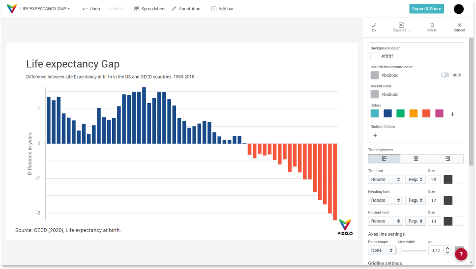
Click on the title of the chart and change it. You will notice that there is the option to add a subtitle too. In the footer we will credit the data source as it is common.
Remove y-axis line
The default settings for axis and grid lines are part of your theme. To change that, click on Customize theme in the sidebar. In the theme editor you can
— change the color palette
— change fonts
— change axis and grid lines
— add an overlay image (like the Vizzlo logo in this example)
Tip: Read our help center article on How to customize your theme.
Add analysis features
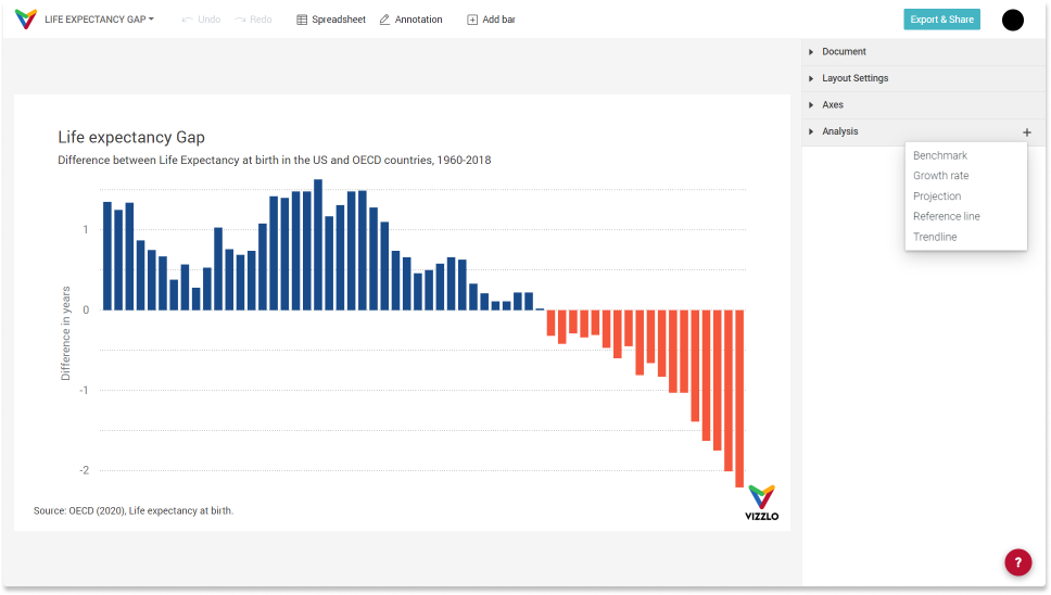
You might have noticed there is a fourth dropdown menu called Analysis. Click on the `+` icon and you see the options you can add
— Benchmark
— Growth rate
— Level Difference Arrows
— Projection
— Reference line
— Trendline
How to add a benchmark to a bar chart
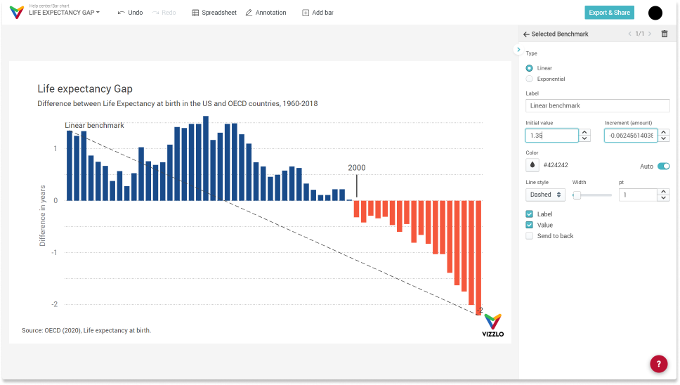
A benchmark will draw a straight line from the first observation. That is, the Initial value f the benchmark matches the initial value of your data. The Increment (amount) is the calculated slope of the line. Both values can be changed by you.
How to add a growth rate to a bar chart
When you add a growth rate you have three options:
— add a compound growth rate
— add an average annual growth rate
— add an individual growth rate
Note: the chart assumes that when you map a time-based variable to the x-axis, it is yearly time series.
- The average annual growth rate (AAGR) is useful for identifying trends. It can be applied to almost any financial metrics, including income, profit, expenses, cash flow, etc. The AAGR is calculated as:
$${AAGR}(t_1,t_n) = GR_1 + GR_2 + ... + GR_n \over n$$,
where `GR_n` is the growth rate at time `n`. (Example the growth rate from, say, 10 to 12 is \((12 - 10) / 10 = 20\%\).
Note that AAGR can be very misleading. To illustrate this, have a look at the chart below, where the initial value and the final value are equal.
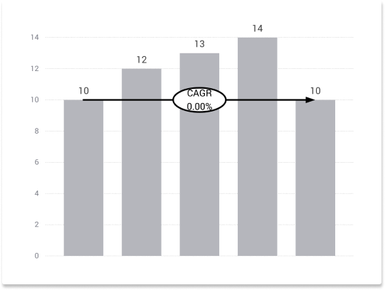
So we can clearly see that the actual growth rate is 0%. Nevertheless, the AAGR is \(20\% + 8.3\% + 7.7\% - 28.6\%) / 4 = 7.4\% / 4 = 1.85\%\). Due to this fact, most analysts use the Compounded Annual Growth Rate (CAGR) when evaluating changing financial figures.
- The compound annual growth rate (CAGR) is calculated as:
$${CAGR} = \left( \frac{V_{final}}{V_{begin})} \right)^\frac{1}{t} - 1$$,
- \(V_{begin}\) : beginning value
- \(V_{final}\) : final value
- `t` : time in years.
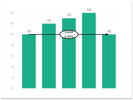
Common CAGR applications are:
- Calculating the average returns of an investment
- Comparing the historical returns of stocks with bonds
- Forecasting future values
- Communication of different business measures such as sales, market shares, costs, customer satisfaction and performance.
- The option individual growth rate calculates the growth rate from one observation to the next:
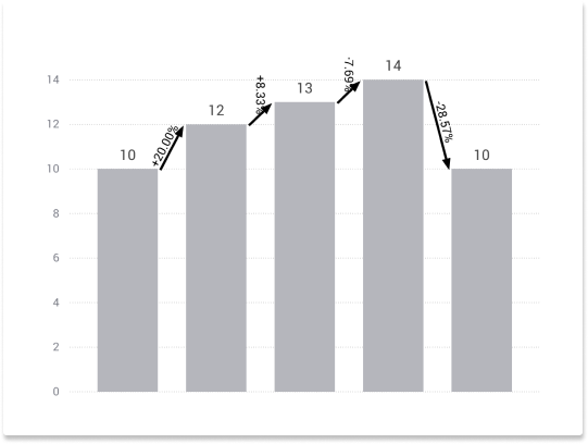
How to add a level difference arrow to a bar chart
If you want to compare the values of two bars you can use level difference arrows. They are designed to work with drag and drop for easy handling. Adding a level difference arrow allows you to display up to two of the following operations:
- Growth rate
- Difference
- Sum
- Ratio
Besides these calculations, you can also show a free text instead.
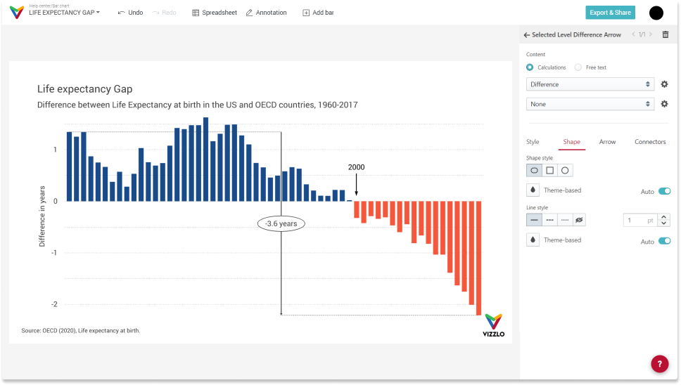
How to add a moving average to a bar chart
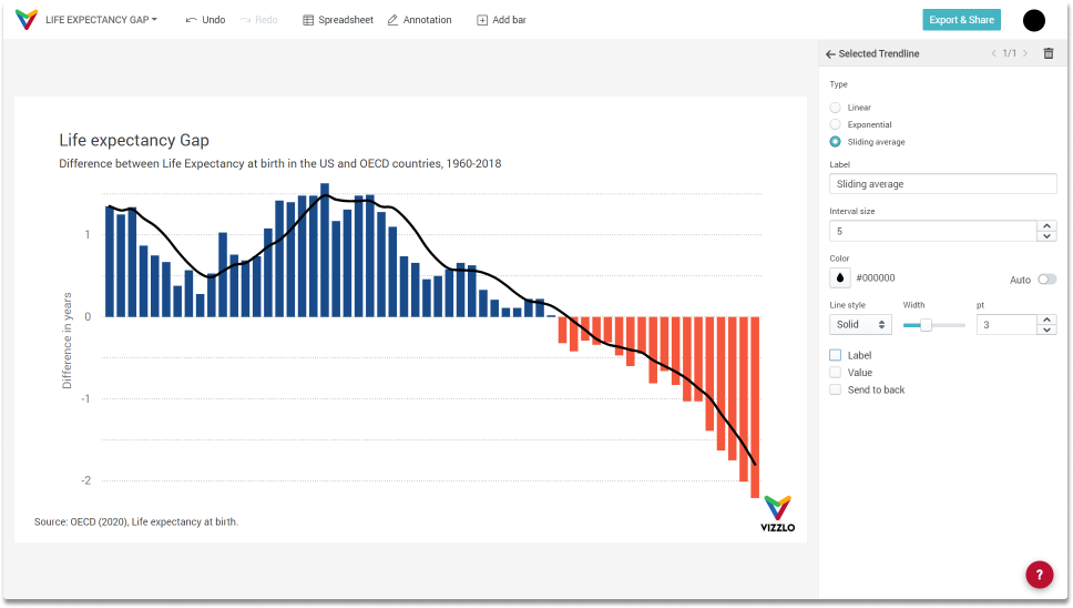
Let's get back to our example showing the difference in life expectancy between the US and the OECD and add a moving average with a window size of 5 years. Choose the option Trendline --> Sliding average. Adjust the window size, line width and color as you like.
How to add a text annotation to a bar chart
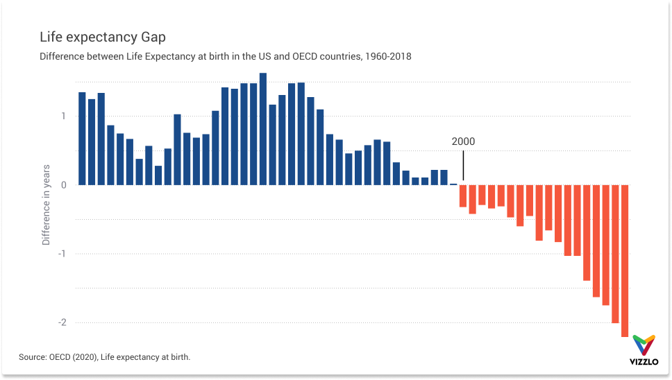
As the first reader of your chart is you, you might ask yourself in which year the figures turned negative? We can add a text and line annotation. Click on Annotation in the menu bar to add them.

Comments
0 comments
Please sign in to leave a comment.