Vizzlo's Time Series Graph allows you to effectively display observations naturally ordered by time as continues lines. In this tutorial we will show you how to create a Difference Chart.
What is a Difference Chart?
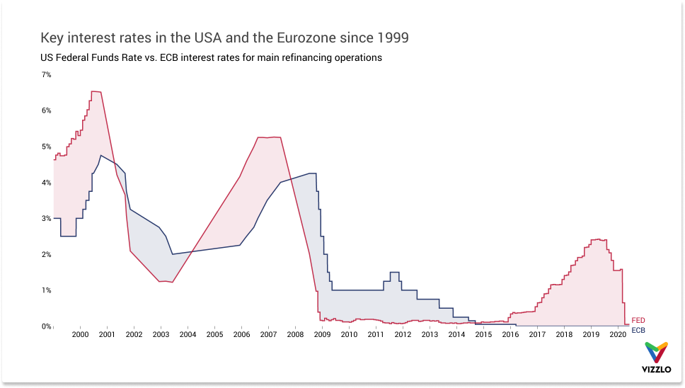
A difference chart shows how two variables interrelate. In addition to the development of the two interest rates since 1999, the chart shows the effective periods during which the Federal Reserve Bank (FED) fund rate has been above the European Central Bank (ECB) interest rates for main refinancing operations and vice versa. The focus of the above example thus appears to be on the difference between the two series from 1999 to 2020, which may be due to differences in the structure of the euro area and US economies, differences in central bank targets or perhaps the different sizes and sources of the shocks affecting the two economies.
You can download the data here as CSV file or Microsoft Excel file.
How to create a Difference Chart with Vizzlo?
Create a Time Series Graph and open the Spreadsheet to import the data. Vizzlo's Time Series graph requires the following data structure:
| date | value1 | value2 | ... |
| 1999-01-01 | 1 | 3 | |
| 1999-01-02 | 2 | 4 | |
| ... | ... | ... |
That is, the first column must be a date column and all other columns are numerical.
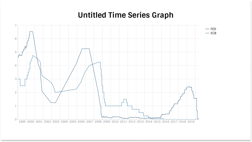
After the import the chart you see, will look like this.
Edit Chart title
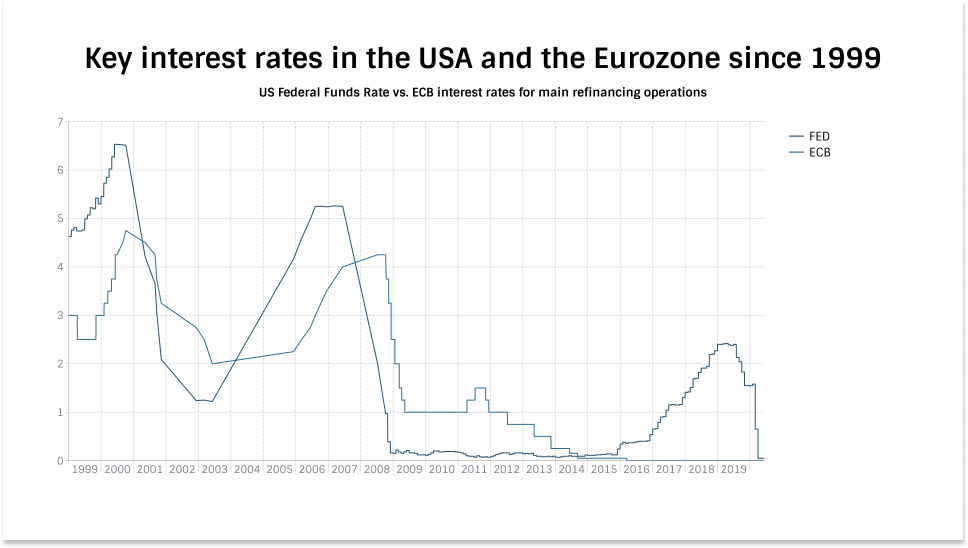
The first thing we will change is the title of the chart. Just click on the title and start editing. You will notice that you can add a subtitle too. The input element becomes visible once you select the title. Note that you can use rich text formatting for the subtitle (unlike for the title).
Add direct labels
Instead of a legend, we will add the series labels at the end of each line. To do so, we need to click the option Integrated legend under the Layout settings.
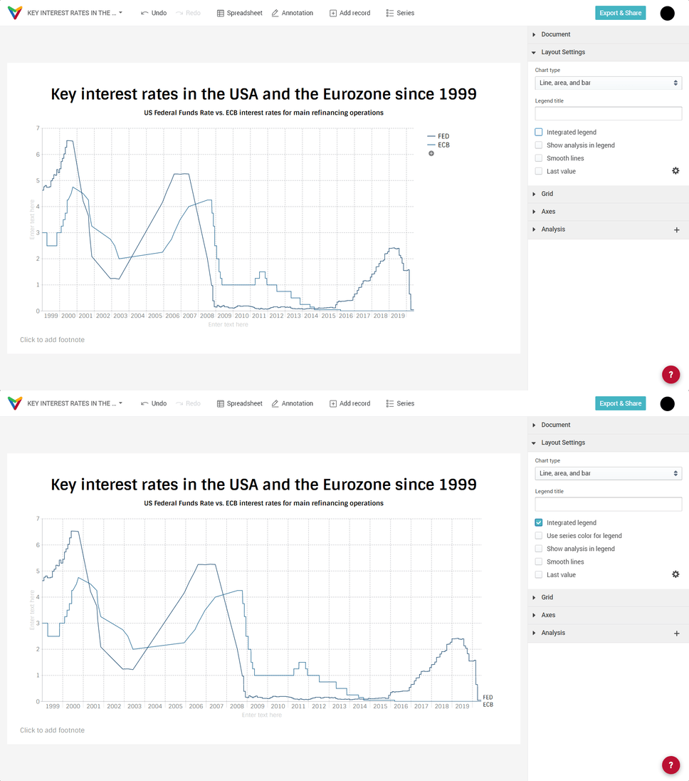
Once you added direct labels, you have the additional option to display the labels in the same color as the series. Click on Use series colors in legend.
Edit grid lines
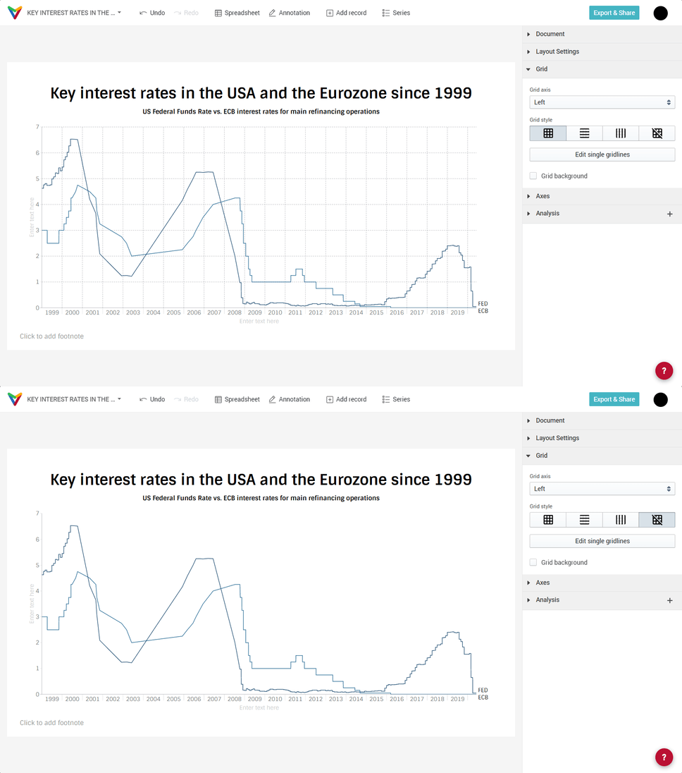
Under Grid in the sidebar you find options to show or hide all vertical lines and all horizontal lines as well as the option to hide single horizontal lines. For the latter, click on Edit single gridlines. In this example we will clean up a bit and remove all grid lines.
Edit line properties
For the lines, we will change
— series label
— the color
— the width
— the opacity
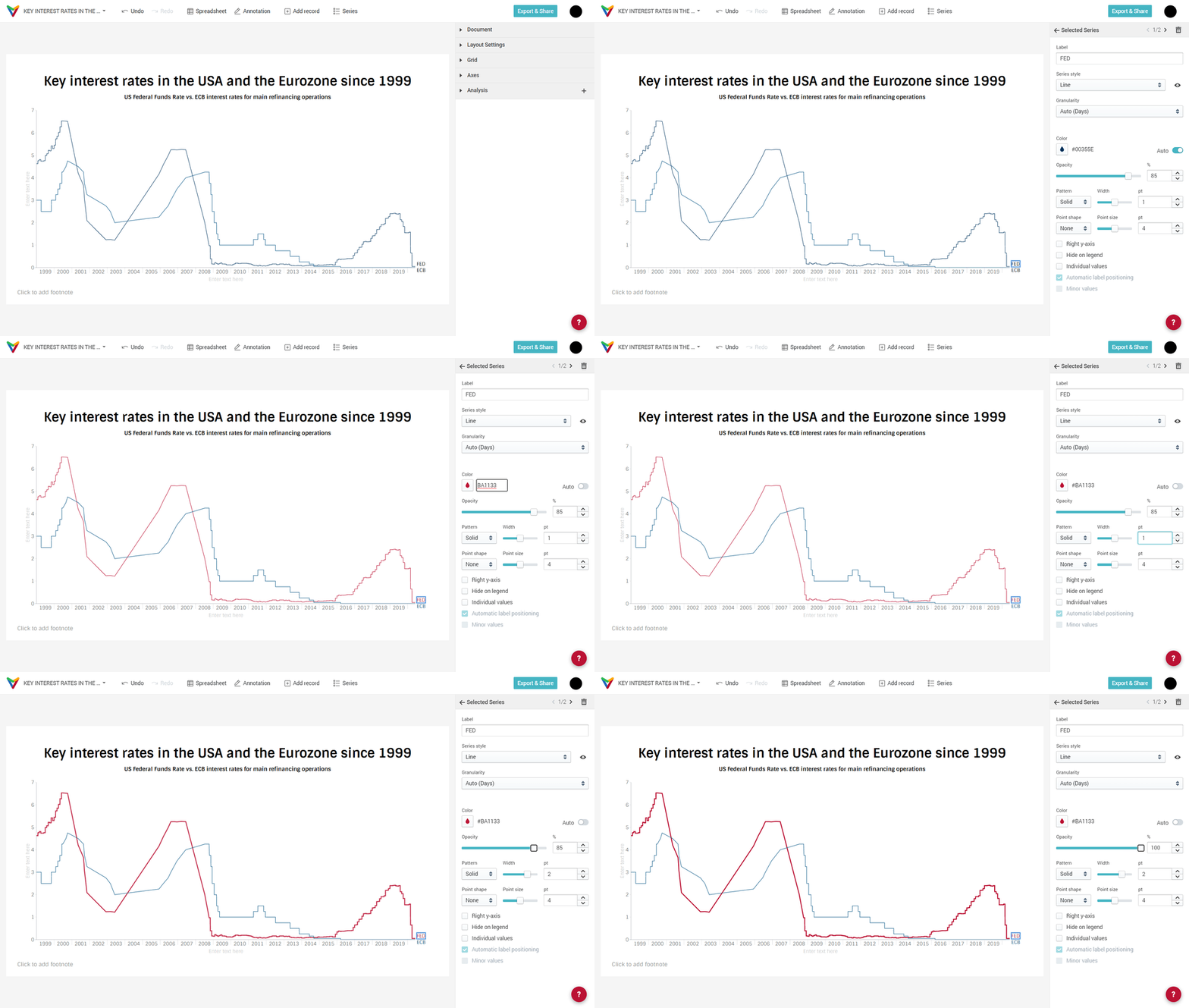
(The color codes used are #BA1133 for the FED and #091D57 for the ECB)
Adjust x-axis labels
We can click on the axis to edit its properties. The date labels of the x-axis can be placed at different positions in relation to the axis ticks:
— below
— left
— right
— between
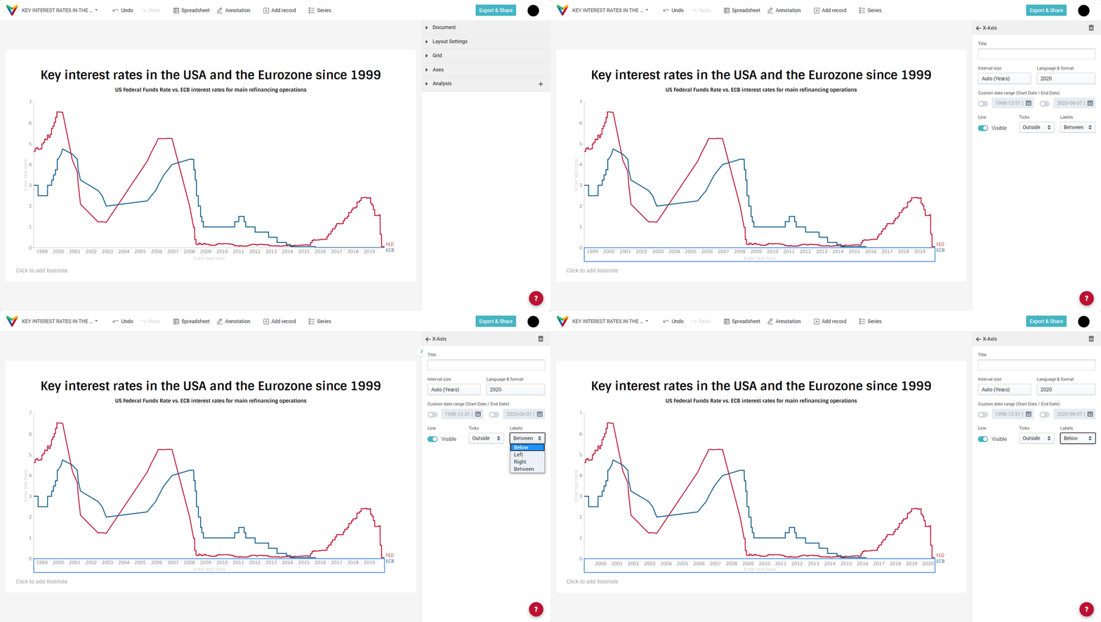
We can hide the axis line completely using the toggle Line.
Adjust the y-axis number format
As for the y-axis we will add a suffix to the axis labels and hide the axis line.

Add a shade between two lines
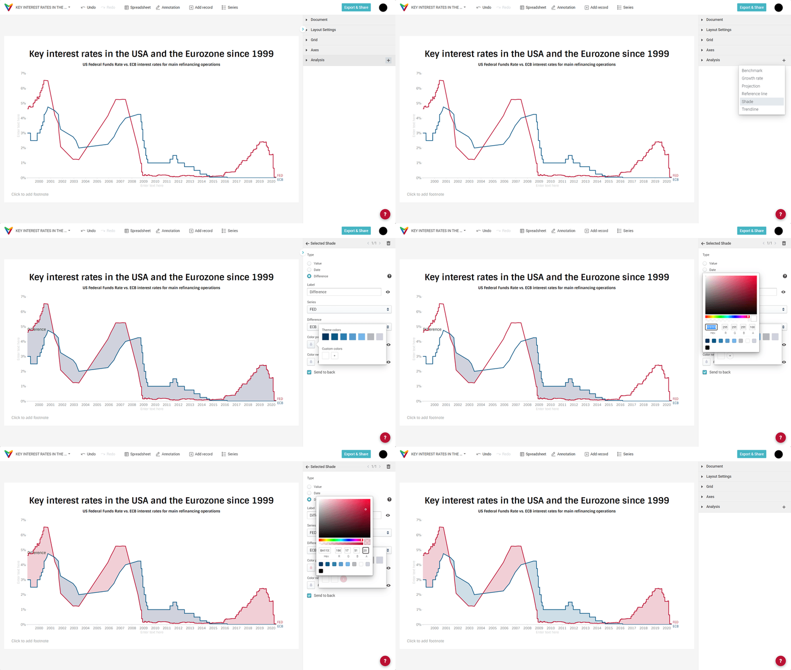
To highlight the area between the two lines we need to add an analysis feature. Click on the `+` icon in the Analysis dropdown and select Shade.
You will have three option:
— Value
— Date
— Difference
The Value option is the default setting. A horizontal shade is drawn between two values. You can adjust the shade's height using the two input elements Start and End.
When you select the option Date, a vertical shade is drawn. Adjust the time span it covers with the input element From and To.
The third option Difference is what you need to create a Difference chart. This option can only be applied when there are at least two series plotted as line. Otherwise, it is disabled. Just as with Value and Date options, the default color of the shade is the Neutral background color taken from your theme. But in addition, the difference shade provides the option to color area differently. This is what we are going to do.
Tip: read our article about How to customize a theme.
The third option Difference is what you need to create a difference chart. This option can only be used if you have drawn at least two series as a line. Otherwise, it is disabled. Just like with the Value and Date options, the default color of the shadow is the neutral background color taken from your theme. But in addition, the difference tone offers the possibility to color the area differently. This is what we will do. Additionally, we will set the opacity of the fill colors to 20/100 and hide the label of the shade.

Comments
0 comments
Please sign in to leave a comment.