A range plot is a great visualization if you want to highlight the difference between two values rather than the values themselves. Typically, two dots are connected by a line to illustrate that difference.
The chart below shows the average speed of the Tour de France champion and the rider that finished that tour last.
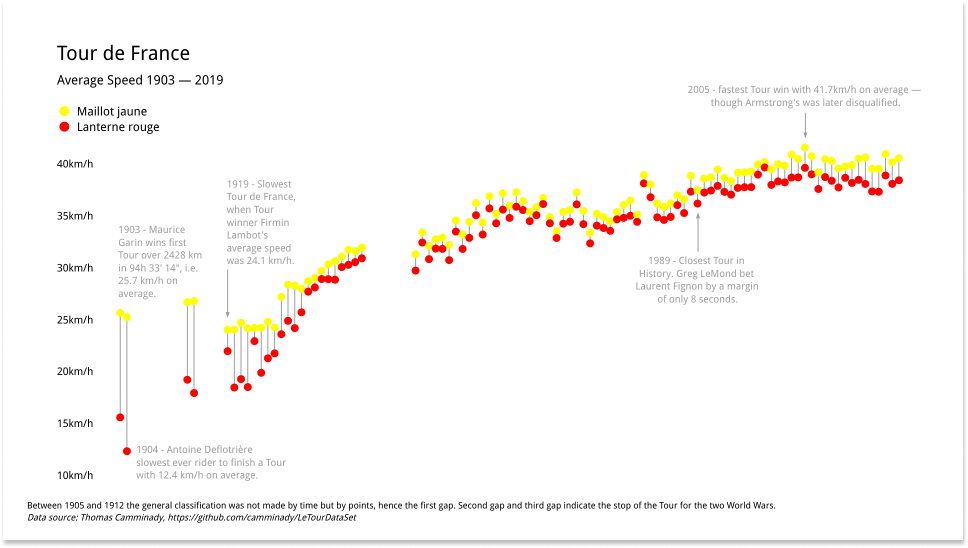
As the sport became more and more professional, the difference between the last rider and the winner decreased over the years, while the overall average speed increased.
Data model
Typically, this chart displays the difference between exactly two values for a single categorical variable. The data for these charts must be arranged as follows:
| Label | Value 1 | Value 2 |
|---|---|---|
| A | 1 | 2 |
| B | 2 | 4 |
| C | 3 | 5 |
| ... | ... | ... |
Open the spreadsheet, insert your data and you are ready to style your chart.
Customization
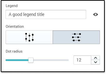
The size of the dots, the orientation of the chart and the colors of the dots can all be changed in the sidebar.
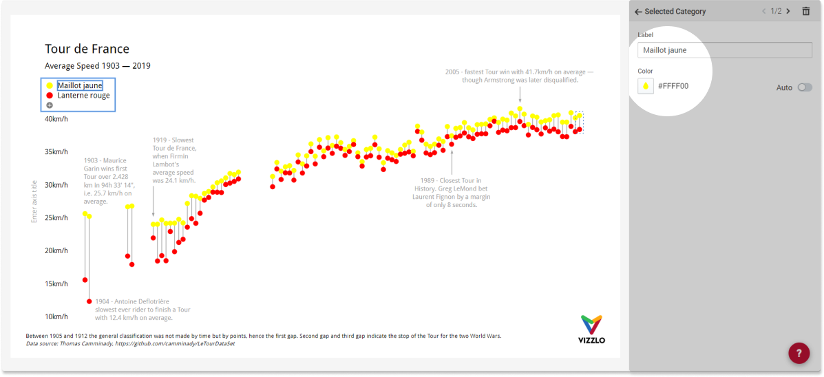
To change the colors, click on the legend and just the color picker in the sidebar:
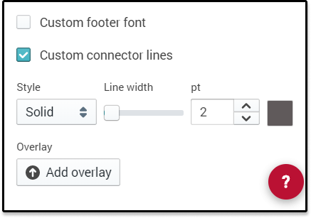
To change the properties of that connector line you must open the theme editor and select Custom connector line for that.
Best practice
If you want to compare two groups or two points in time (e.g. women vs. men, 2019 vs. 2020) and you find yourself with a grouped bar chart like the one below, you might want to give the range plot a try.
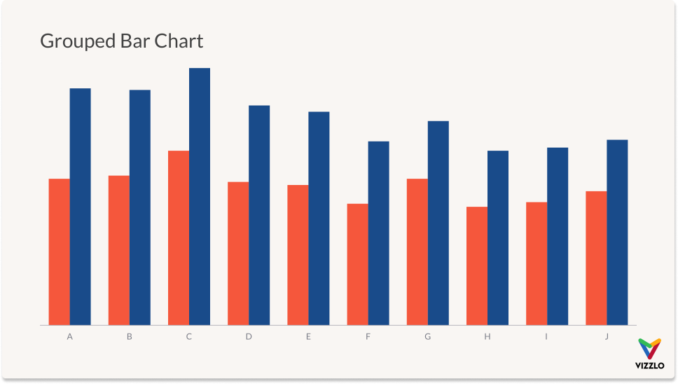
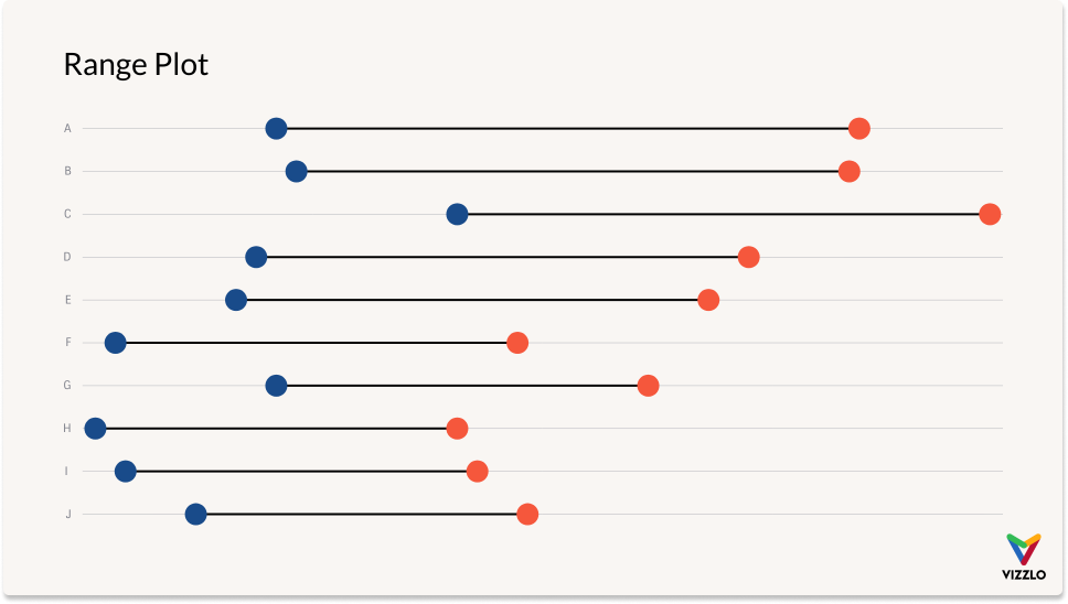
Because a bar chart relies on length to show data, it must start at zero. But you wanted to make another point, didn't you? The values themselves may not play the most important role and hence the axis must not start from zero; the focus of the statement should be on their difference. And a range plot does exactly that.
Using the same data as before a range plot will look like this:
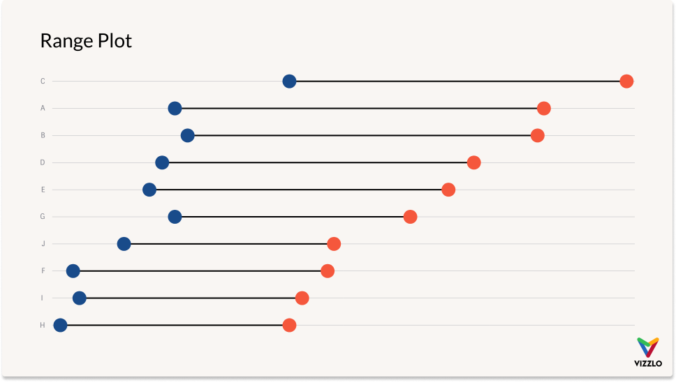
If the order of your discrete variable doesn't matter, and you want to emphasize one of the value columns, you might sort your data before plotting. You must do that before you upload your data to Vizzlo. This feature is not yet supported by our spreadsheet. 🙄
Miscellaneous
This visualization goes by many names such as DNA chart, gap chart, barbell chart, connected dot plot, or dumbbell chart. 💪

Comments
0 comments
Please sign in to leave a comment.