
Vizzlo's box plot makes it easy for you to summarise your data compactly. This visualisation takes your data and draws a robust five-number summary for each column.
What is a box plot?
A box plot summaries the distribution of a continuous variable. It displays a robust five-number summary for each column of your data, and all ‘outlying’ data points. The five summary statistics are the lower whisker, the first quartile, the median, the third quartile, and the extreme of the upper and lower whisker.
- Lower whisker: Smallest value greater than or equal to Q1 - 1.5 * IQR
- First quartile (Q1): 25% of the data is smaller than this value
- Median: The ‘middle’ value of your data
- Third quartile (Q3): 25% of the data is larger than this value
- Upper whisker: Largest value less than or equal to Q3 + 1.5 * IQR
- Interquartile range (IQR) : The difference between Q3 and Q1
- Outliers: Values smaller than lower whisker, or greater than upper whisker
A box is drawn from the first quartile to the third quartile, i.e. the box shows the IQR. A vertical line goes through the box, which is the median of the data.
Box plots also show lines extending from the box indicating variability outside the first and third quartiles. These lines are called whiskers, hence the name box-and-whisker plot.
Data structure
Vizzlo allows you to insert as many columns as you like. For the box plot, all data must be numeric. Missing values will be ignored when calculating the summary statistics:
| Value1 | Value2 | Value3 | ... |
| 1 | 4 | ... | |
| 2 | 3 | ||
| 3 | 6 | ||
| ... | ... |
To enter your data, click on Spreadsheet in the menu bar. You can copy&paste your data, or upload a XLSX or CSV file, or connect to external data sources.
Tip: Read our articles about How to upload your data to Vizzlo, and How to connect Vizzlo charts to external data sources for automated update.
How to customise your box plot?
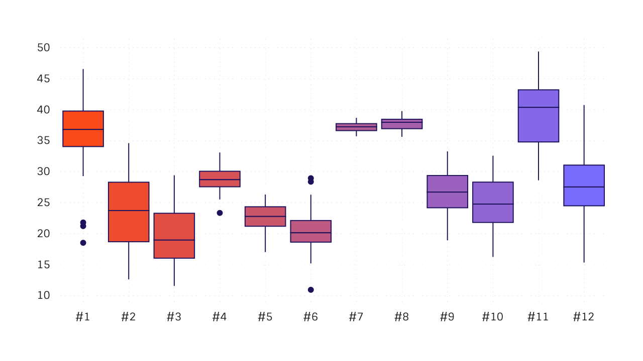
Like any other chart, Vizzlo's box plot comes with default data. Depending on your default theme settings, a new box plot will look somewhat like this:
In the sidebar under Layout settings you have the option to:
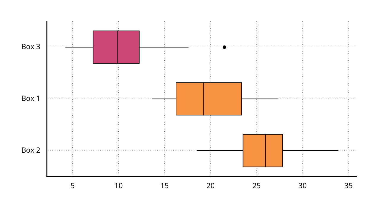
- switch between a horizontal and a vertical chart layout
- adjust the width of your boxes
- set the color for all boxes to be the same, or use the color of your theme palette
- sort the boxes by median, and
- reverse the order of the boxes
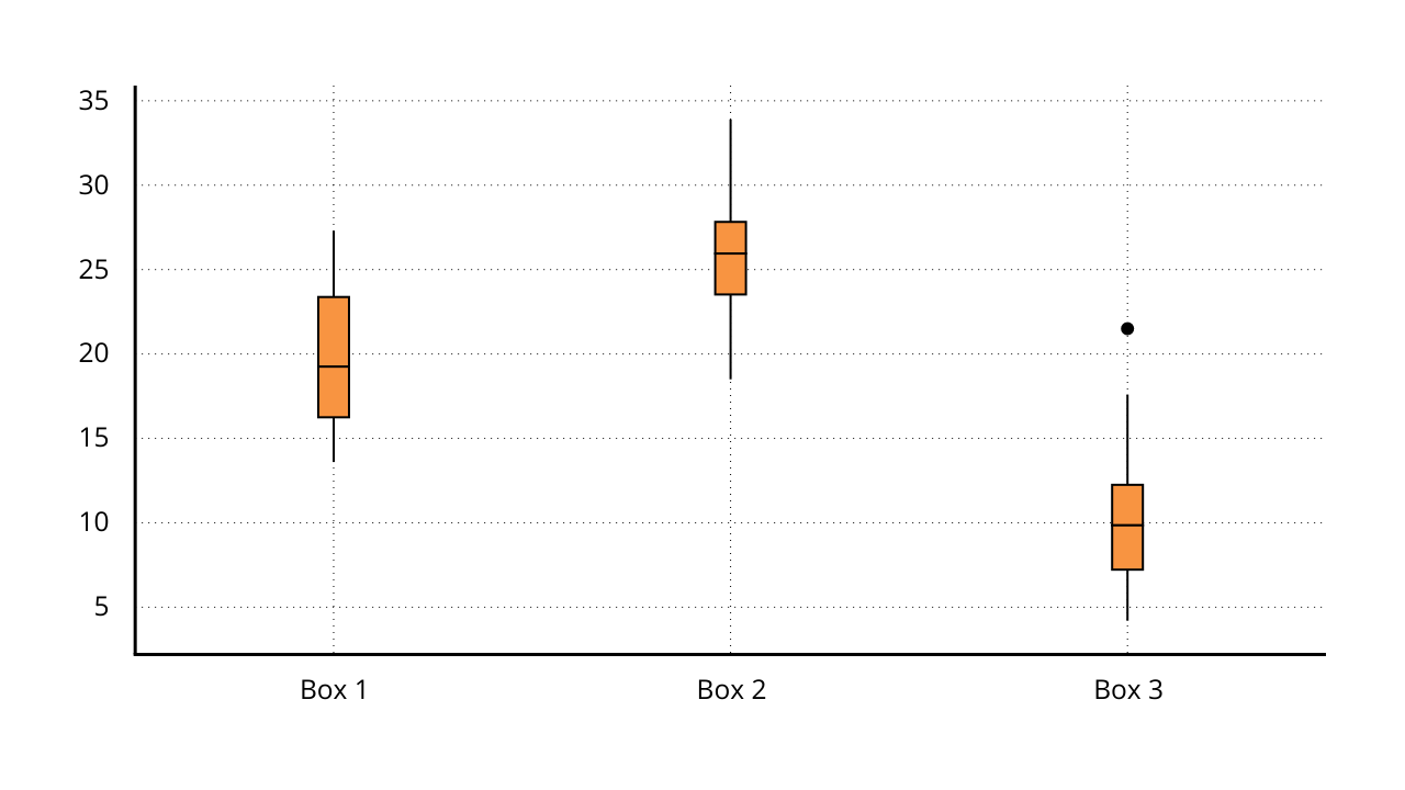
Besides that, the chart is interactive - that means you can select any of the boxes to adjust its position manually or change its color:
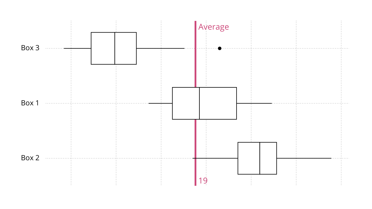
How to add a reference line to a box plot chart
To show an additional summary statistic, you can add a reference line. This analysis features supports multiple calculations based on all the data used in the chart. Included are
- minimum
- maximum
- mean
- median, and
- a custom value
How to customise axis settings a reference line to a box plot chart
In addition, you have the option to show/hide axis labels, axis lines etc. under the Axes settings. In addition, you can use the advanced number format options to change the axis labels of the y-axis. You can multiply or divide the values by a multiple of 10, display SI prefixes etc. This will not change the underlying data, but only the way the numbers in the chart are shown.
Those settings are not unique to the box plot, but we thought it would be good to know.
Comments
0 comments
Article is closed for comments.